VOID travel
ui/ux
2022
VOID is the first in its market to reimagine how people experience travel. They are the first to offer time travel experiences and seek to sell travel packages to 289 destinations all over the world. Individuals can now purchase time travel experiences and experience a whole new world.
Project Details
Client
VOID (speculative) student project
Role
ui/ux design & research
Timeline
April - June 2022 xxx (6 weeks)
Tools
figma, adobe creative suite, optimalsort
My goal as the designer was to create an effective e-commerce booking platform where individuals can search, browse, build their own travel packages, and book unique experiences. I was tasked with rethinking the booking experience and developing a design approach that would transform how individuals book time travel experiences.
Let's talk about the Problem
"Time travel experiences sound fun, but it's so new and I'm unsure about it."
Being the first in its market, VOID wants to distrupt the travel industry with the new time travel technology they've acquired. According to Reuters, the Travel and Tourism market generated an estimated $1.9 trillion USD in the year 2021, following covid-19 travel halt. By the year 2026, 74% of that revenue will be generated through e-commerce sites. VOID sees this a huge opportunity to grow their business and provide time travel experiences as a new form of traveling.
Design Challenge
How can I help VOID gain consumer's trust in the product so that they can successfully and efficiently sell time travel experiences to consumers?
Proposed Solution
A responsive and effective e-commerce website that provides consumers with information on time travel and also allows them to search, build their own travel packages, and book unique experiences.
Research Goals
The main research goals are to understand what current travelers value about their booking experiences so that we can identify pain points, needs and goals in order to create and effective and seamless platform.
✼ What fears and concerns do users have about time travel?
✼ What are the pain points users face when using an existing booking platform?
✼ What do users value about their booking experience?
✼ What are competitive platforms offering users? And what makes them successful?
Research Methods
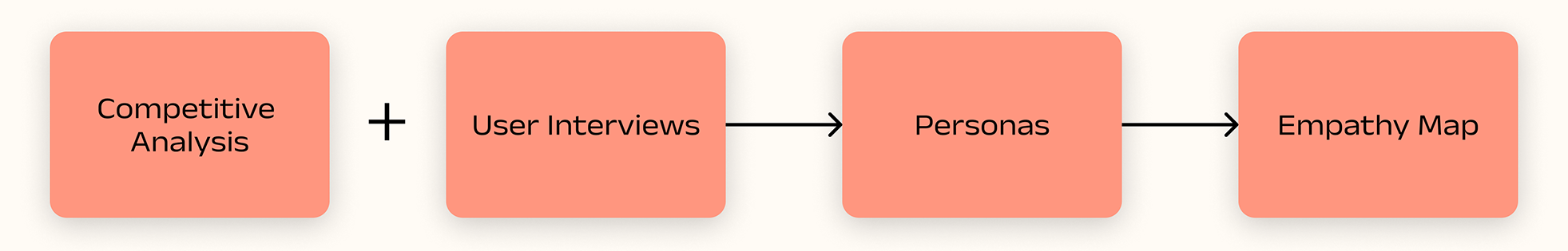
Conducting
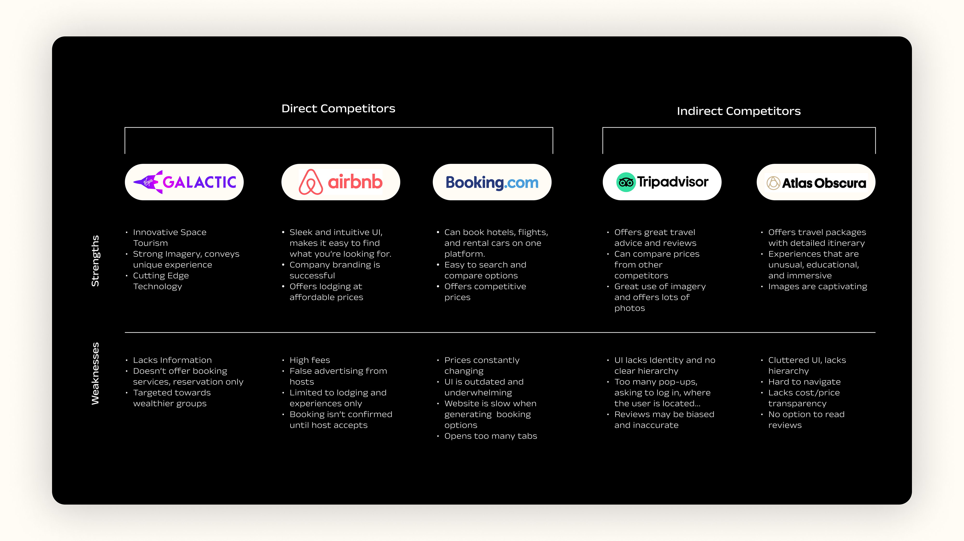
Competitive Analysis
First step in my research process was to conduct competive analysis to familiarize myself with VOID's competitors. I researched direct competitors, those that disrupted travel & tourism in their own way and indirect competitors, those that offer travel services and could potentially satisfy the same needs.
Some key items I looked at:
- Key features
- Ability to customize travel packages
- User interface, usability & navigation
- Search options
- Credibility and company information
Performing
User Interviews
Findings
What I heard
I conducted 1:1 interviews with 4 participants. Through the interview process, I was able to get a better understanding of each participant's motivations for traveling and their booking behaviors.
Ages: 25 - 32
Travel a minimum of 2 times a year
Trust: Participants are more likely to travel based on friends recommendations or social media
Transparency: Participants value price transparency so they know exactly what they're paying for
Visual Experience: Participants prefer a simple and user-friendly UI design
Booking Experience: Participants prefer a seamless and effortless booking experience
"Booking travel bundles are too complicated and rarely customizable, however, if they were easier to manage, I would 100% prefer to book bundles" - Mechanical Engineer, 32
"The least amount of tabs I have to toggle through, the better my experience!" - Student, 26
I find the map feature to be super helpful but it can be frustrating when the price on the map doesn’t match the final price because 'fees' are not included in the map price." - Aircraft Engineer, 33
"I almost exclusively use the filter option because too many search results can be overwhelming." - Landscape Designer, 28
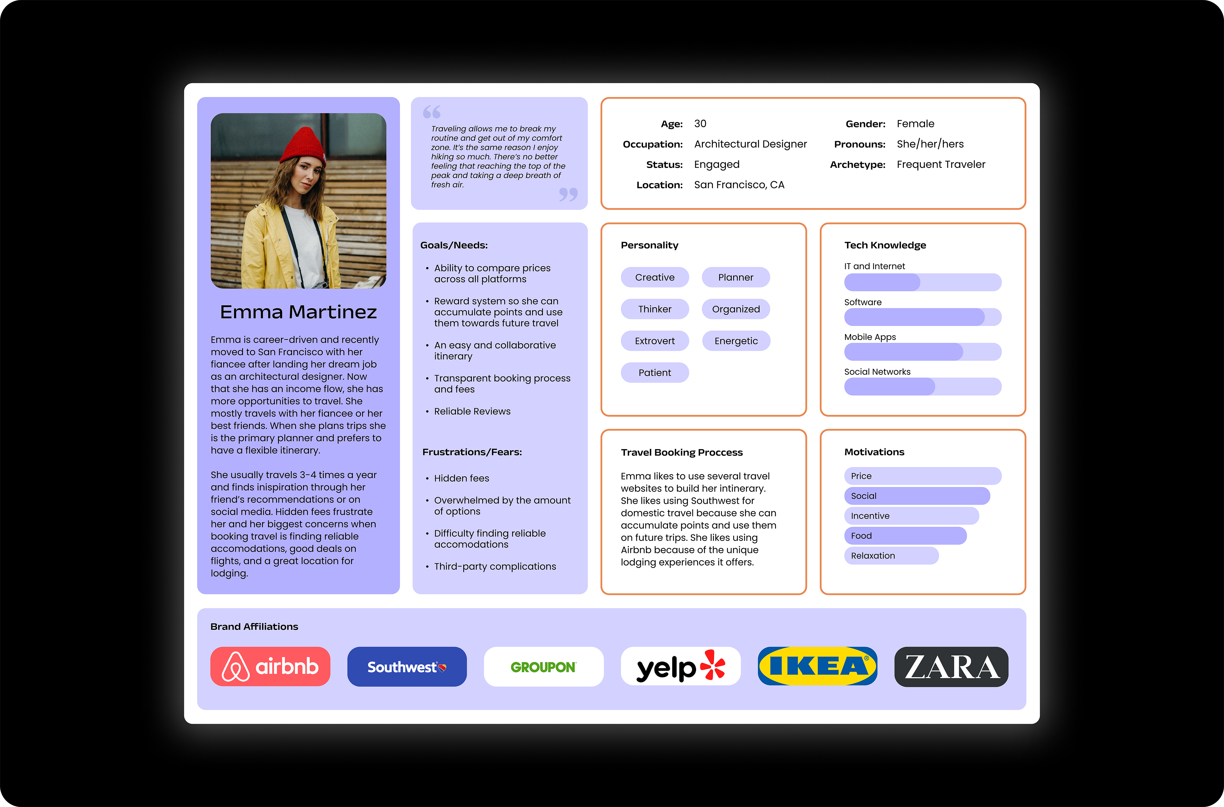
Creating
Personas
Provisional personas:
- Entrepreneur
- Vlogger
- Frequent Traveler
- Budget-Conscious
- Enviornmentalist
Based on my user interviews insights, the persona is a blend between frequent traveler and budget-conscious.
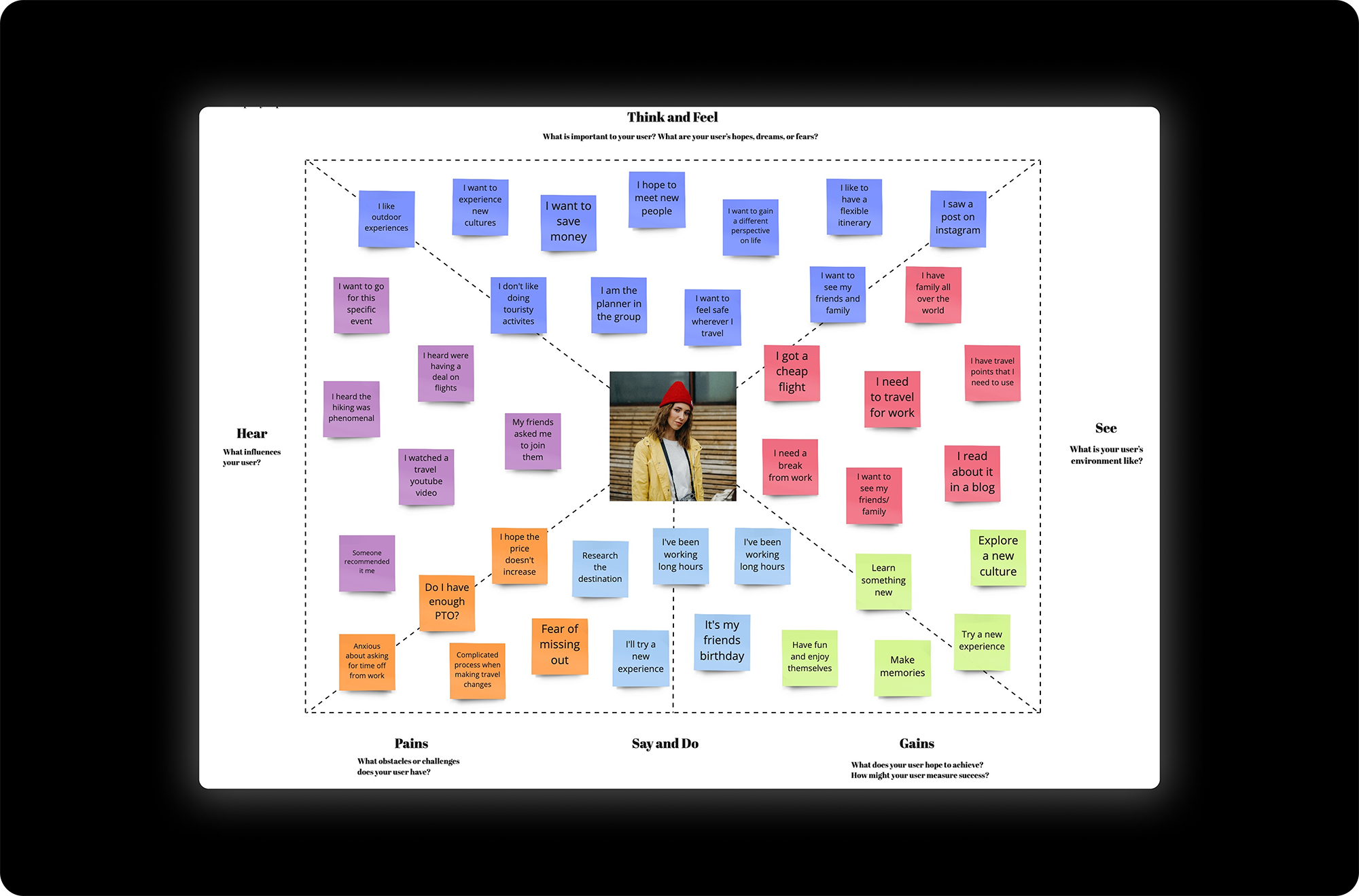
Developing
an Empathy Map
After developing my persona, I created an empathy map in order to gain insight of the goals, pain-points, gains, and needs. This allowed me to make inferences about the user's behaviors and prioritze their main concerns.
Pains
- Lack of price transparency
- Third-party booking sites
- Too complicated to make changes after booking
- Fear of missing out
Gains
- Try a new experience
- Learn something new and make memories
- Explore a new culture
Building
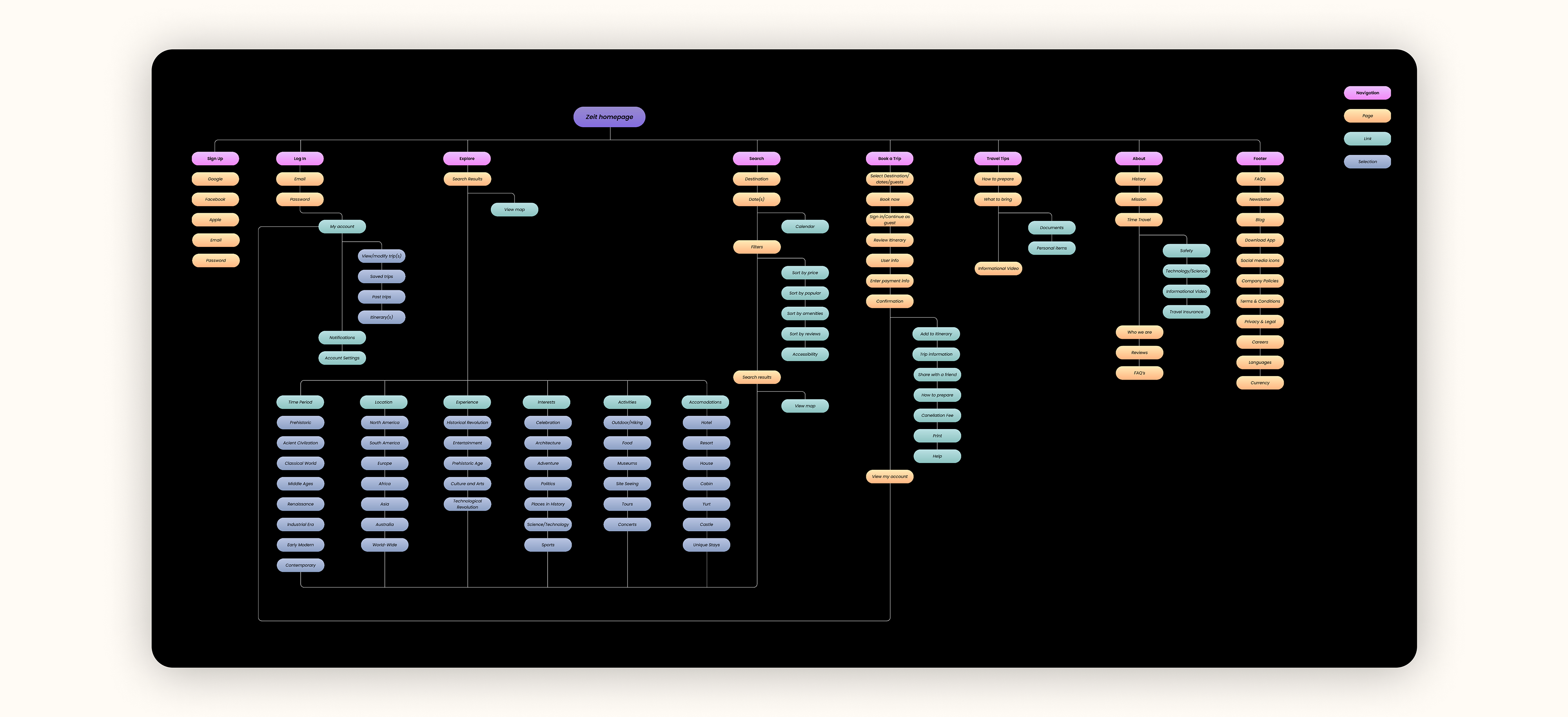
Information Architecture
To further understand users and develop an intuitive approach to organizing the site's information, I conducted a hybrid card sort with 6 participants. I provided participants with predetermined categories and asked them either sort the information using the predetermined categories or to provide their own.
Ages ranged from 19 - 38 years old
The average time spent sorting was 5 mins and 43 secs. The shortest time was 2 mins and 2 secs while the longest was 9 mins and 10 secs.
Findings
All participants grouped two destinations within the same categories. Followed by 5 out of 6 participants who grouped 5 destinations within the same categories. The rest destinations were 50% or less of a match. 3 out of the 6 participants created 1 new category. Participants came up with 4 new categories and the result ended with renaming 3 categories.

Site Map
Utilizing the data from the hybrid card sort, I created navigation categories based on the user feedback and results.
Walking
with the Users
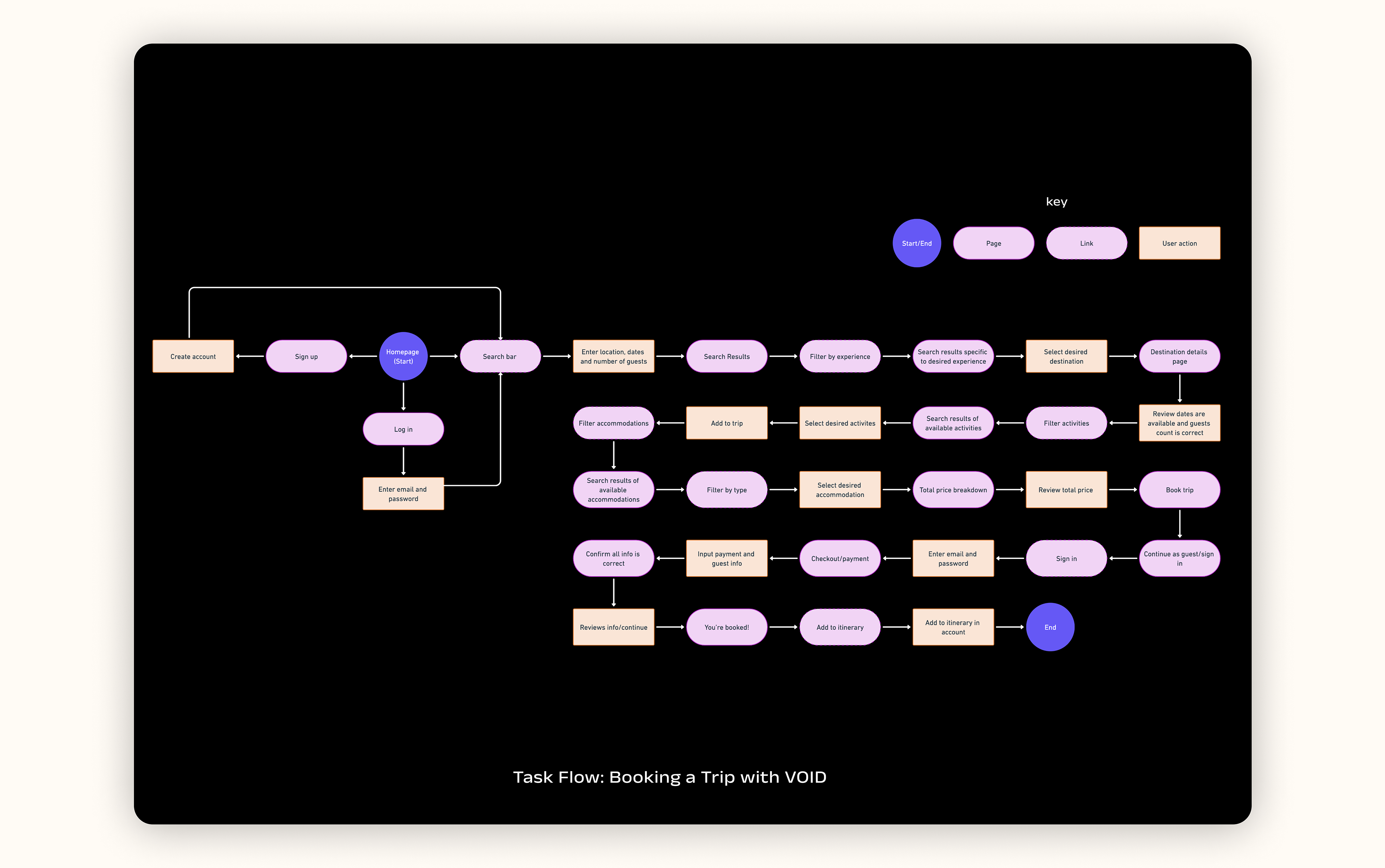
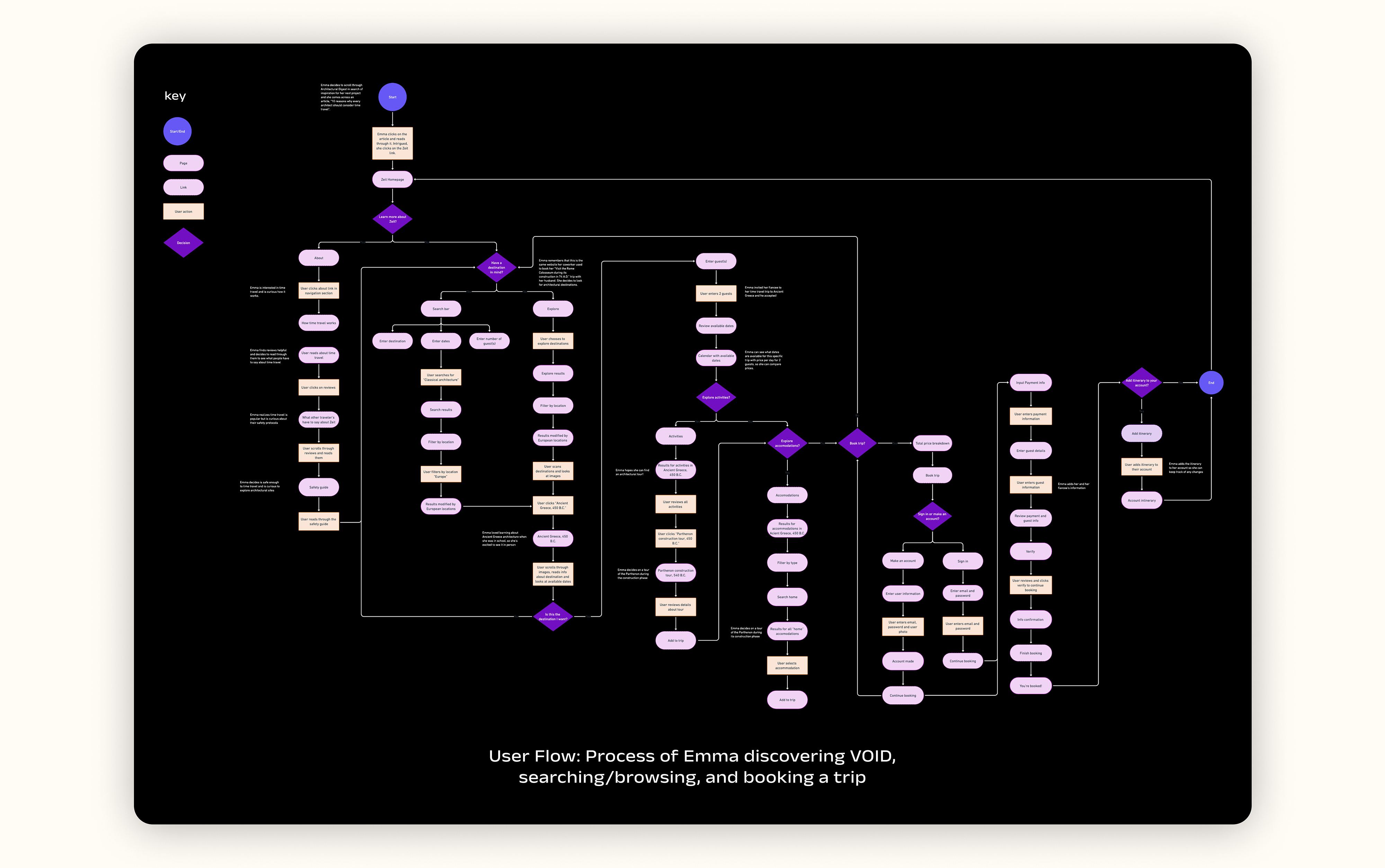
Using the information from the site map I created earlier, I developed a task flow and user flow based on my persona, Emma.
The task flow represents a path Emma might take when attempting to search and book a trip. This scenario was chosen based off user research determining booking experiences to be a main interest.
The user flow outlines all the possible paths Emma might take when discovering VOID, searching/browsing, and booking a trip.
Generating
Design Ideas
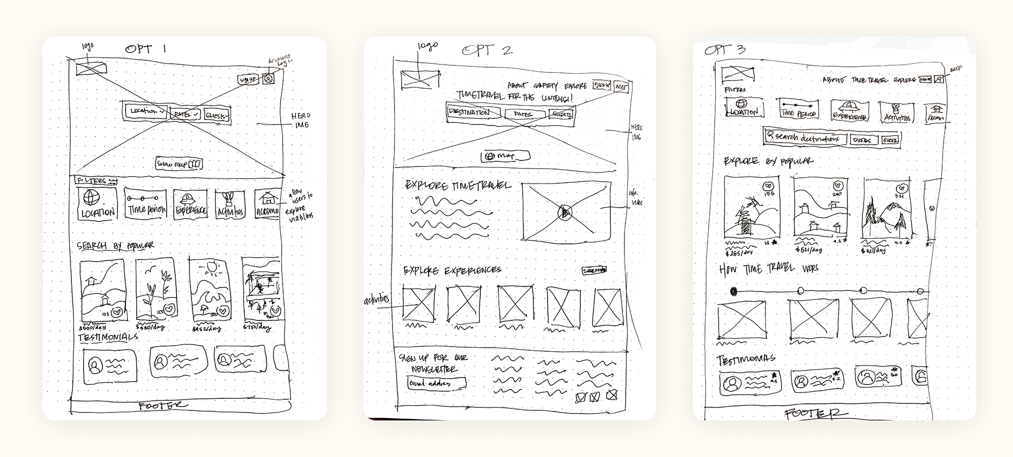
At this point, I gathered enough information to begin sketching low-fidelity ideas for potential homepage layouts. I focused on including 3 main features on the homepage:
1. Bring attention to the experience of time travel and why the user should book a trip with VOID. This provides the users with enough information to get them excited and also understand the process of time traveling.
2. Provide users with popular experiences as part of the homepage so that they don't have to do the work and can directly go to the results, in addition to providing them with filters. During my research, users found filtering through results useful and an easy solution to reducing the amount of information they're presented with.
3. Include testimonials so that users can build trust with VOID and feel safer when booking a trip. In my research, I found users are more likely to use a product if it's recommended.
Refining
Low-Fidelity Wireframes
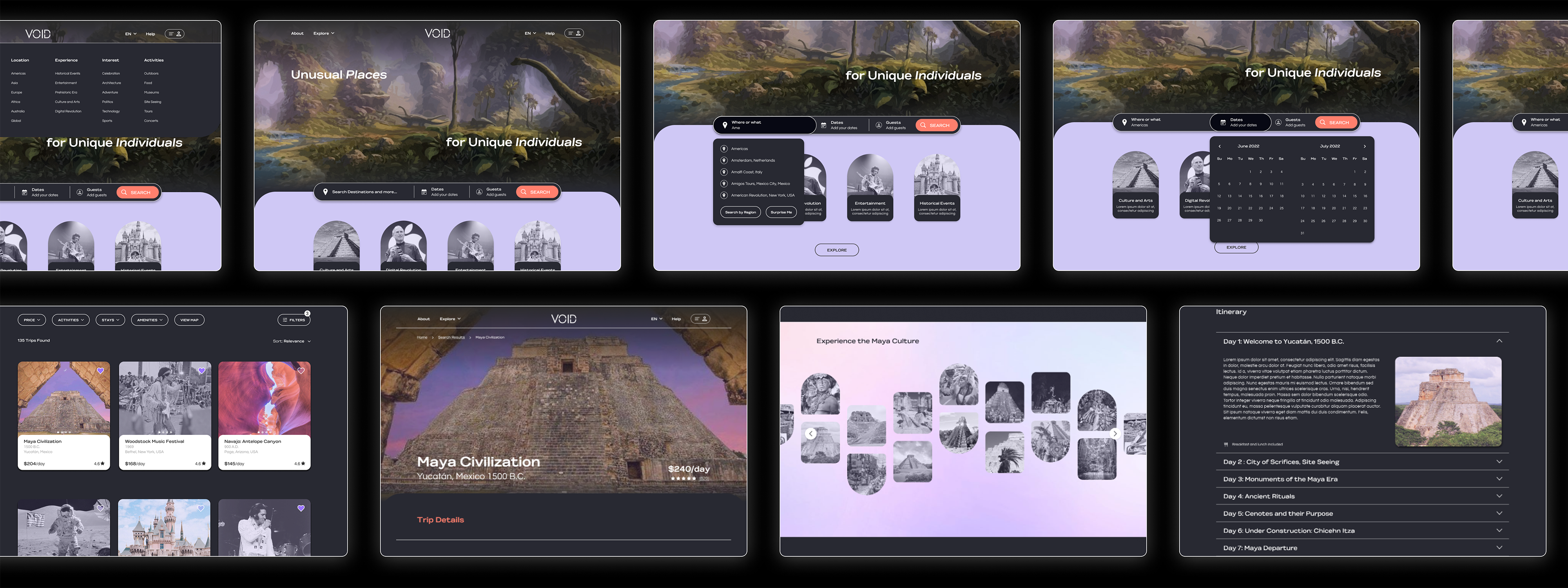
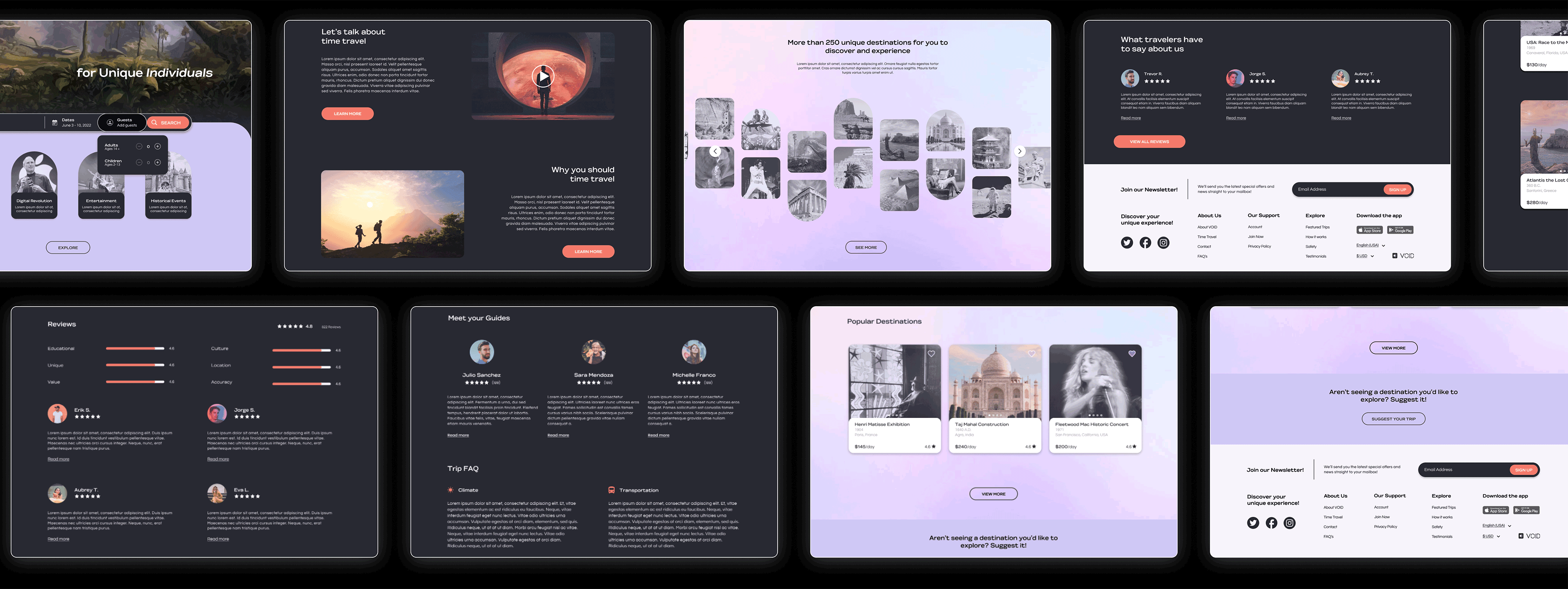
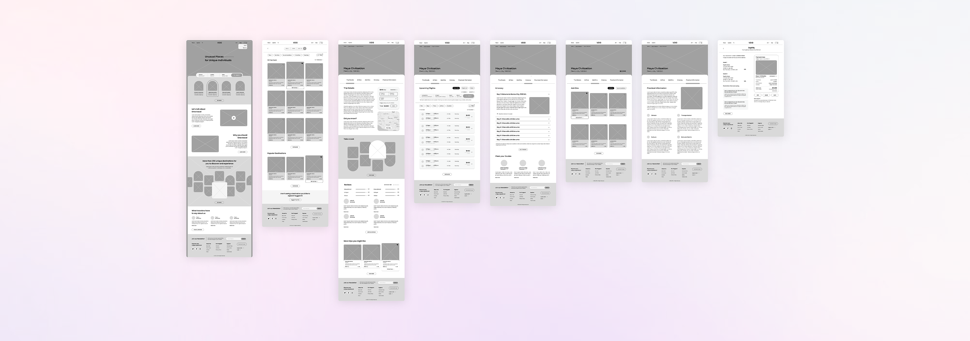
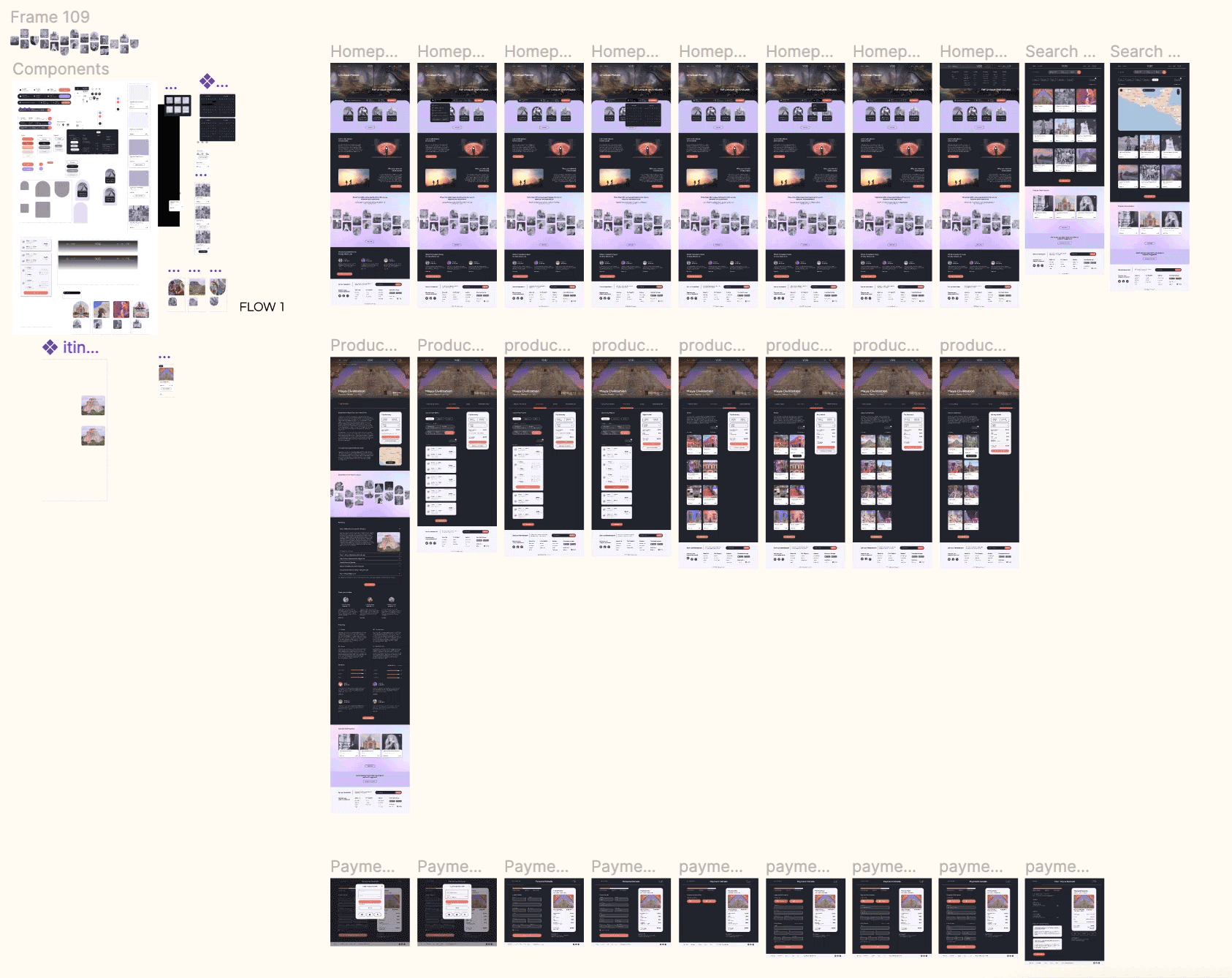
Low-fidelity wireframes were developed solving pain-points and highlighting necessary features that were discovered during the research process. These features included the ability to build your own package, price breakdown, detailed itinerary, and ability to edit and share the trip with other travelers. In addition, the screens that were developed capture the necessary paths users might take when booking a trip with VOID. To view additional low-fidelity wireframes please click here.
Creating
Visual Identity
The next step was to develop a brand identity that both represented the product and was aesthetically pleasing to the user.
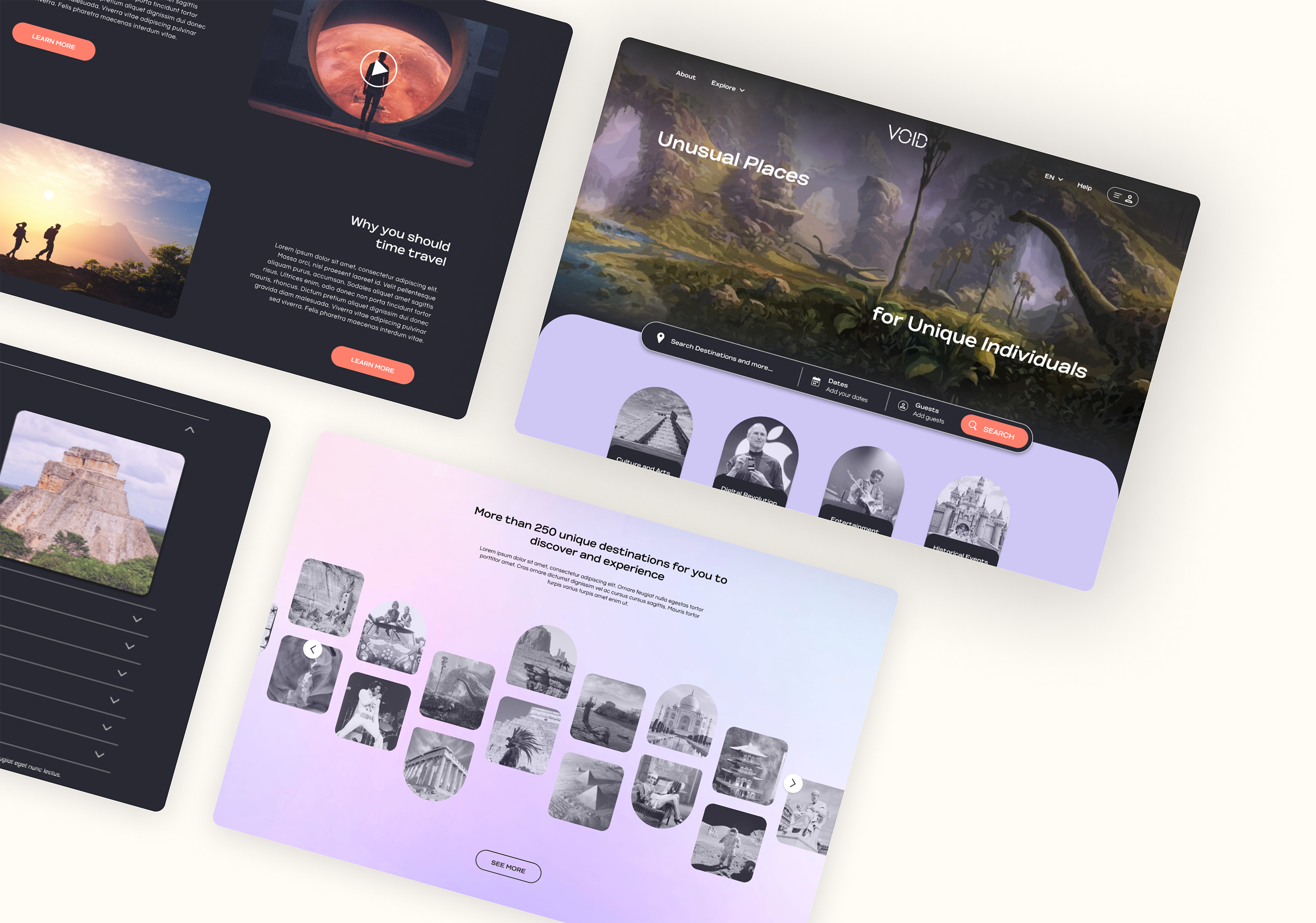
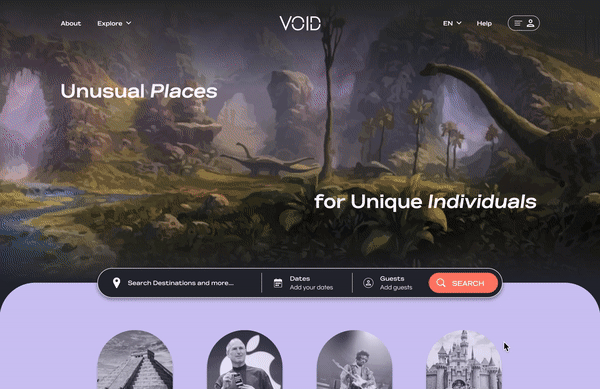
With VOID being the first in its market, I wanted the brand to represent mystery and excitement while sparking interest and adventure. The overall theme is meant to be dark, modern, nostalgic, and mysterious; bringing attention to the experiences VOID offers.
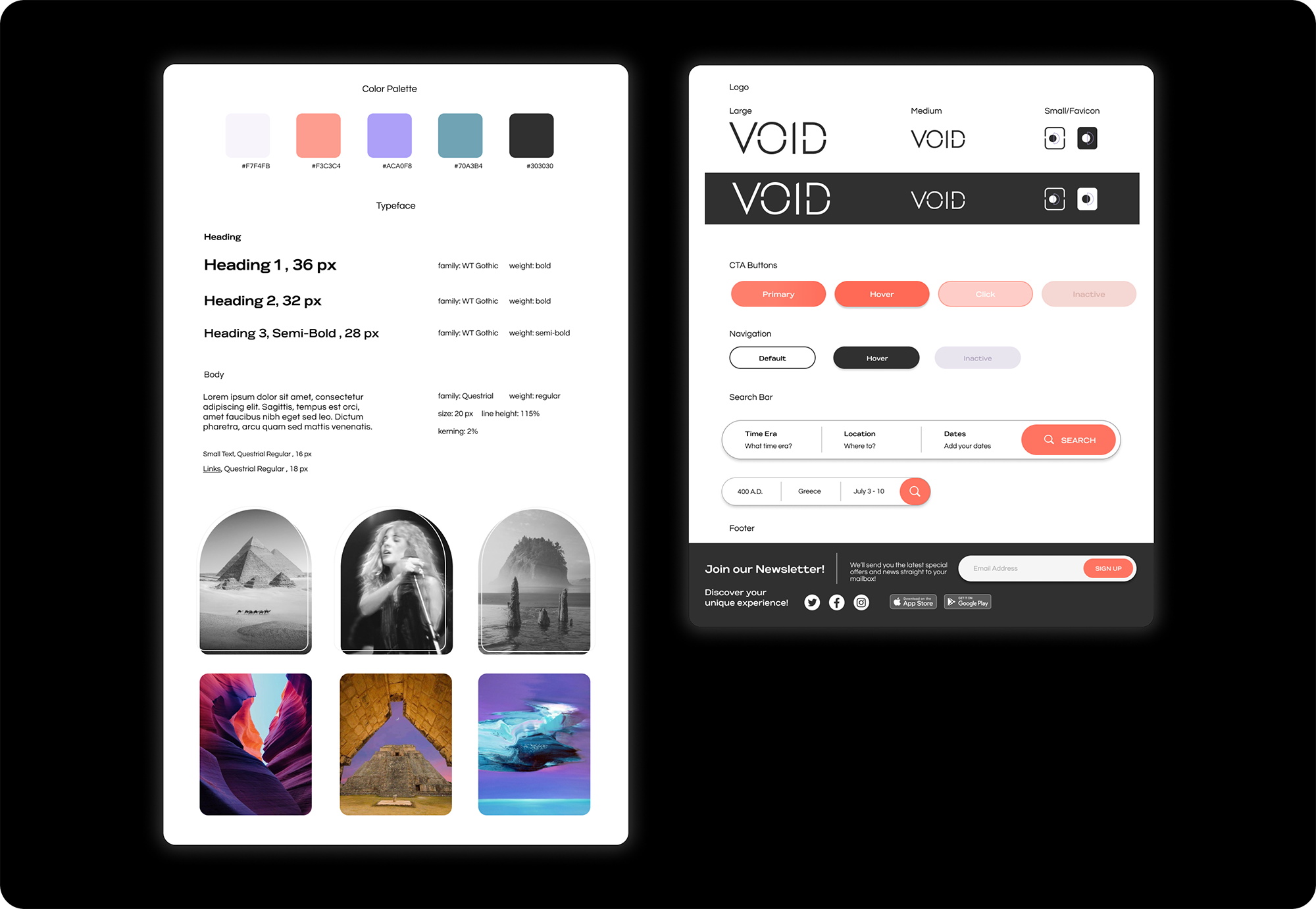
Capturing
High-Fidelity Wireframes
To capture the accuracy of the website, high-fidelity wireframes were created. They aesthetically represent the brand and evoke mystery and excitement with the use of dark colors and hues of purple. The UI design accomplishes VOID's visual identity goal.
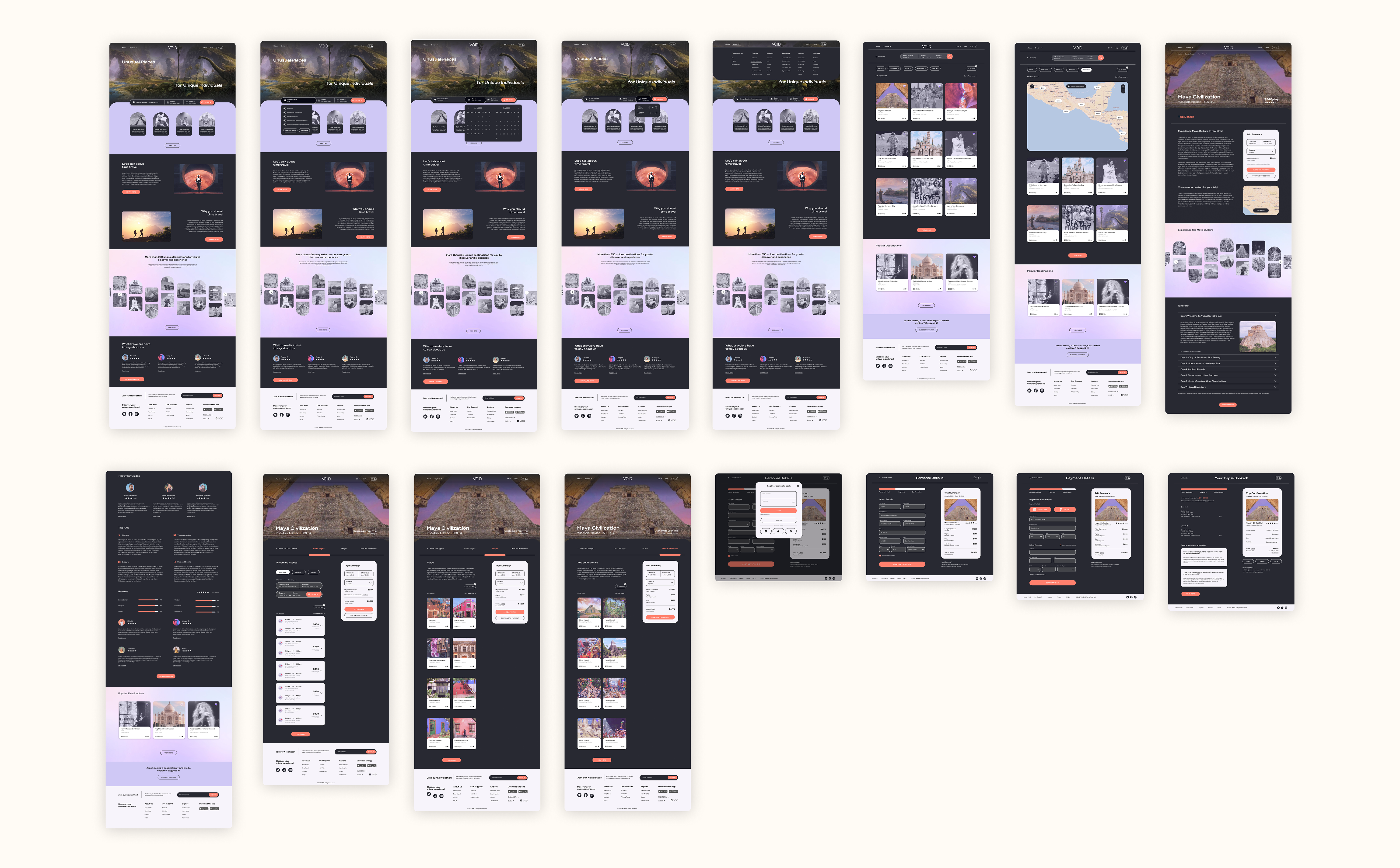
Prototyping
High-Fidelity via Figma
Additional high-fidelity wireframes were created to best accurate represent the booking flow. Interactions were also included in the prototype to give a sense of response when the users would hover or click on an item.
Getting
User Feedback
I conducted an unmoderated and remote usability test with 6 participants. Participants were given background information about the product then asked to complete a user task. Two methods were used during the test:
1. Maze was used to record the participants clicks throughout the process
2. Asked participants to share their screen while performing the task
Participants were tasked with searching for a destination, creating a bundle, and booking their trip.
Findings: What didn't work well
50% of participants stated the explore tab in the navigation bar isn’t clear
66% of participants were confused whether they had added the destination to their trip
33% of participants prefer to search by keyword because they don’t know exactly the time eras for each event/location
50% of participants weren't sure if they were correctly building a bundle during the booking flow
What worked well
100% of participants stated the user interface is sleek, fun, evokes time travel, exciting, attractive, and easy to navigate
83% of participants liked that they could build their own travel package
83% of participants said booking flow and checkout felt familiar
100% of participants found the product page to be super helpful and easy to navigate
Iterating
the Prototype
After collecting all of my user feedback, I addressed the problem areas and revised the prototype. Below are the revisions.
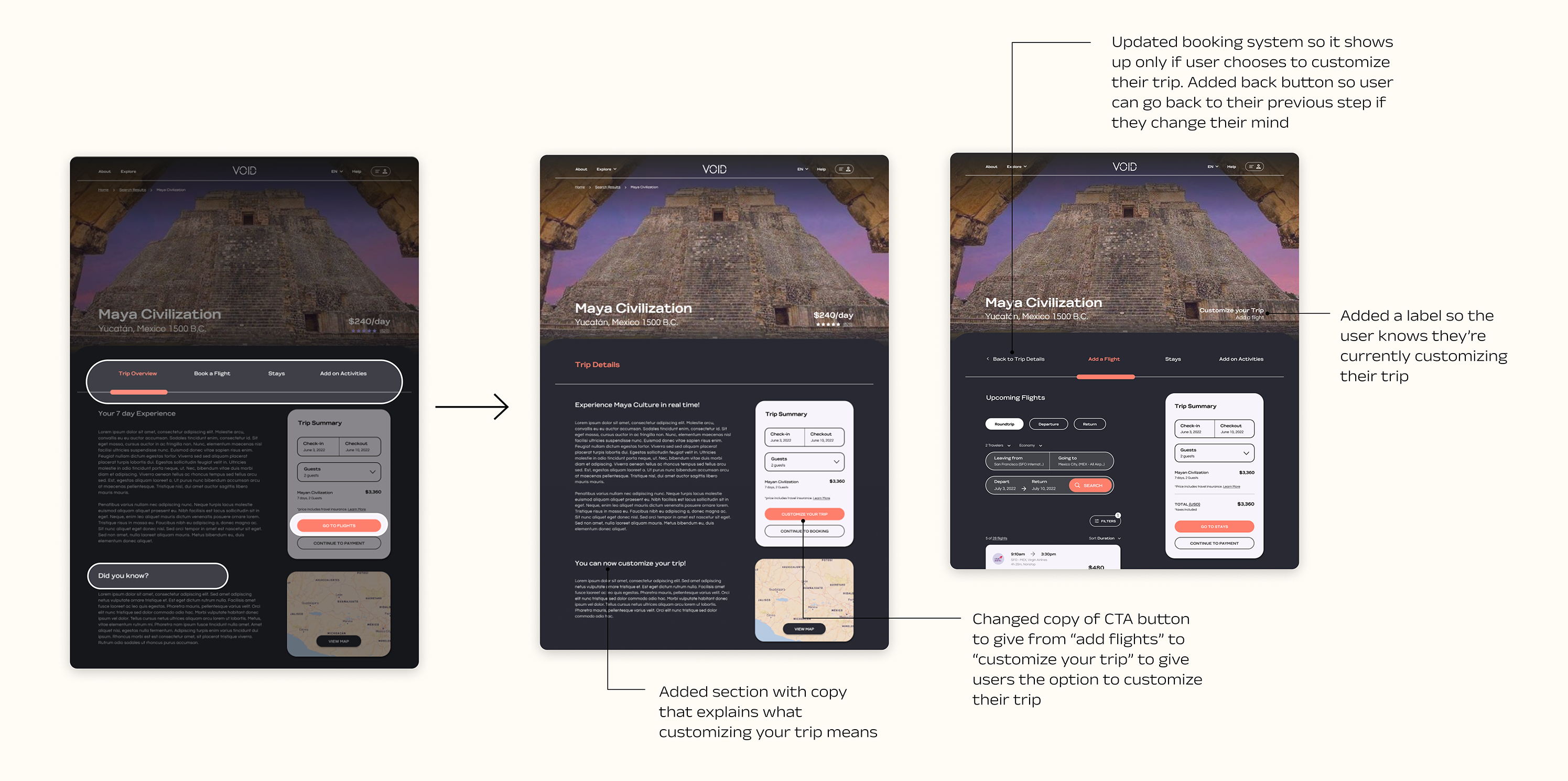
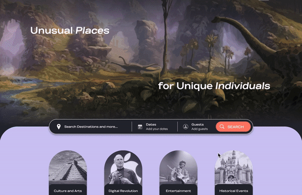
Homepage:
Updated Search Bar, Explore tab, & CTA button
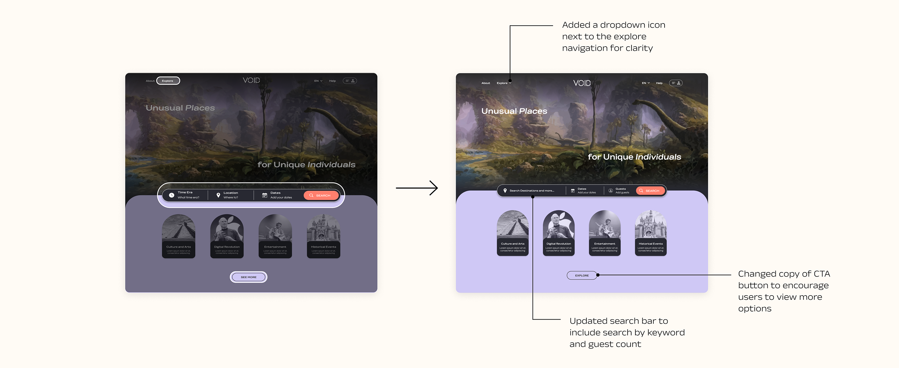
Product Page:
Updated CTA button, added copy that explains customization, updated booking system flow, & added progress label during customization
Finalizing
the Design & Prototype
Reflecting
and Next Steps
Simple UI changes can make the product more usable and effective. Testing the product with users allowed me to get a better insight on what the design was lacking and how I could improve their experience. Understanding user behavior and their preferred booking method, allowed me to resolve some of their frustrations and provide them with a more intuitive approach. Receiving feedback was extrmeley helpful and reminded me that my assumptions aren't always correct and I am designing for the user and their needs, not mine. Design is an iterative process and no product will ever be final, but it is important to design a product that is functional, easy to use and attractive to the user.
Next Steps
1. Continue to reiterate on the design based on all the user feedback (mid to high-priority items)
2. Develop additional high-fidelity screens with more interactions, missing features, and eye-catching copy
3. Conduct additional usability testing with the updated prototype
Other works
Agent AI AssistantProfessional Work
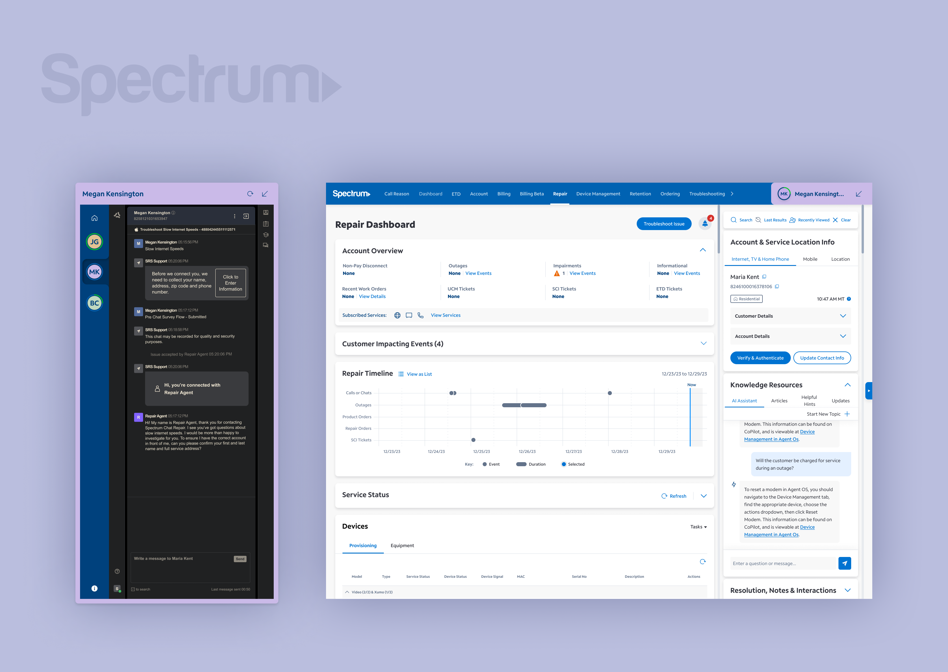
Undocked Agent ChatProfessional Work
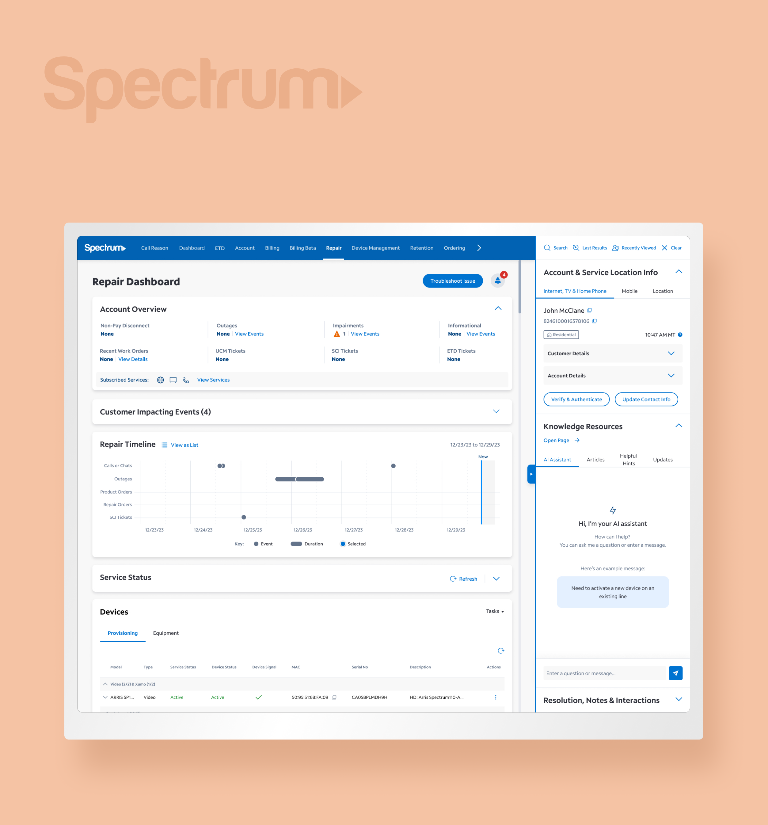
Spectrum Right RailProfessional Work
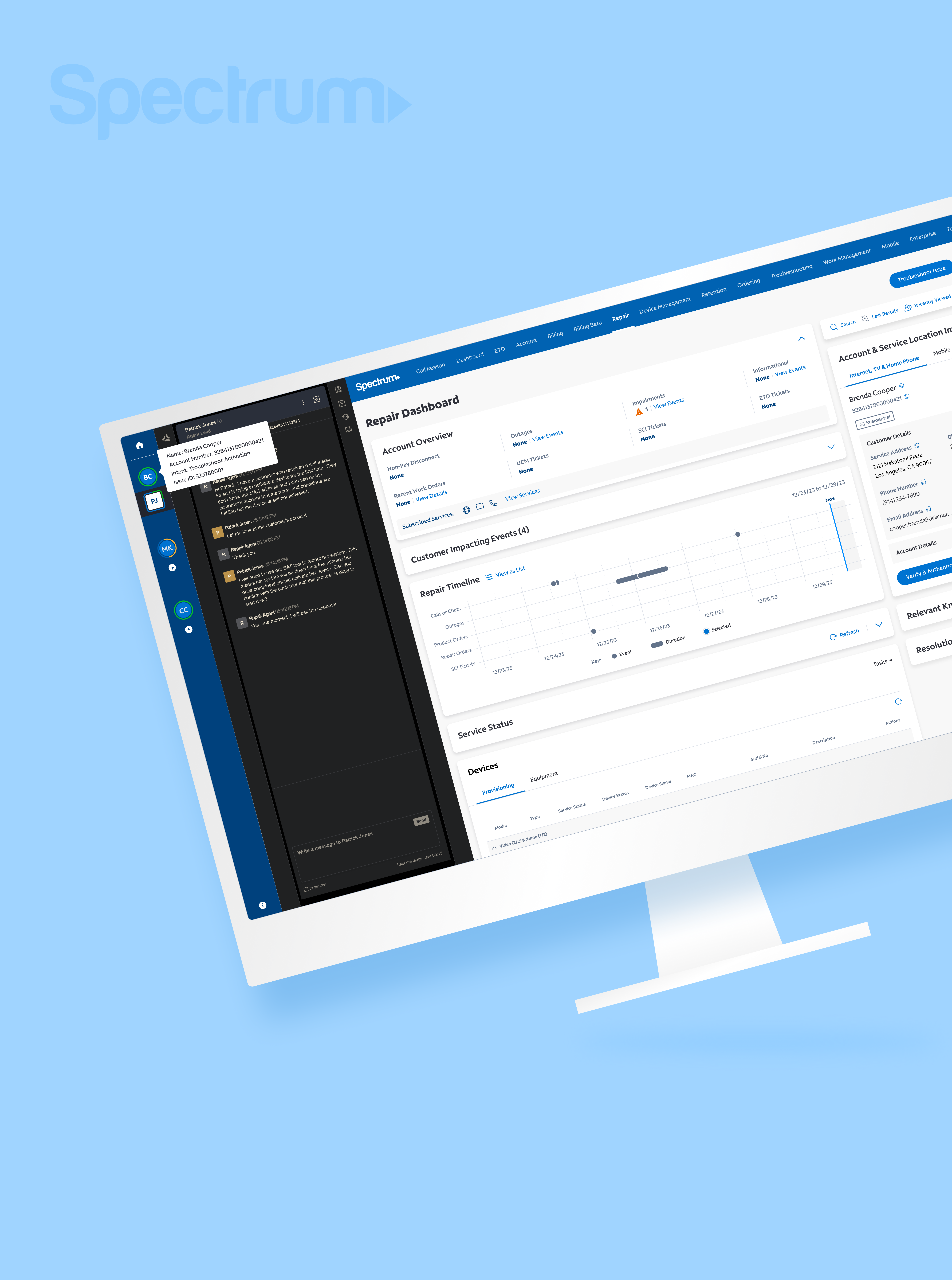
Chat Lead Line IntegrationProfessional Work
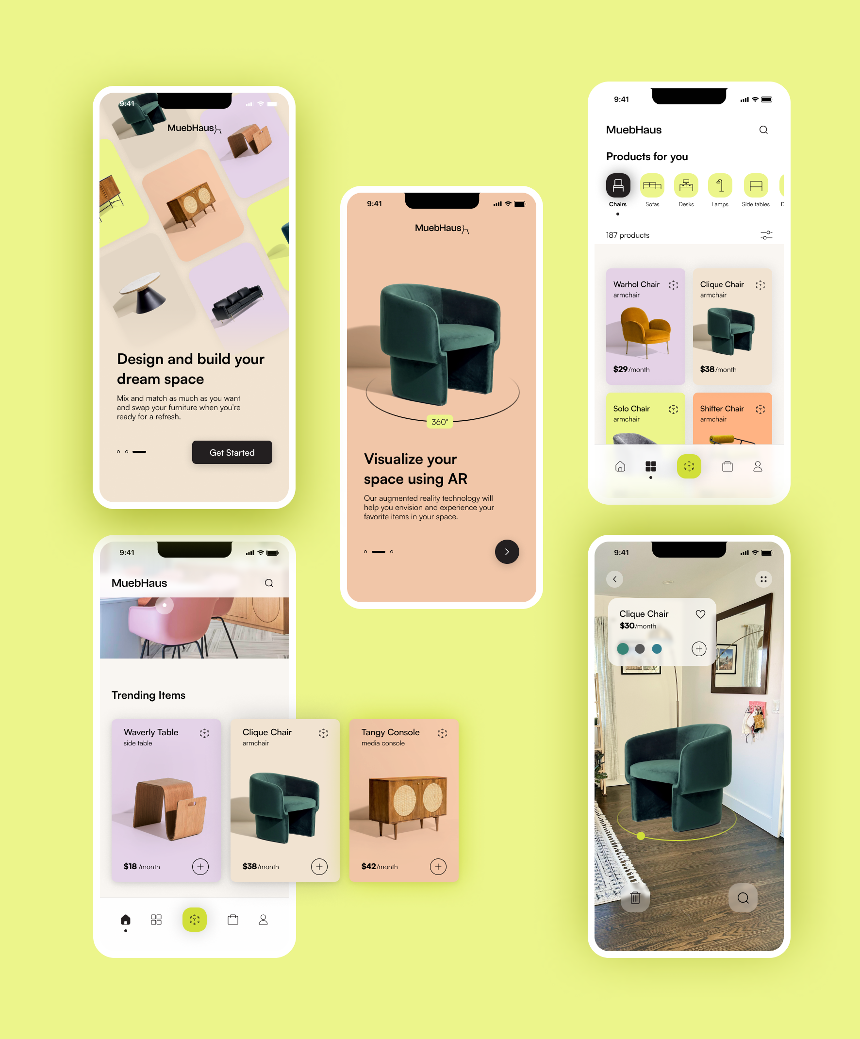
MuebHausProject type
PatreonProject type
Kristina Cooke, RDProject type
this isn't goodbye, it's see ya later ! ✺
designed by miriam arias © 2022