MuebHaus
Furniture Rental AR, Mobile App
ux/ui
2022
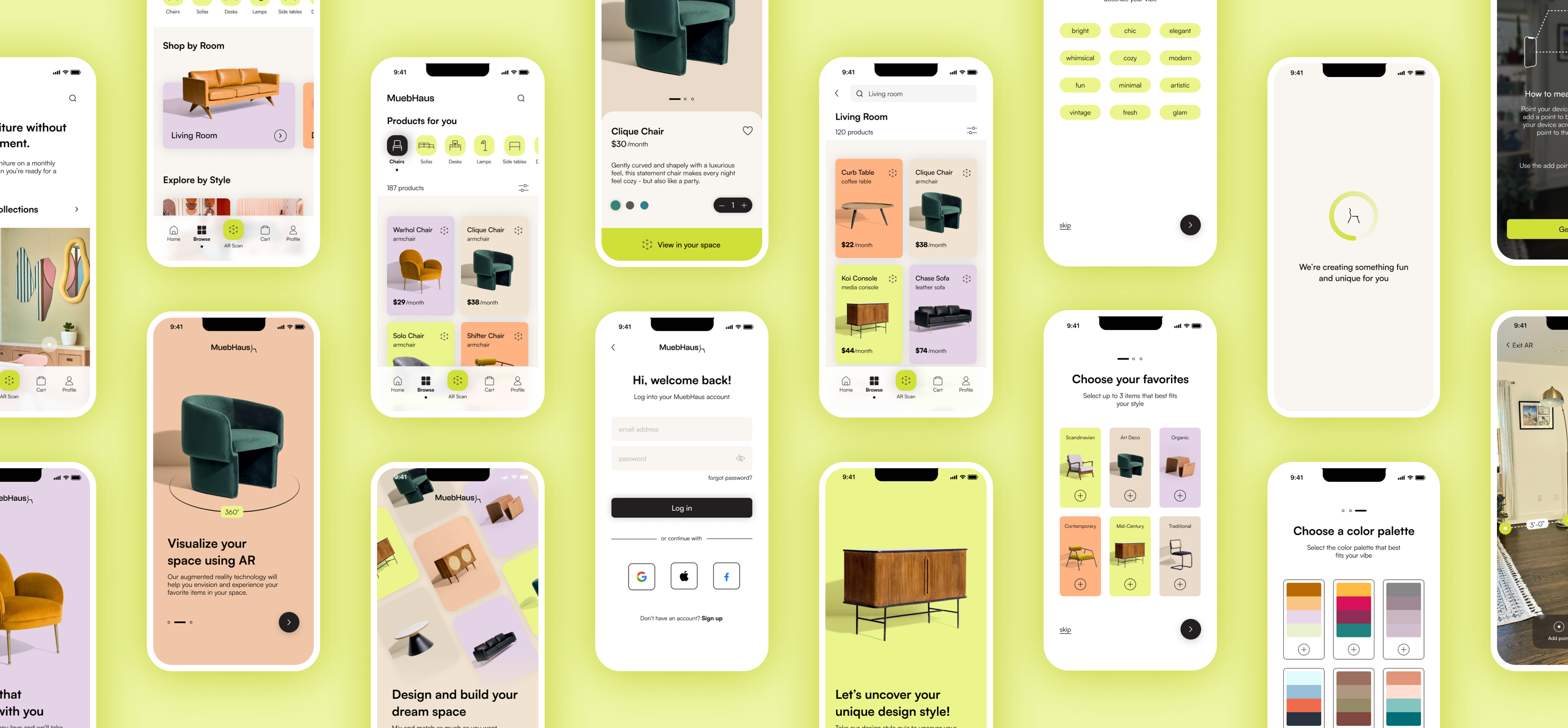
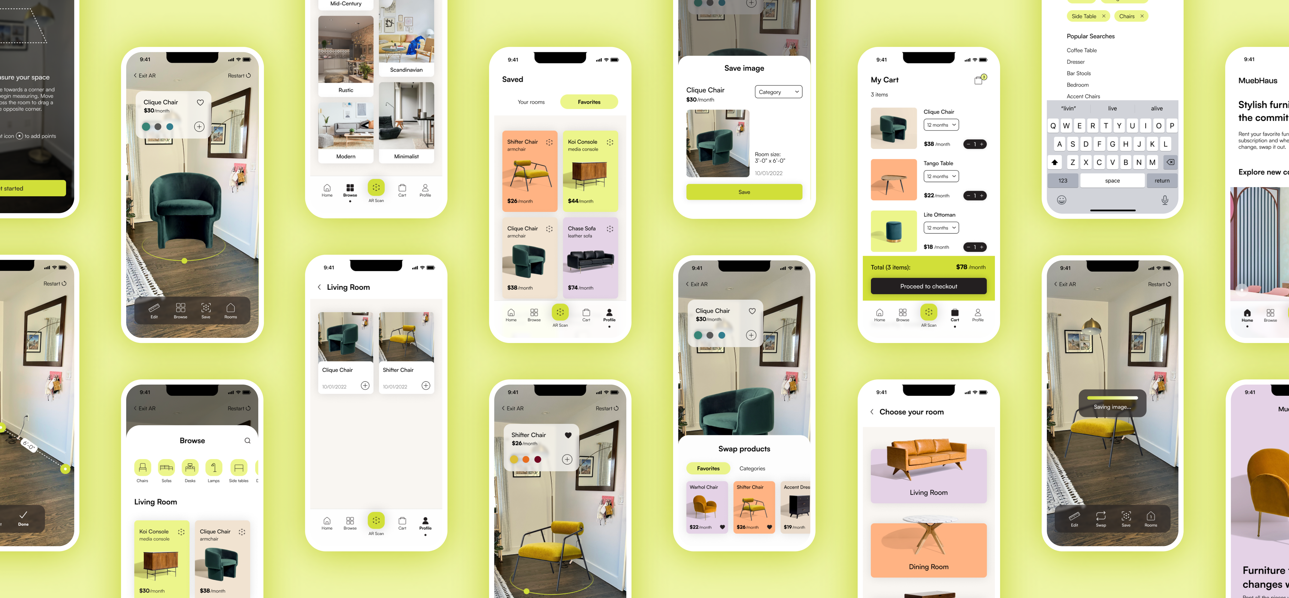
Picking out furniture can be overwhelming and stressful. More and more people are spending money on cheap furniture to keep up with design trends, which has led to an unsustainable practice, fast furniture. MuebHaus hopes to combat the fast furniture problem by providing users with trendy, high-quality rentable furniture and help them envision their new space through augmented reality.
Project Details
Client
MuebHaus (educational)
Role
ux/ui design & research
Timeline
aug - sept 2022 xxx
(3 weeks/80 hours)xx
Tools
figma, adobe creative suite, whimsical, maze
The EPA estimates that 9 million tons of furniture are discarded each year. That amounts to roughly 5% of items in landfills–not only is it wasteful, but it’s also not sustainable or worth the investment. Many young adults are constantly moving and many find it’s cheaper to throw their furniture away and replace it than to move with it. This is an opportunity to solve the pain points of the renter generation to help them choose the furniture they love without having to worry about moving furniture, while providing them with the opportunity to envision, design and build their dream space through augmented reality.
Let's talk about the Problem
With more people renting and spending time at home, interests in interior design trends is at an all-time high. We are experiencing a rise in fast furniture because the millenial and gen Z generation cannot afford high-quality furniture, but they also don’t see the value in investing when 65% of them are renting. Additionally, this is an opportunity to change how people envision their spaces and provide them with the opportunity to experience and explore 3D furniture to help them design their dream space without the hassle.
The Challenge

Cost + Efficiency
Renters often move and don't want to invest in high-quality furniture because they're not sure what their next home will look like. Plus moving furniture is a stressful and tedious task, many prefer to avoid.
Design
With people spending more time at home, they want to create a space that feels like home and reflects their needs and design style, but have a difficult time envisioning what that may be.
Sustainability
Fast furniture is not meant to last which has resulted in 9 million tons of furniture are discarded each year. That amounts to roughly 5% of items in landfills–not only is it wasteful, but it’s also not sustainable or worth the investment.
Proposed Solution
This is an opportunity to solve the pain points of the renter generation to help them choose the furniture they love without having to worry about moving furniture and while having the opportunity to switch out furniture, hassle-free.
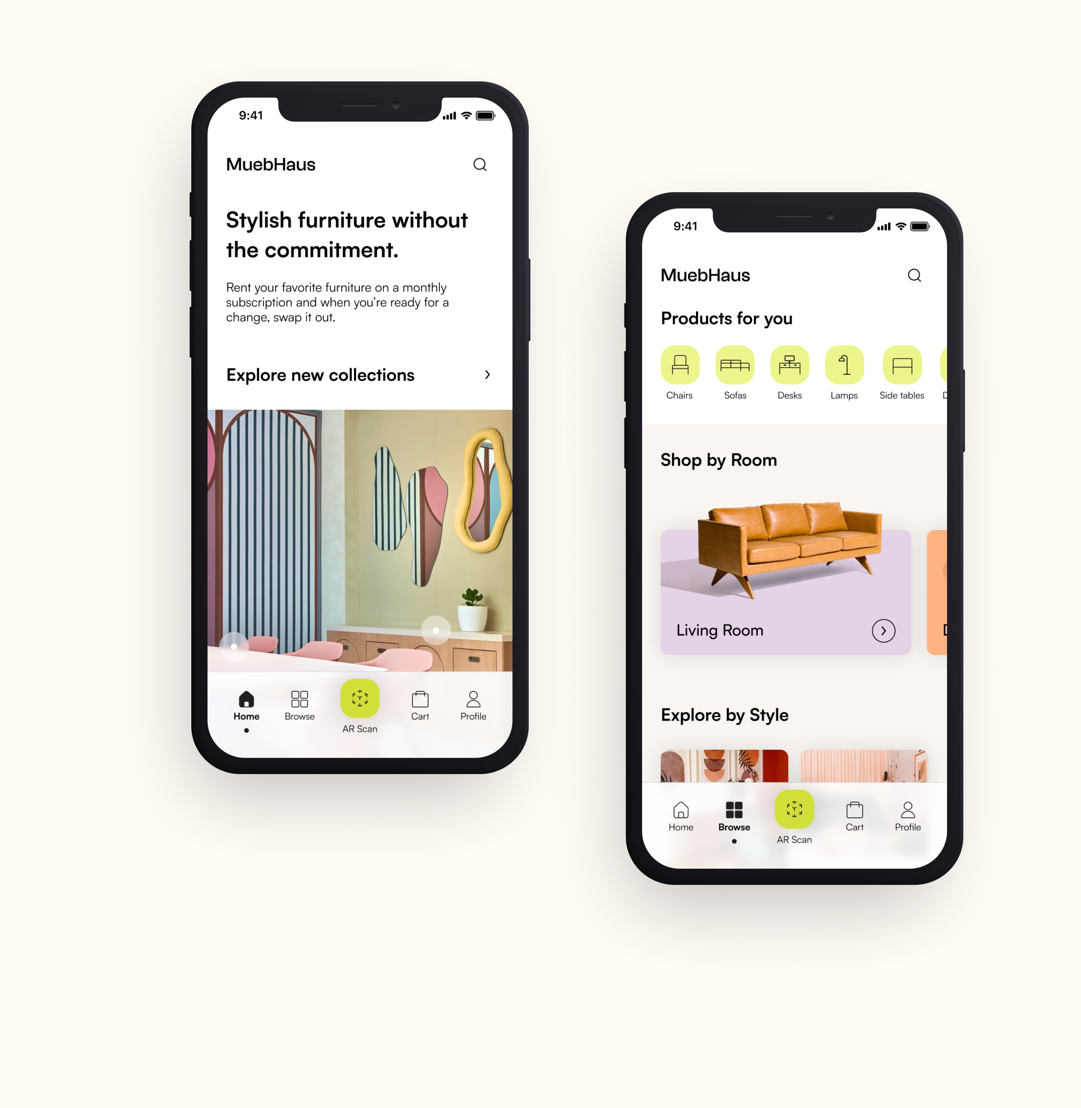
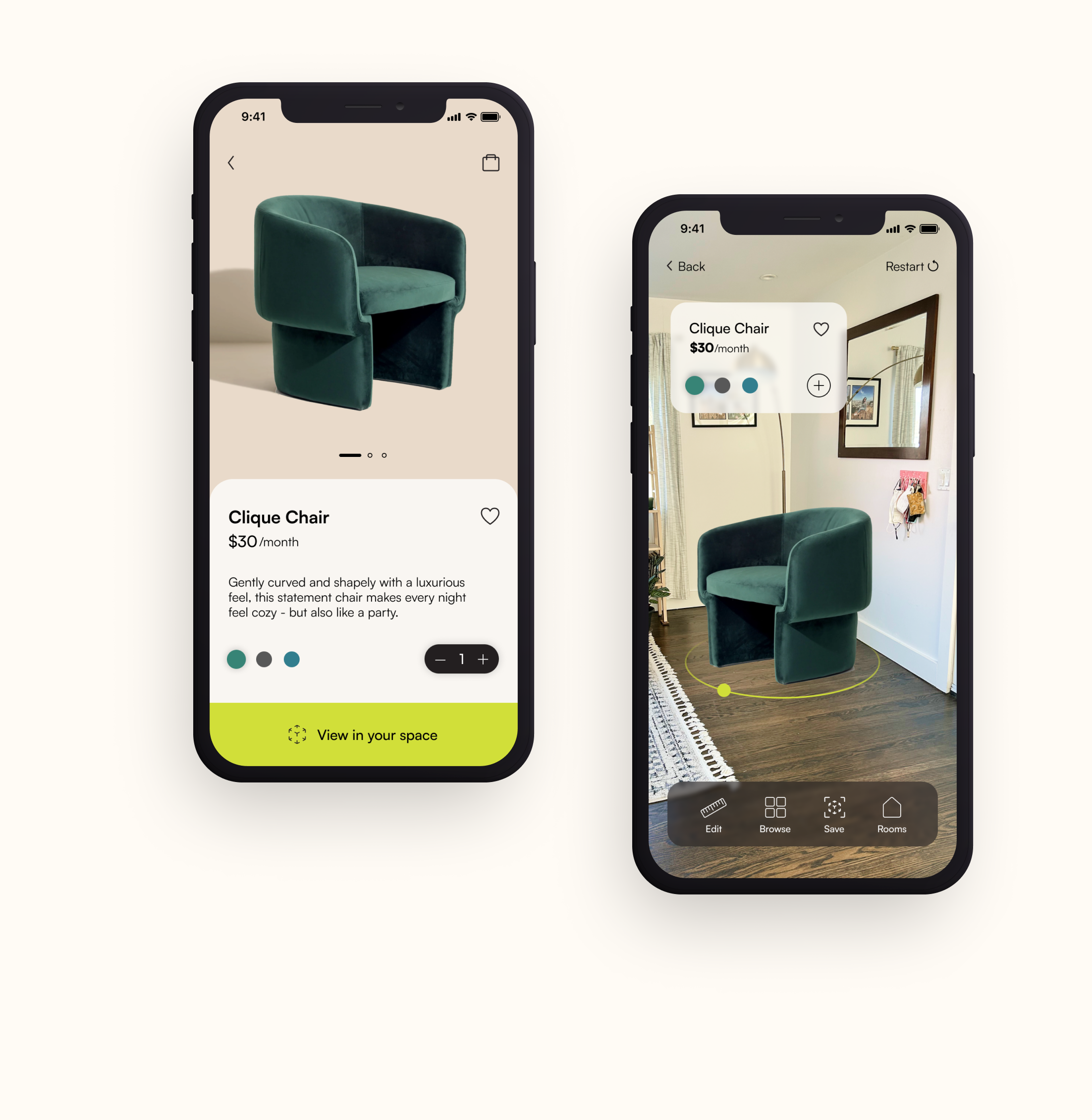
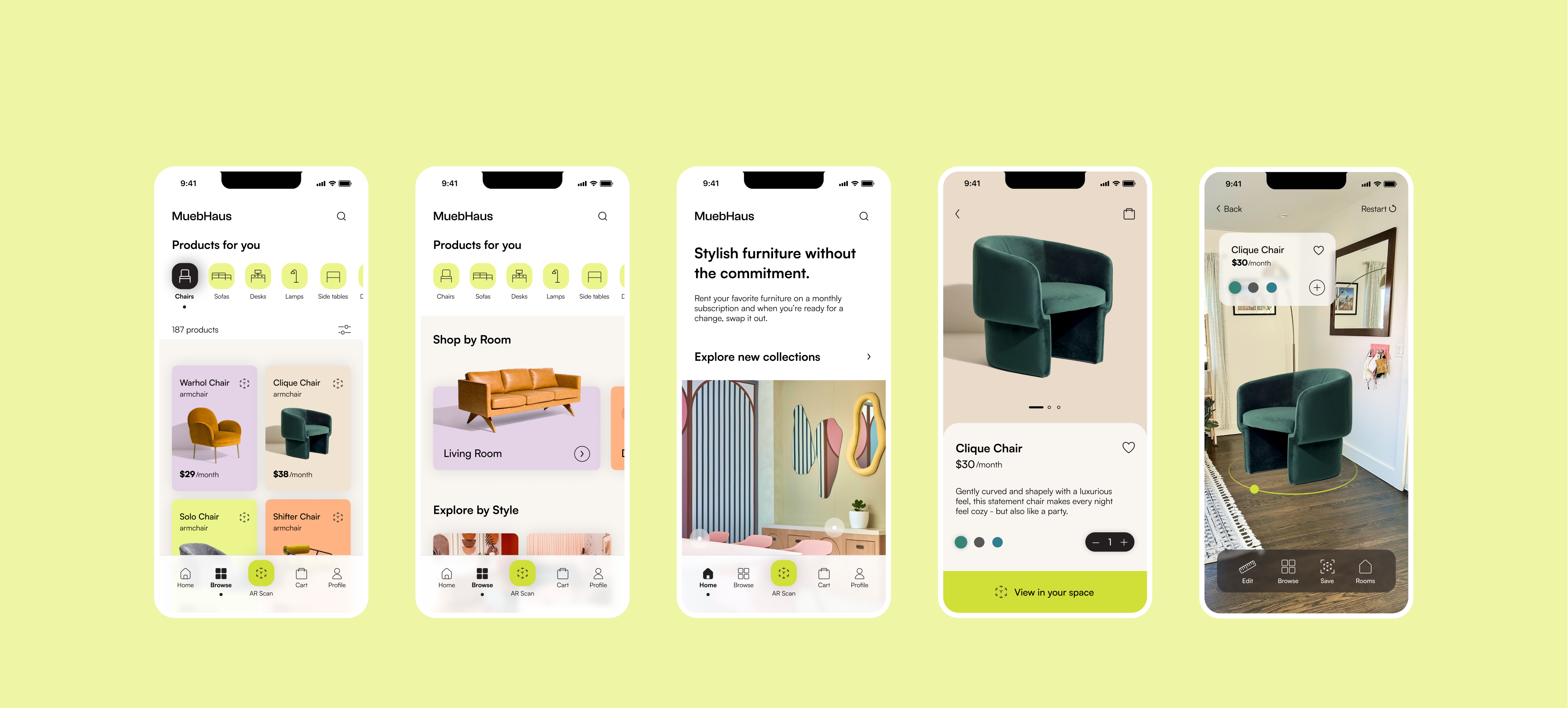
An e-commerce mobile app that combats the fast furniture problem by providing users with trendy, high-quality rentable furniture and augmented reality to change how users experience and envision 3D furniture to help them decide the best product for them.
MuebHaus Walkthrough
High-Level Goals
01 / ENCOURAGE SUSTAINABLE PRACTICES
With over 9 billion tons of furniture waste in our landfills, how can we encourage customers to rethink their furniture purchasing habits?
02 / DESIGN AUTONOMY
Customers can't always envision furniture in their space. How can we provide them with the right tools to help them imagine and build their dream space?
03 / REDUCE MOVING STRESS
How might we help customers during their stressful moving process? How can we provide them with a pleasureable experience?
04 / ACCESS TO HIGH QUALITY FURNITURE ITEMS
Provide opportunities for customers to rent higher quality furniture that is stylish and will last longer.
Conducting
Competitive Analysis
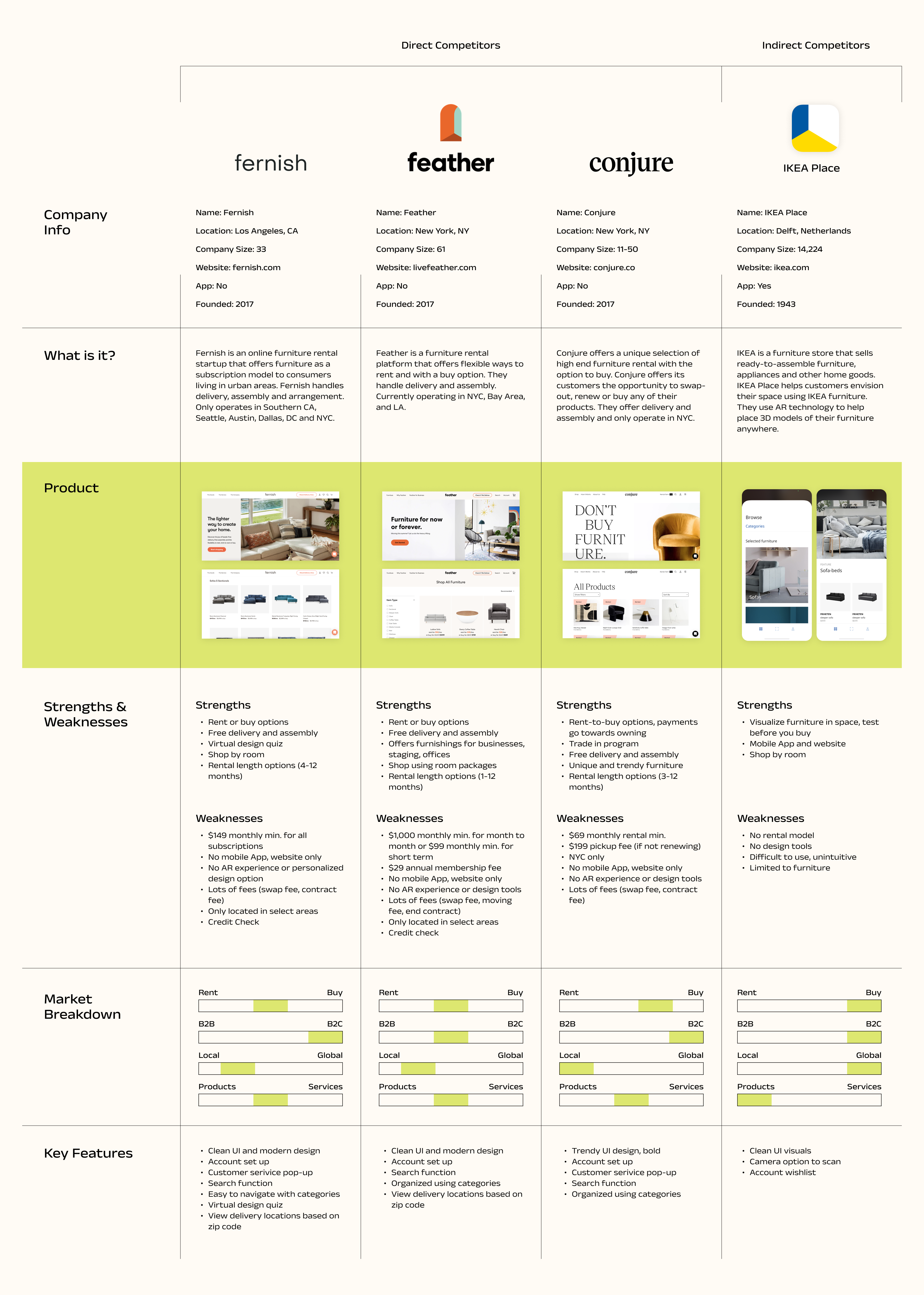
I analyzed competitor's to better understand the opportunities, successes, and weaknesses of existing products and how they differentiate themselves.
Some key items I looked at:
- User interface & design
- Solution & approach
- Usability & navigation
- Categories, filters, search
- Mobile App
- AR feature & experience
Performing
User Research
I conducted 5 user interviews and sent a survey to 13 participants. Through the interview & survey process, I was able to understand participant's pain poins, motivations, and behaviors. Below is a summary of my findings:
Findings
Participants find it difficult to sell furniture and almost always prefer to throw it away than spend time negotiating/coordinating with buyers
Cost in combination with quality and time often impacts the participants purchasing decision, which often led to choosing fast furniture
Participants have a hard time envisioning their space and find it difficult to see whether new pieces will work well in their current space
When purchasing new furniture, participants dislike assembling furniture and find it time-consuming and tedious
Inability to accurately measure their space led participants to purchase items that were too large or too small for their space
Goals
- Freshen up their space and stay up to date with trends
- Find functional pieces that fit their existing set-up
- Avoid assembly and disassembly
- Envision their space to see if all pieces work well together
- Find furniture that matches their vision
Needs
- Stay within budget
- Fit furniture in their space
- Furniture that is comfortable and has a purpose
- Own larger pieces of furniture
- Test furniture before buying to see if it fits well in their space
Motivations
- Satisfaction when all pieces come together and work well
- Design trends on the internet to help them choose items they like
- A space that reflects their personal style, is comfortable, and useful
- Rearranging furniture to create a different space
Creating
Personas
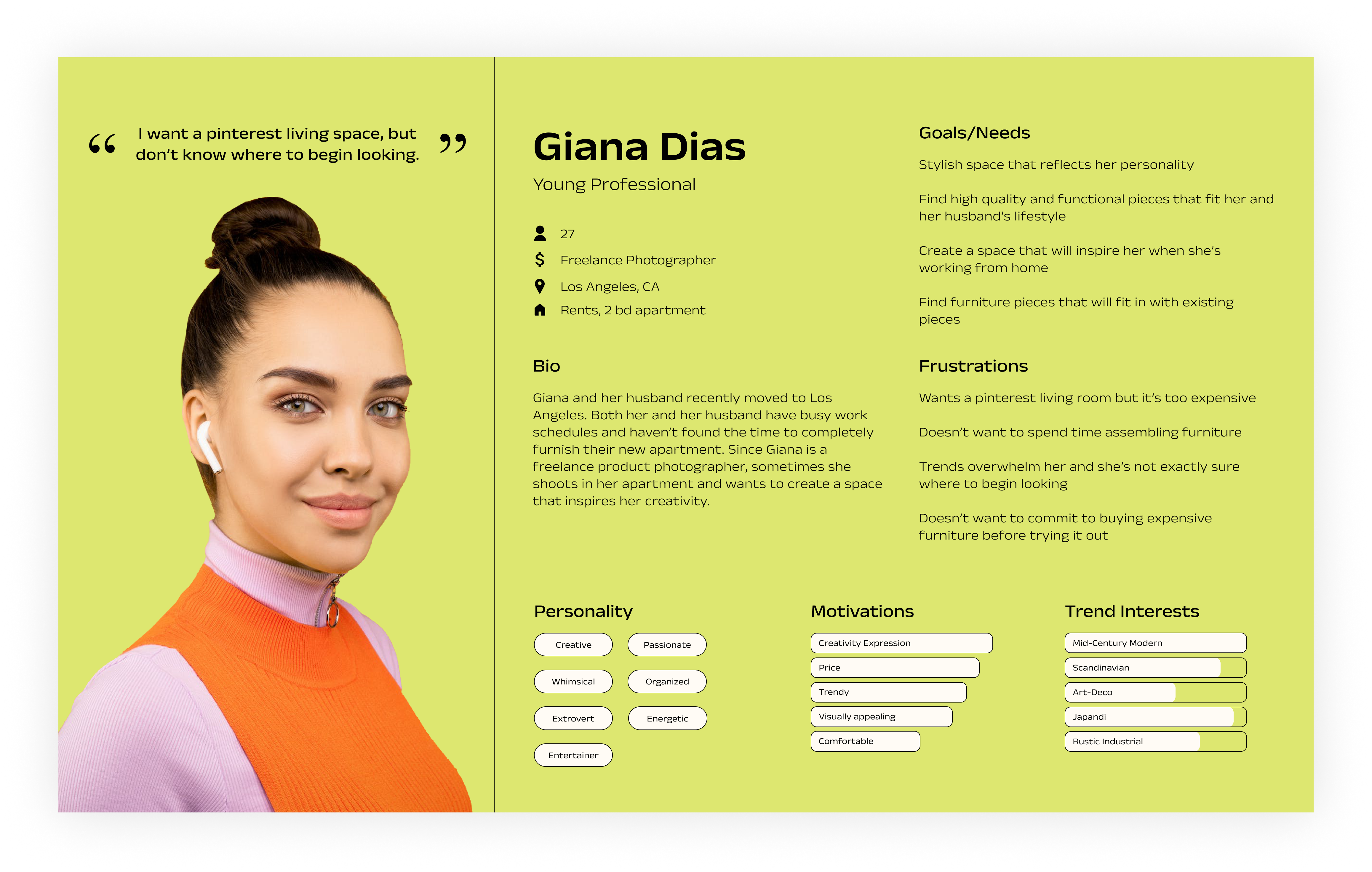
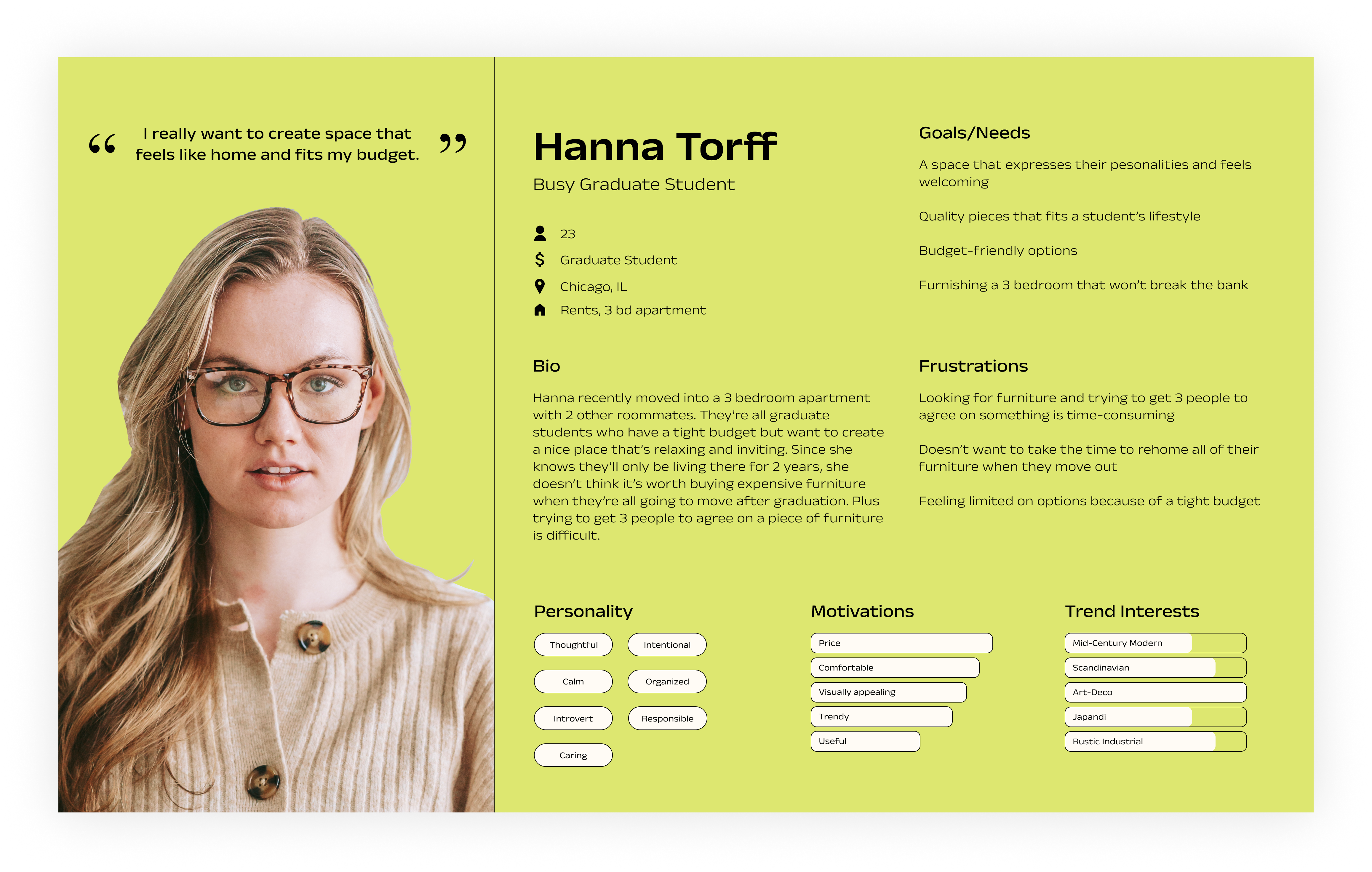
The findings from my user interviews and surveys led to the creation of two personas: The young professionaI and the busy graduate student. I focused on defining key characteristics to better understand their behaviors and choices.
Pains
- Not being able to build their dream space without breaking the bank
- Having to spend time on assembling furniture
- Not having the option to test furniture in their space before buying
- Limited options due to budget
- Spending time trying to rehome and sell previous furniture
Goals
- Create a space that expresses style and needs
- Find quality and functional pieces
- Ability to match new furniture with existing furniture
- Renter friendly options
- Staying on trend
Walking
with the Users
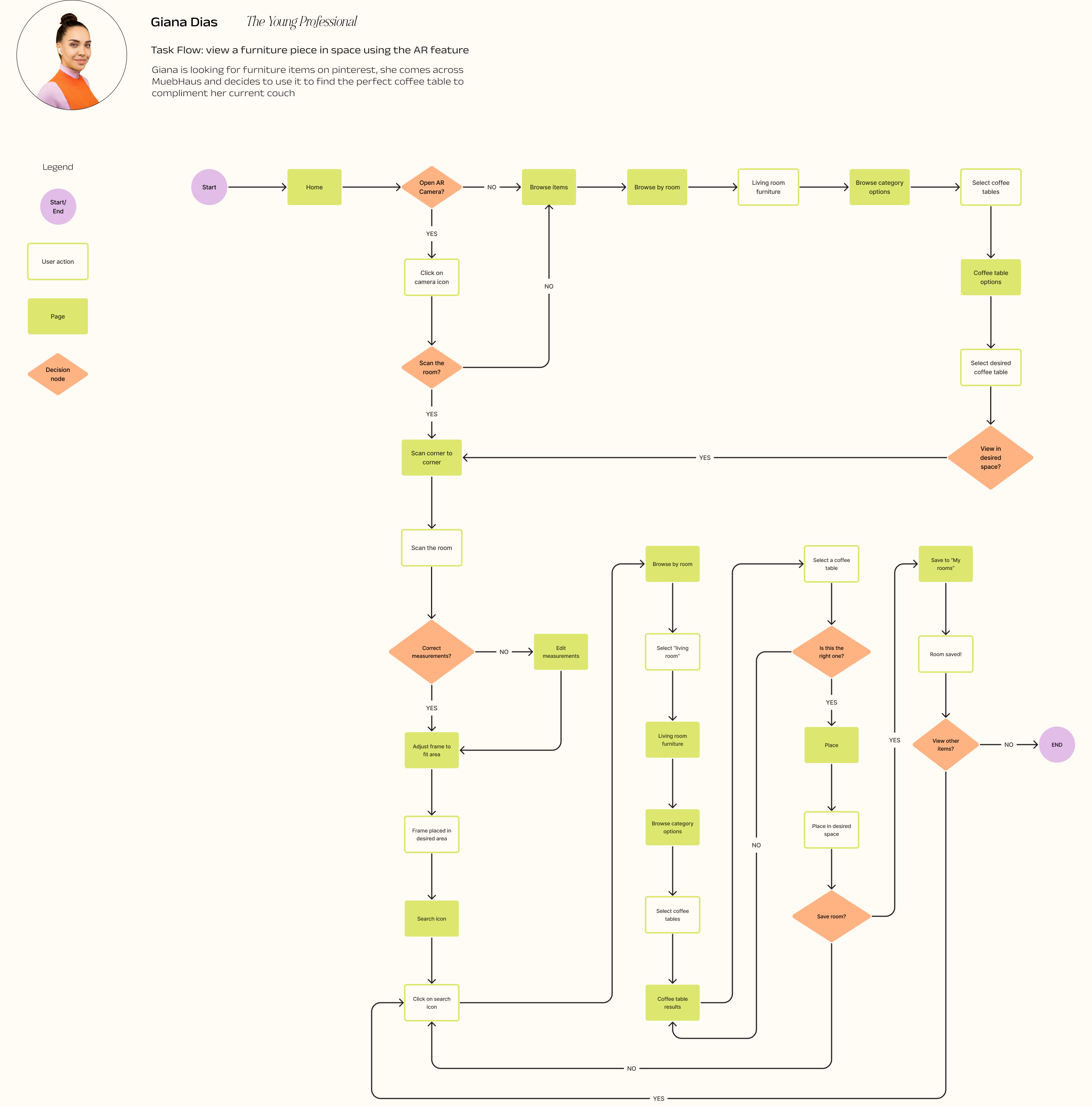
Using the information from the research and the personas, I developed user flow based on one of the personas, Giana.
The user flow represents the pathway Giana would take to view a piece of furniture in her space using the AR feature. This scenario was chosen based off user research determining importance in providing users with the ability to measure and place items in their selected space to help them bring their vision together in 3D.
Generating
Design Ideas
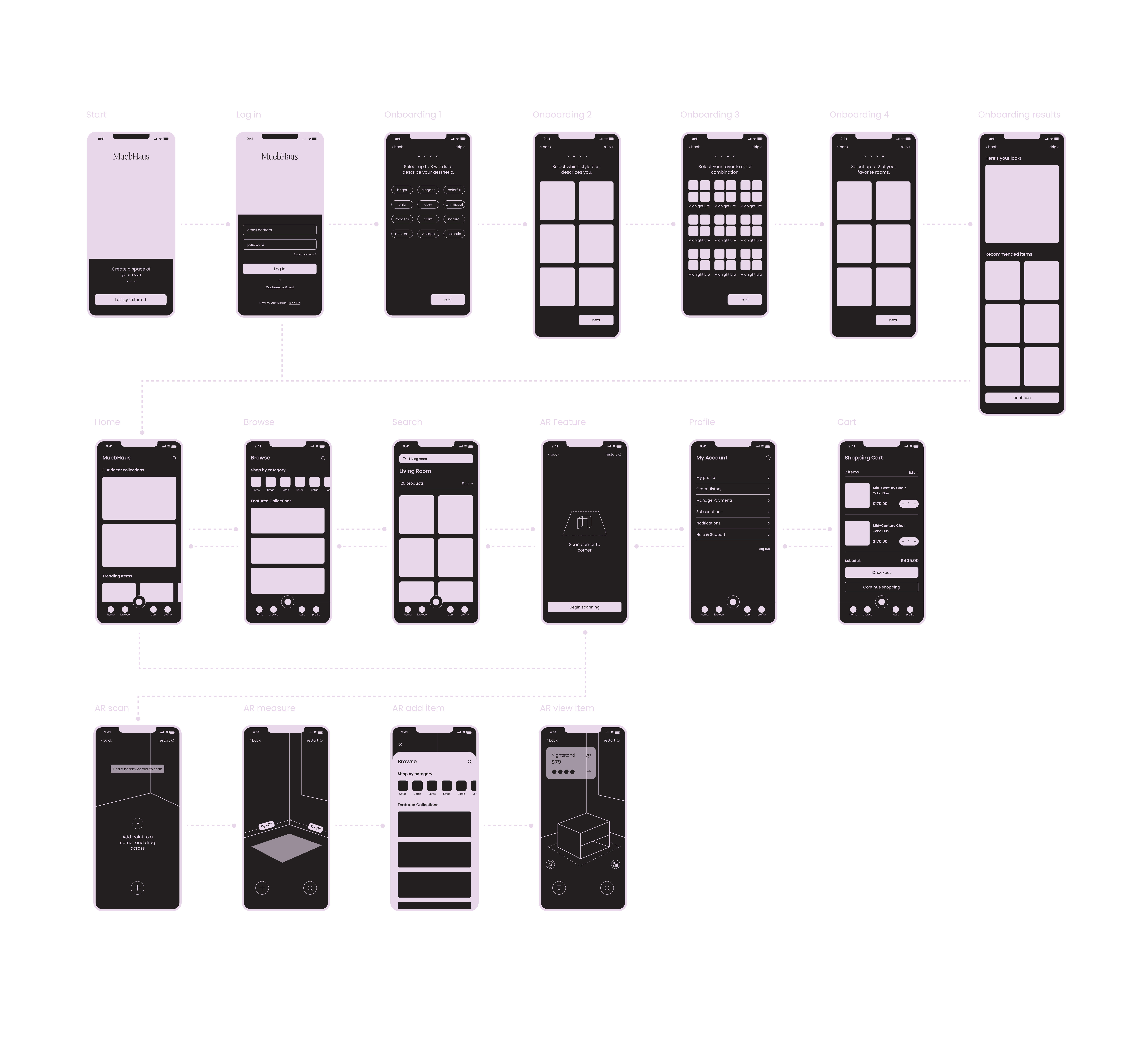
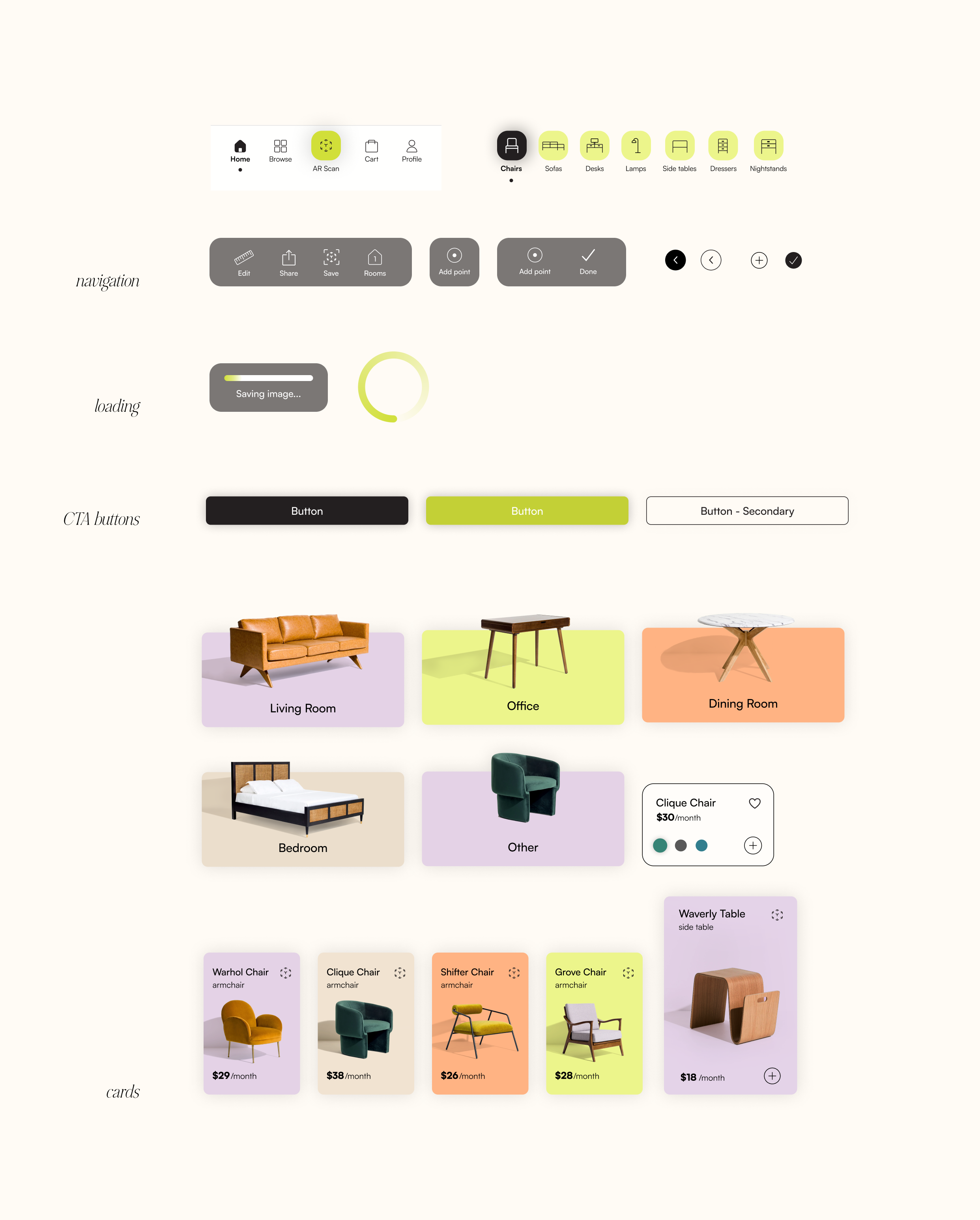
At this point, I had a good understanding of how users would navigate through the app and what features to include. I began by translating all my findings into wireframes and creating connection points between screens to better understand what each screens needs in order to successfully complete tasks.
Conducting
Usability Testing
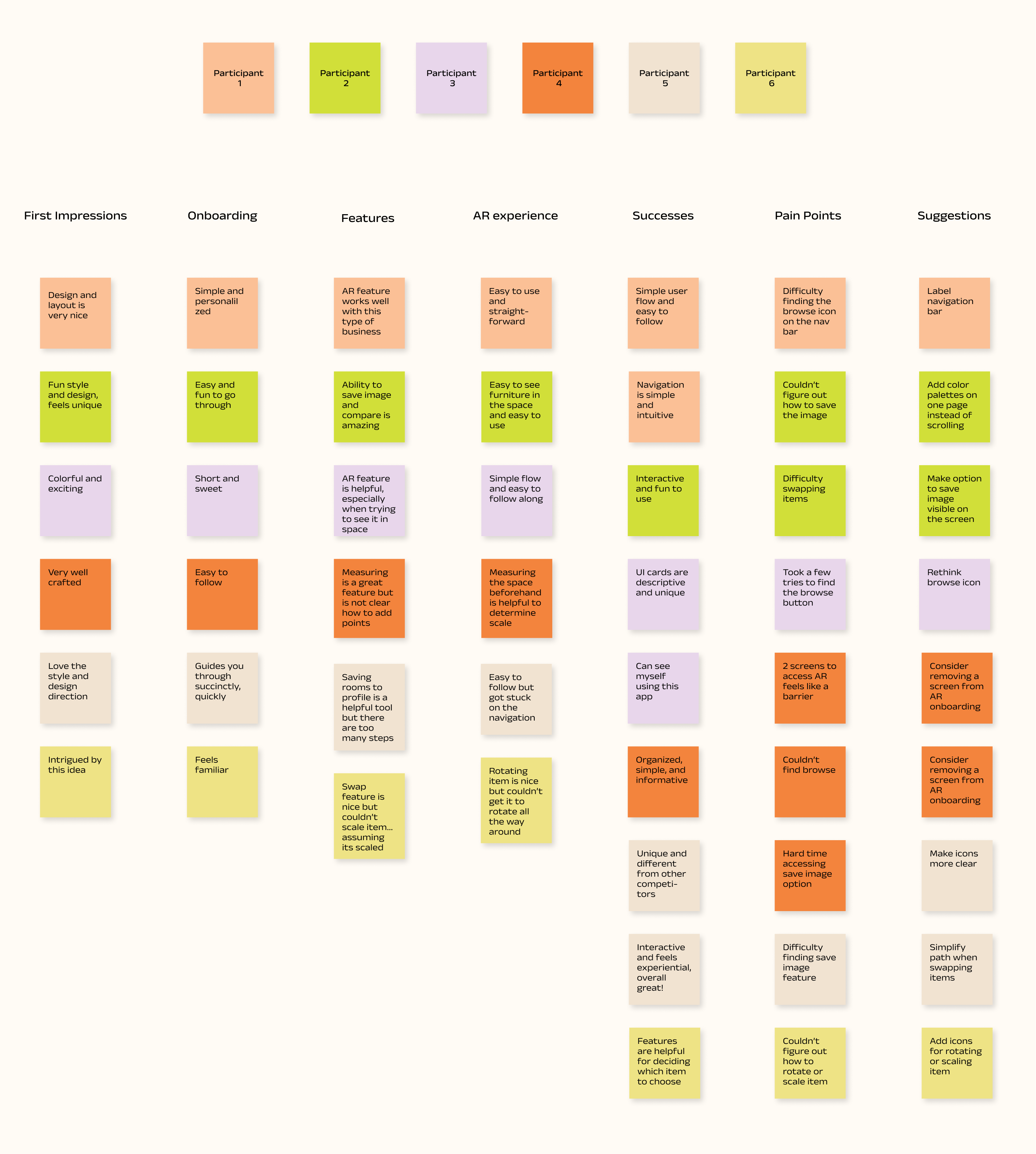
I conducted remote usability testing with 6 participants, all of which were asked to complete a variety of tasks. The app performed well and 83% of participants were able to navigate through the app with minimal error and found the app intuitive. The test provided me with some key takeways to iterate on.
What needs iteration
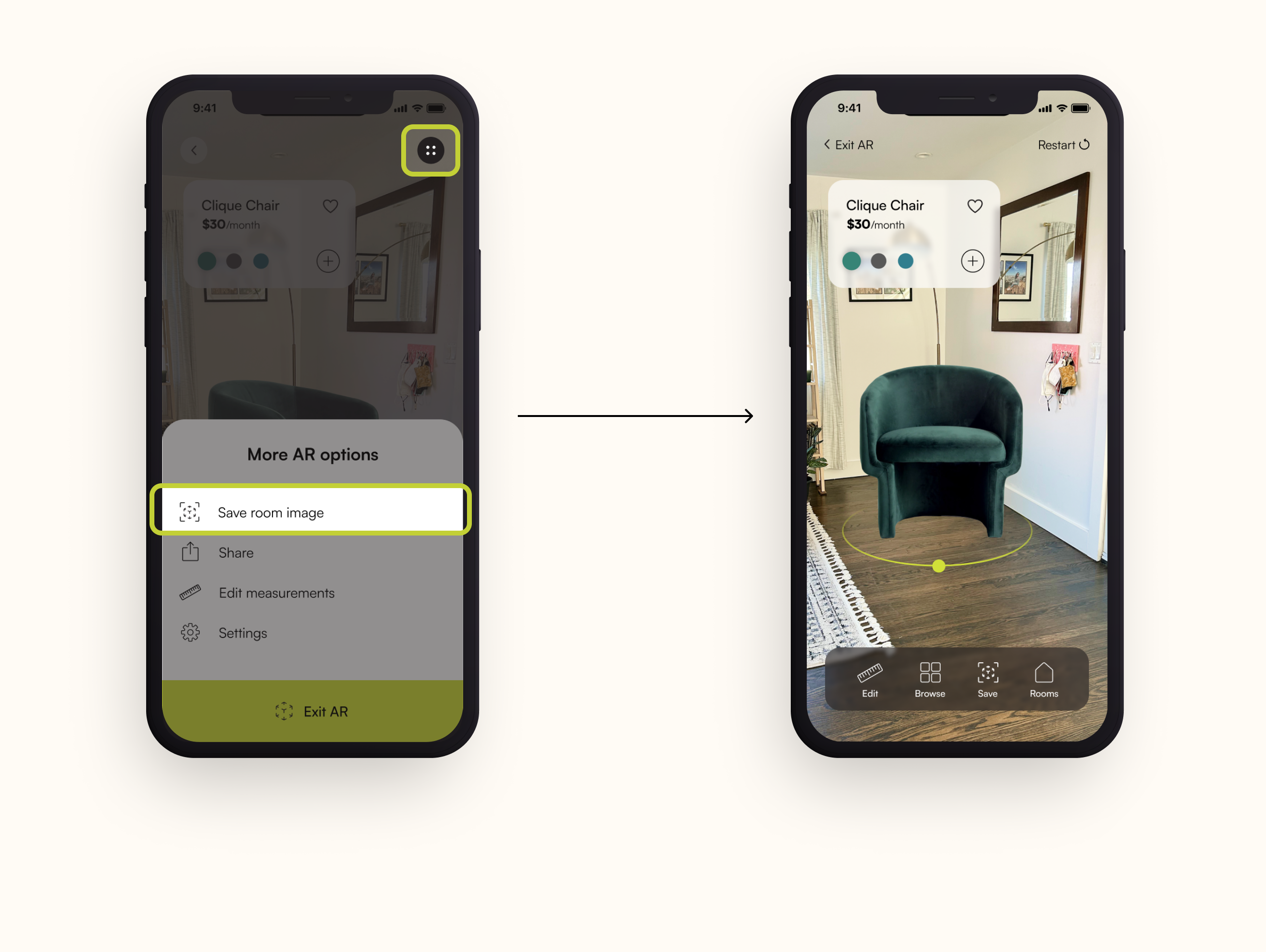
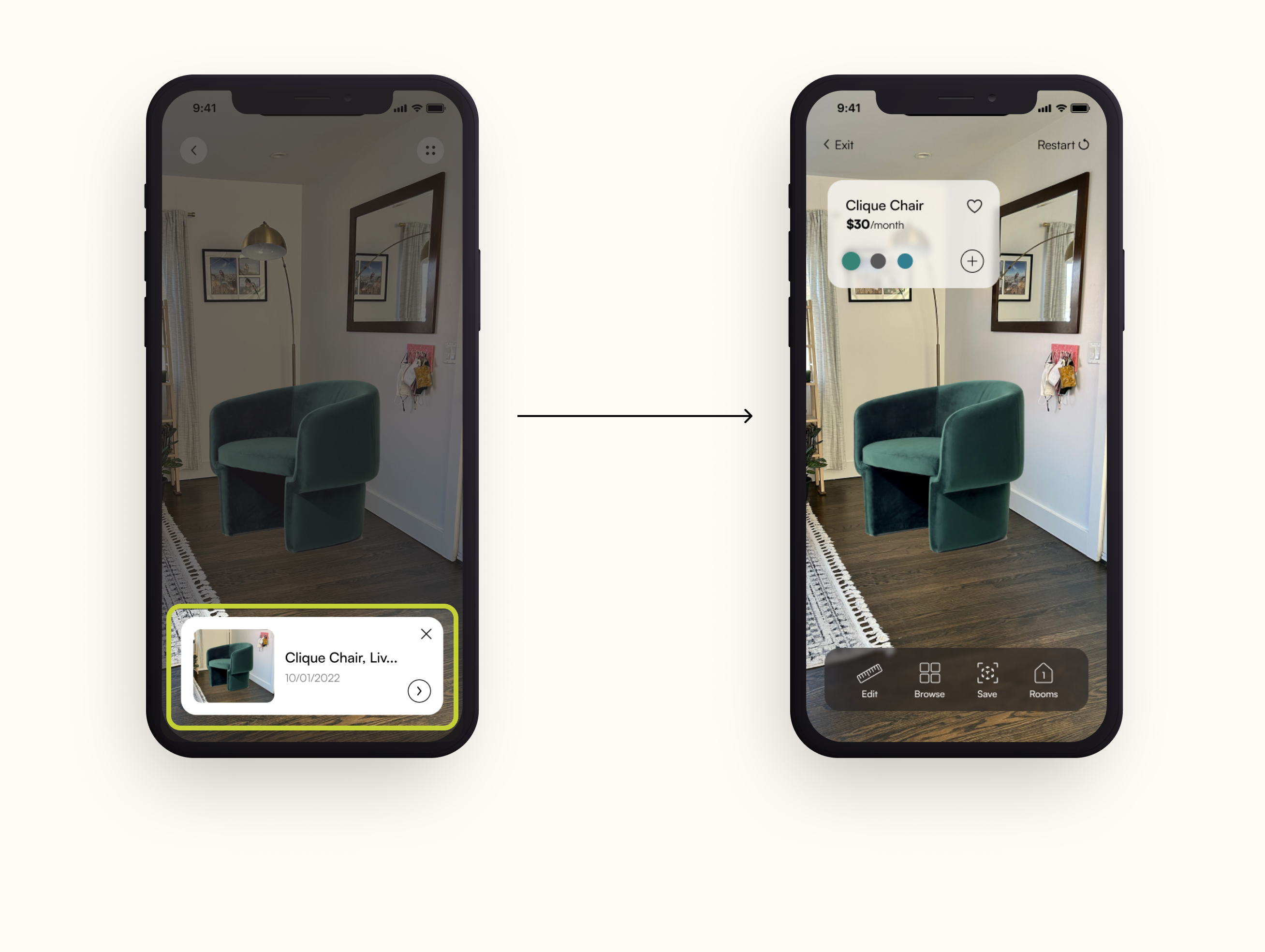
Participants had trouble locating the save image option while in the AR feature
- How can I rethink the location of the save image option?
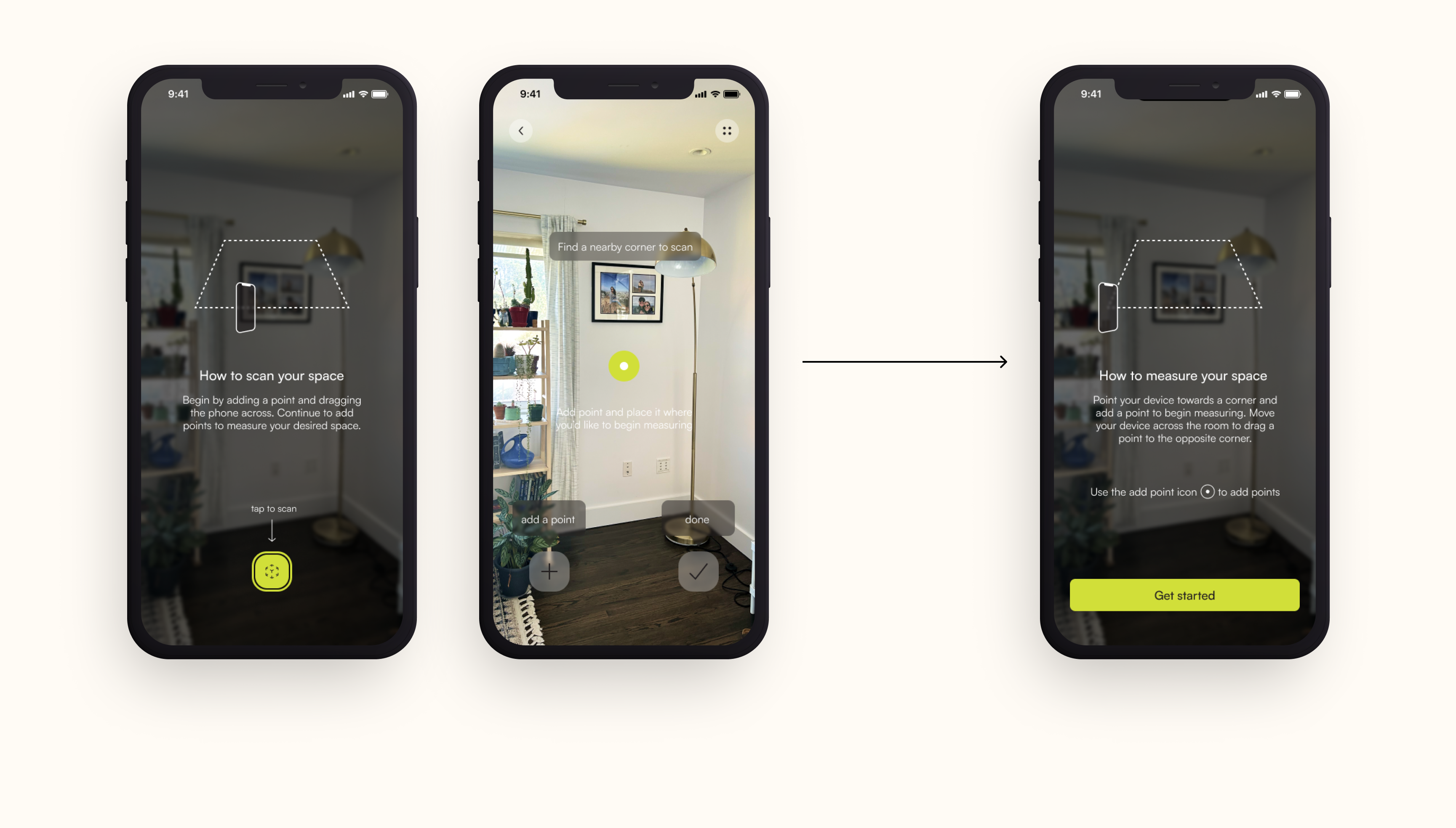
The second AR screen created a barrier and was unnecessary during the flow, which in return caused confusion
- Remove the second screen and only provide necessary information in the first screen
Participants had a difficult time accessing their saved image once they had saved it
- Rethink the save image flow and where the user goes to locate the image once its been saved
Iterating
the Design
Reflecting
and Next Steps
Takeaways
01 / Asking why
This idea was sparked by my own issues of renting apartments, moving furniture from place to place and seeing loads of furniture on the streets everyday. Asking why this problem needed to be solved pushed me to understand people's behaviors, decisions and their effects on our enviornment. User research and market analysis was especially mportant in uncovering the problems and finding a solution that would ultimately change how users view furniture.
02 / Creating something users want
This was especially hard because there are many issues that need to be solved in order to change users behaviors, but given the time constraint and limited resources, I chose to focus on one main pain point I uncovered during my user research: helping users visualize their space. The main goal was to create an immersive experience that is exciting and helpful. When it comes to choosing furniture, I want users to feel confident in their decision and have control over the design of their space.
Next Steps
I began this project with wanting to provide a sustainable and accessible solution to furniture. If I had more time, I would spend more time thinking about the business and how renting furniture would work on an app like this and ultimately, how to integrate with the AR feature.
Other works
Agent AI AssistantProfessional Work
Undocked Agent ChatProfessional Work
Spectrum Right RailProfessional Work
Chat Lead Line IntegrationProfessional Work
PatreonProject type
VOID TravelProject type
Kristina Cooke, RDProject type
this isn't goodbye, it's see ya later ! ✺
designed by miriam arias © 2022
