Patreon
Discover Feature, Mobile App
ui/ux
2022
Patreon is an excellent platform for content creators and artists to make an income sharing their creativity through a monthly subscription service. In the last 5 years, Patreon has tripled the number of subscribed users but the user experience falls short when users have no way of discovering creators on Patreon's platform.
Project Details
Client
Patreon (educational)
Role
ui/ux design & research
Timeline
july - august 2022 xxx (2 weeks/80 hours)
Tools
figma, adobe creative suite, whimsical, maze
There is no easy way to discover other creators on Patreon without knowing exactly who you’re looking for. On the other hand, creators have to rally their own patrons from other platforms in order to get them to subscribe to Patreon, and given the cost to use Patreon, creators want Patreon to offer more marketing and discovery tools.

Let's talk about the Problem
Patrons find there is no easy way to discover creators on Patreon without knowing exactly who they're looking for. On the other hand, creators have to rally their own patrons from other platforms in order to get them to subscribe to Patreon, and given the cost to use Patreon, creators want Patreon to offer more marketing and discovery tools.
Design Challenge
This project presented two main challenges: work within the existing design guidelines and design a discovery feature that benefits both the patron (subscriber) and the creator.
Proposed Solution
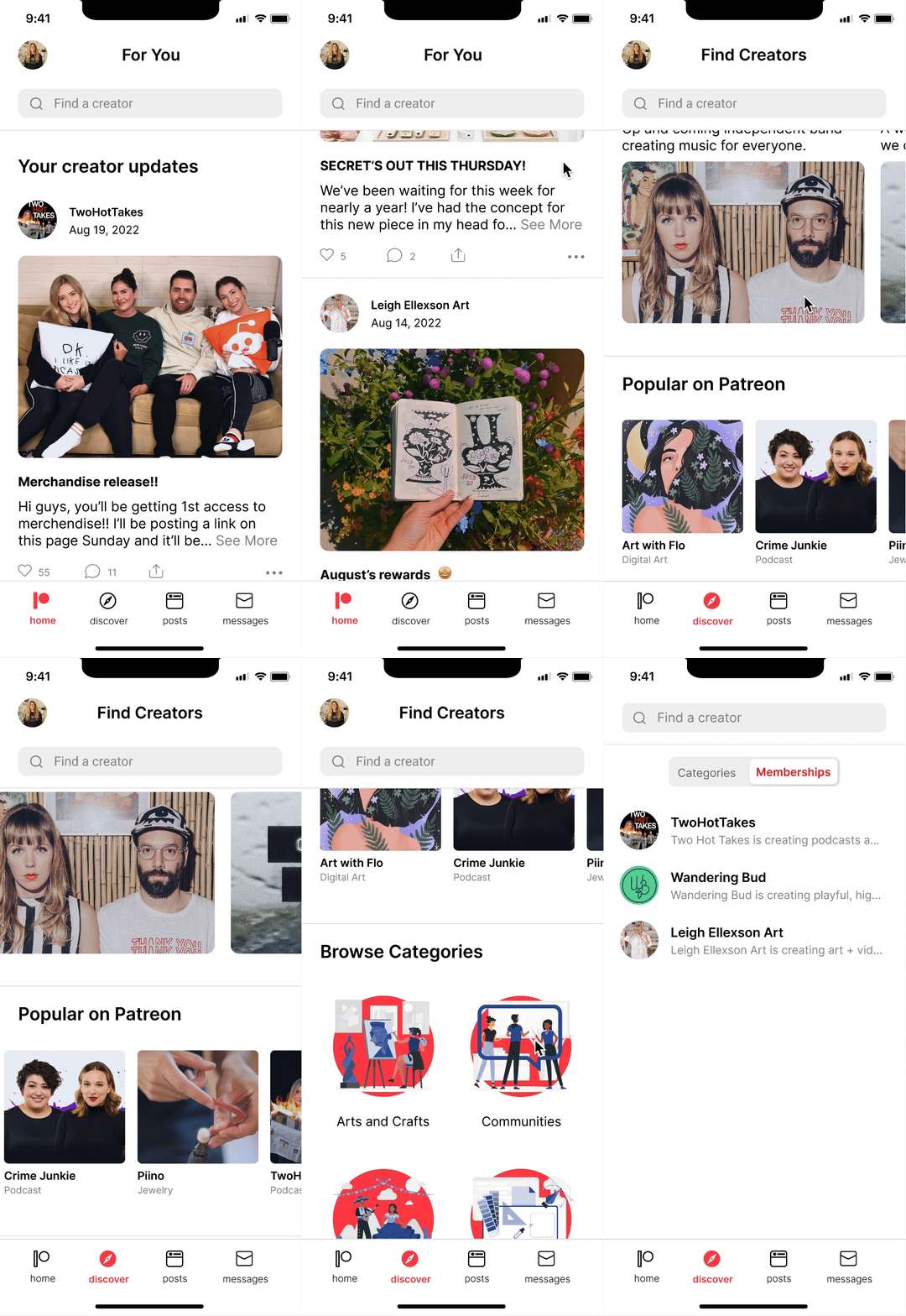
A discovery feature that allows users to search for creators on Patreon based on their interests, while also promoting creators.
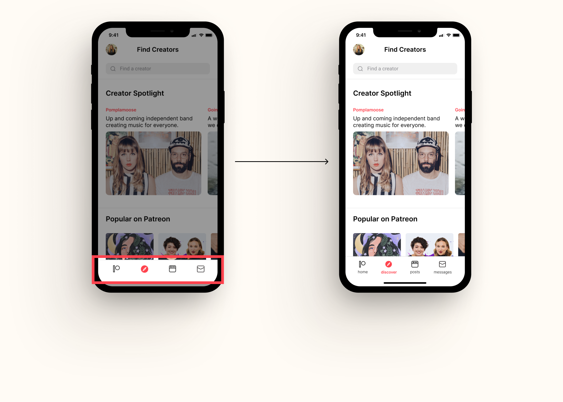
Quick Glance Before & After
Before
After
High-Level Goals
01 / MAKE DISCOVERING EASY
With over 200,000 creators, searching can feel overwhelming. Users need design solution that allows them to easily find creators.
02 / INCREASE CREATOR DISCOVERABILITY
Patreon charges creators between 5%-10% in fees plus a processing fee, given the cost to use platform, creators want Patreon to offer more marketing and discovery tools. It's important the design solution allows creatosr to easily be discovered on Patreon.
03 / INCREASE USER ENGAGEMENT
How might we get users to feel excited about exploring creators, increasing the total time spent on the mobile app?
04 / VARIOUS WAYS TO DISCOVER CREATORS
Provide various ways to discover creators to help users find specific creators.
Conducting
Competitive Analysis
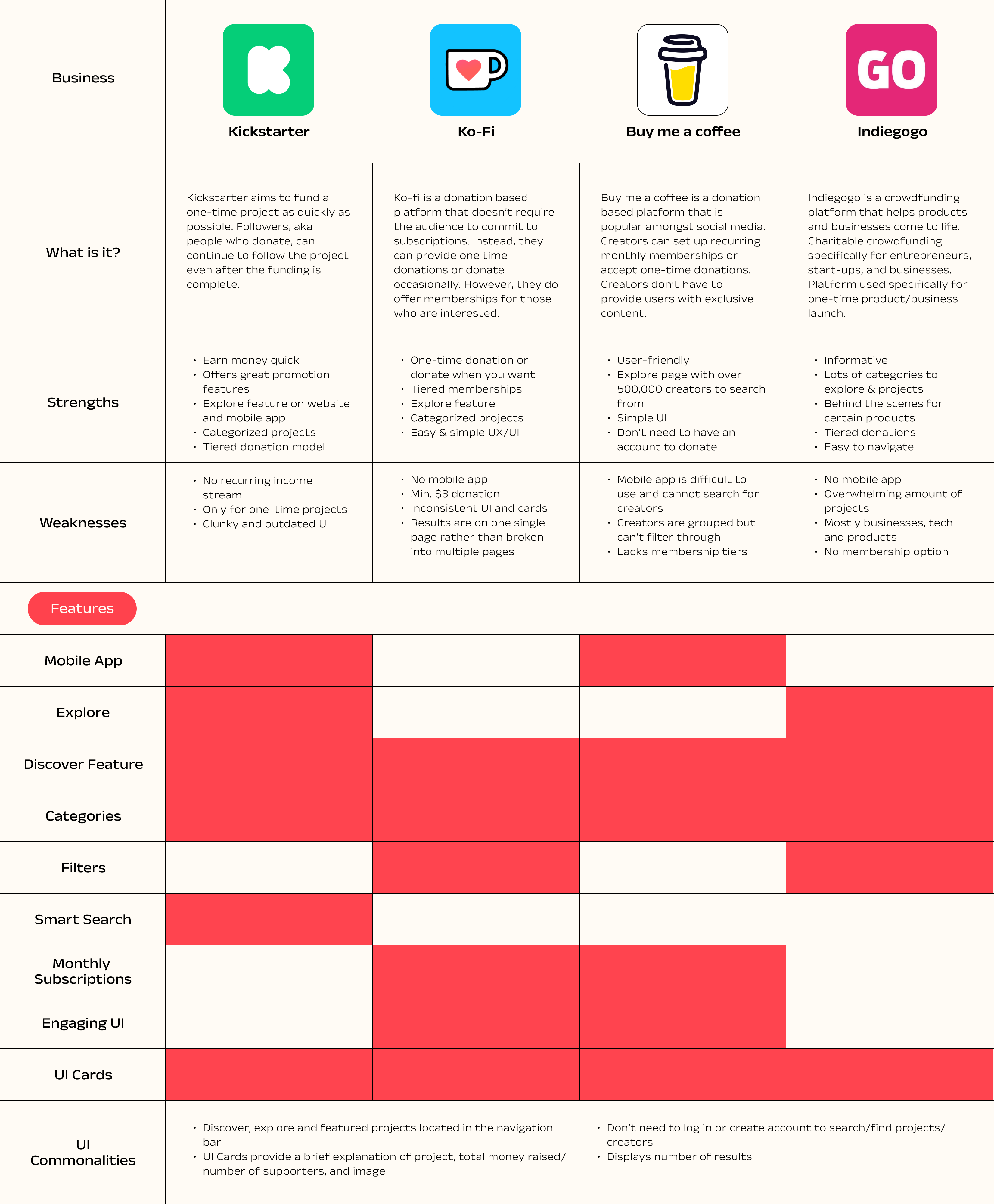
First step in my research process was to conduct market research to determine competitors and what they're doing to differentiate themselves. I analyzed four competitors: Kickstarter, Ko-Fi, Buy me a coffee, and Indiegogo.
Some key items I looked at:
- Discover/explore features
- Search options/features
- Usability & navigation
- Categories, filters, UI layout
- Mobile App
Performing
User Interviews
I began screening potential participants to partake in a survey and/or user interview. This led me to 13 survey participants and 5 user interview participants. Through the interview process, I was able to get a better understanding of each participant's pain poins, motivations, and behaviors. Below is a summary of my findings:
Findings
Patreon users not only use the app to support their favorite creators and artists but to gain knowledge and/or learn a new skill.
Users are willing to pay extra to get exclusive content and receive free goodies from creators.
Patreon is seen as an experience and users are drawn to it as a form of entertainment.
Users are more likely to subscribe to more creators if they had the ability to search on Patreon.
What I heard
"Subscribing to creators feels like catching up with a friend who is doing really cool stuff." - Graphic Designer, 26
"I really only contribute to one visual artist/illustrator who I like and follow her life updates and podcasts through Patreon." - Student, 29
"I enjoy the podcasts and would like to contribute to their income. I also enjoy ad-free episodes." - Business Owner, 29
"I cycle through creators every few months so I am continuously learning something new and supporting different forms of art. Would be nice to have a search function so I can search for specific categories when looking to switch." - PhD Student, 28
Creating
Personas
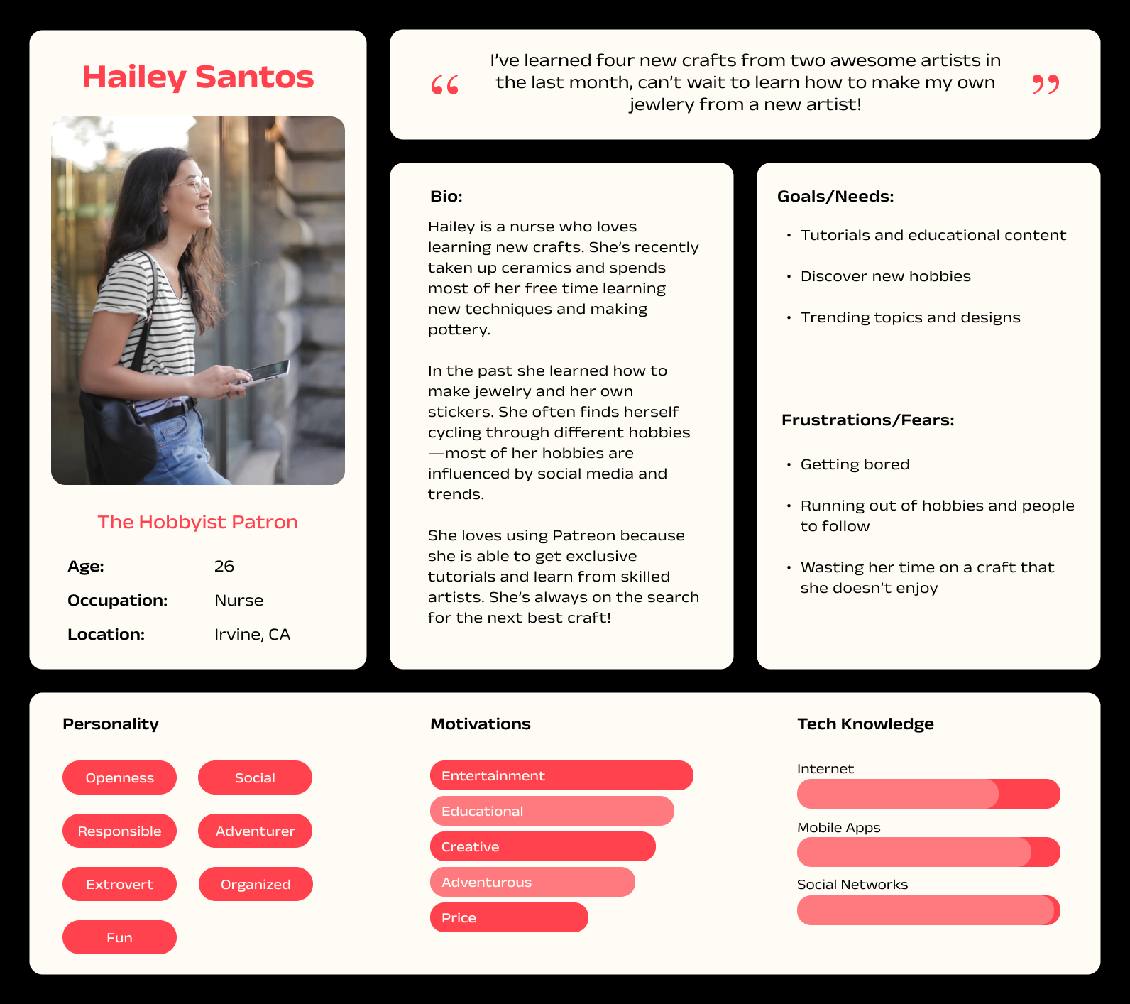
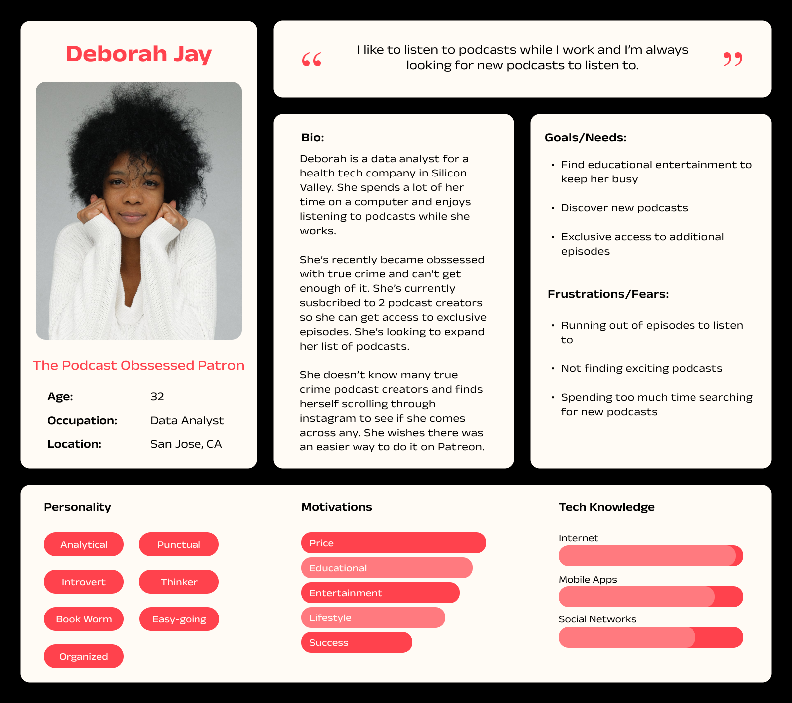
The findings from my user interviews and surveys led to the creation of two personas: The Podcast Obssessed Patron and The Hobbyist Patron. I focused on defining key characteristics to better understand their behaviors and choices when using Patreon.
Pains
- Not having enough content to keep them entertained
- Not finding exciting creators
- Wasting money and time on creators who don't fullfill their expectations
- Spending too much time searching for new creators
Goals
- Try and new hobby and/or learn something new
- Get exclusive and bonus content
- Discover new creators
- Be as efficient as possible with their time
Walking
with the Users
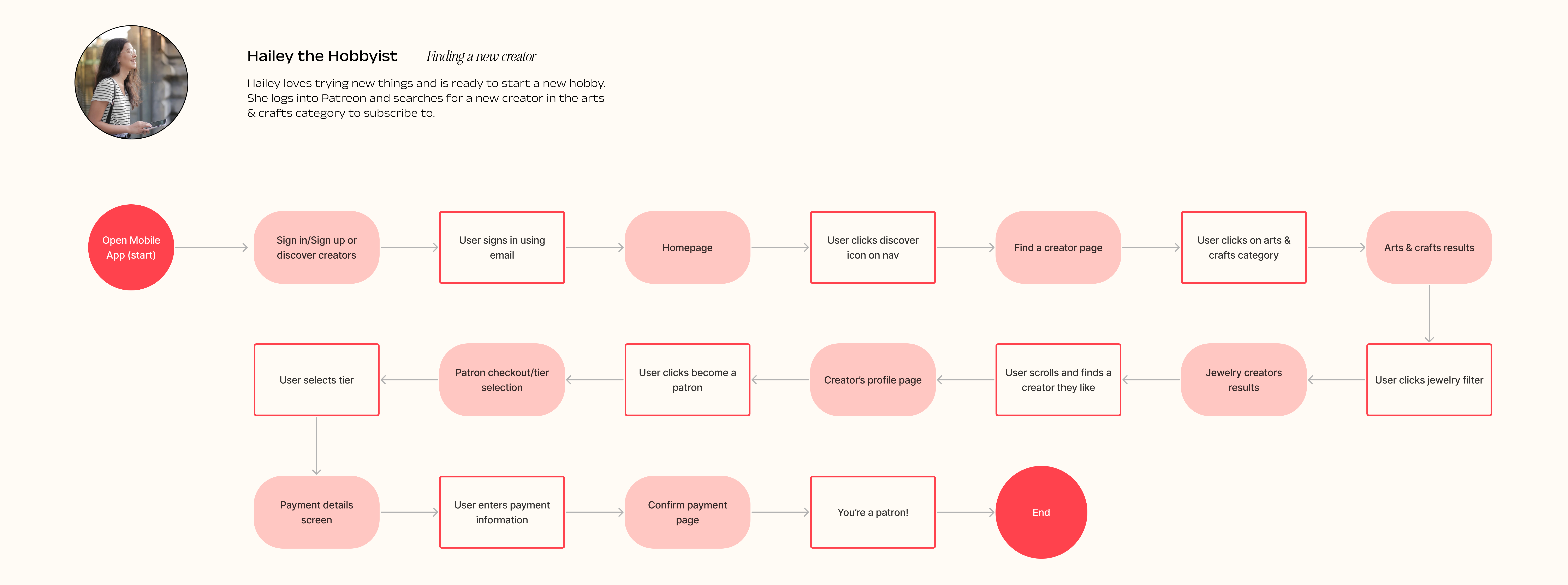
Using the information from the research and the personas, I developed task flow based on one of the personas, Hailey.
The task flow represents a path Hailey might take when attempting to discover new creators. This scenario was chosen based off user research determining importance in the search/discover experience.
Generating
Design Ideas
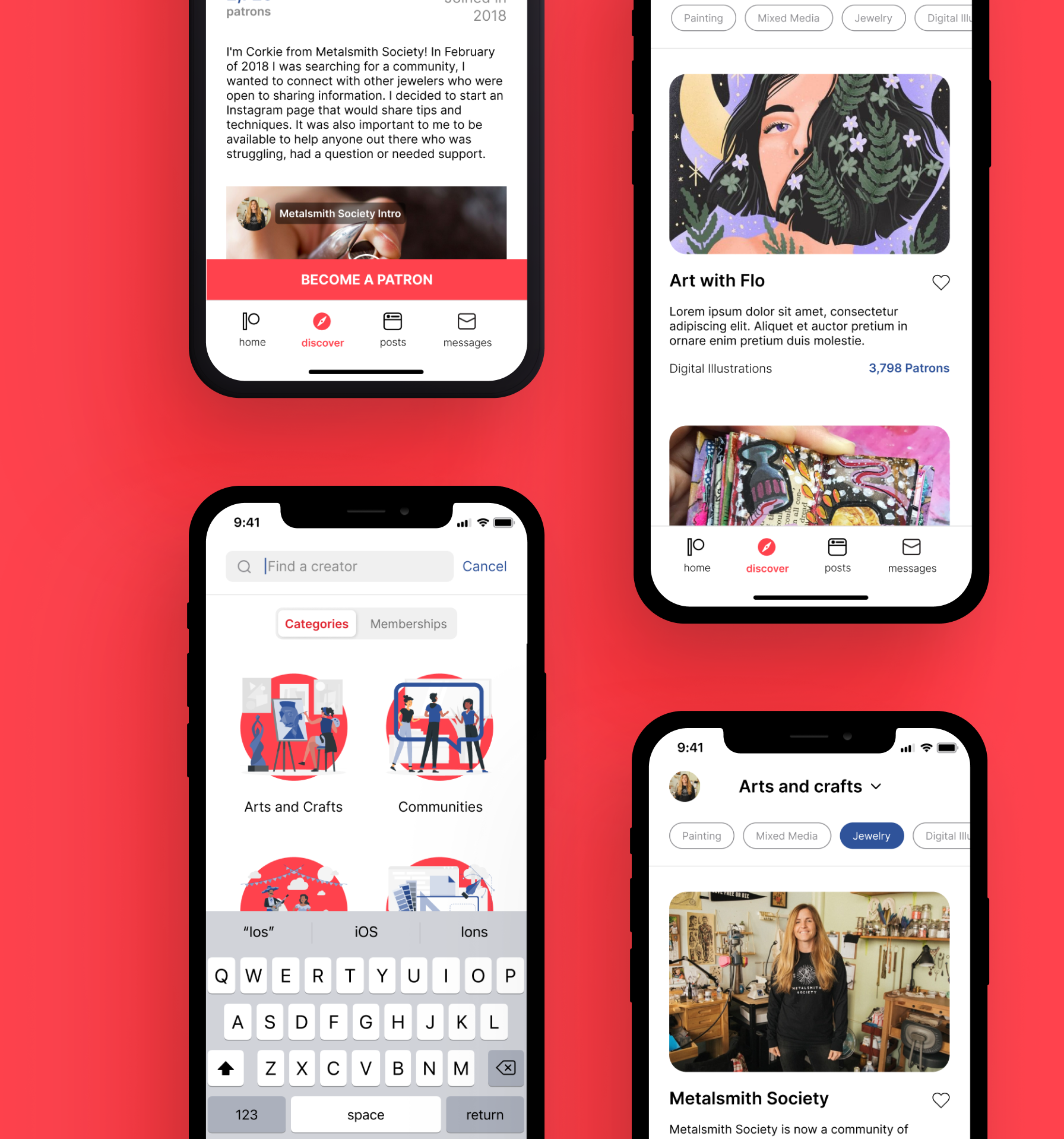
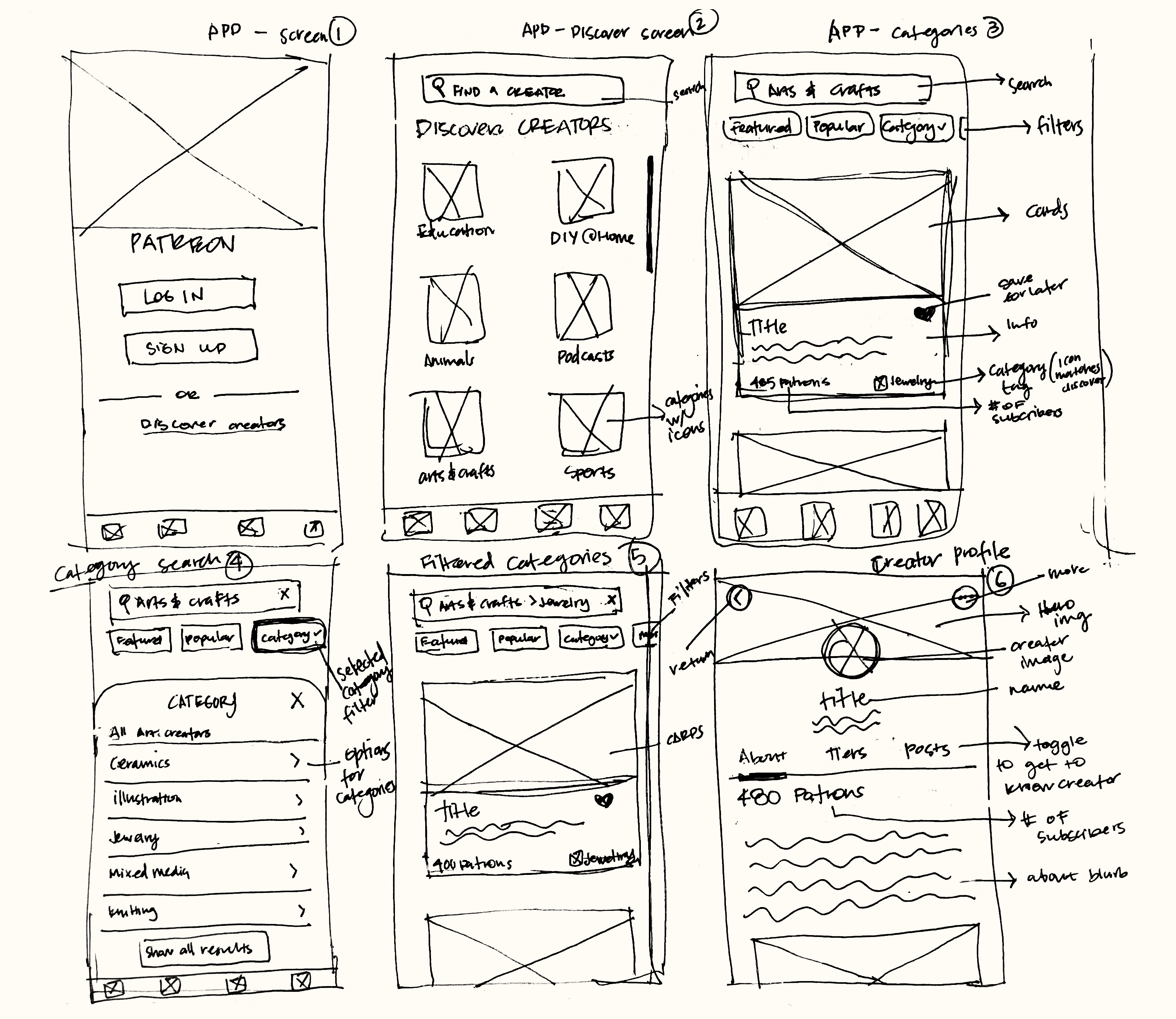
At this point, I gathered enough information to begin sketching low-fidelity ideas with the discover feature. I had to work within the existing design guidlines to make the feature as seamless as possible to fit with the existing UI. Below are some ways the discover feature becomes integrated into the mobile app:
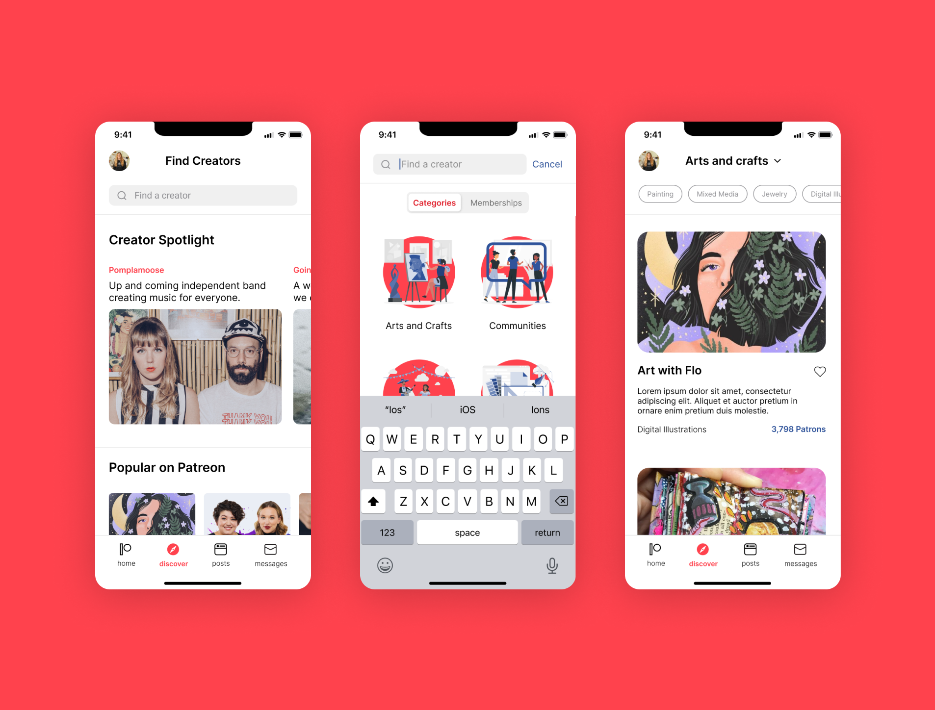
Log in screen: provide a discover creators option to allow users to browse through creators without the log in barrier
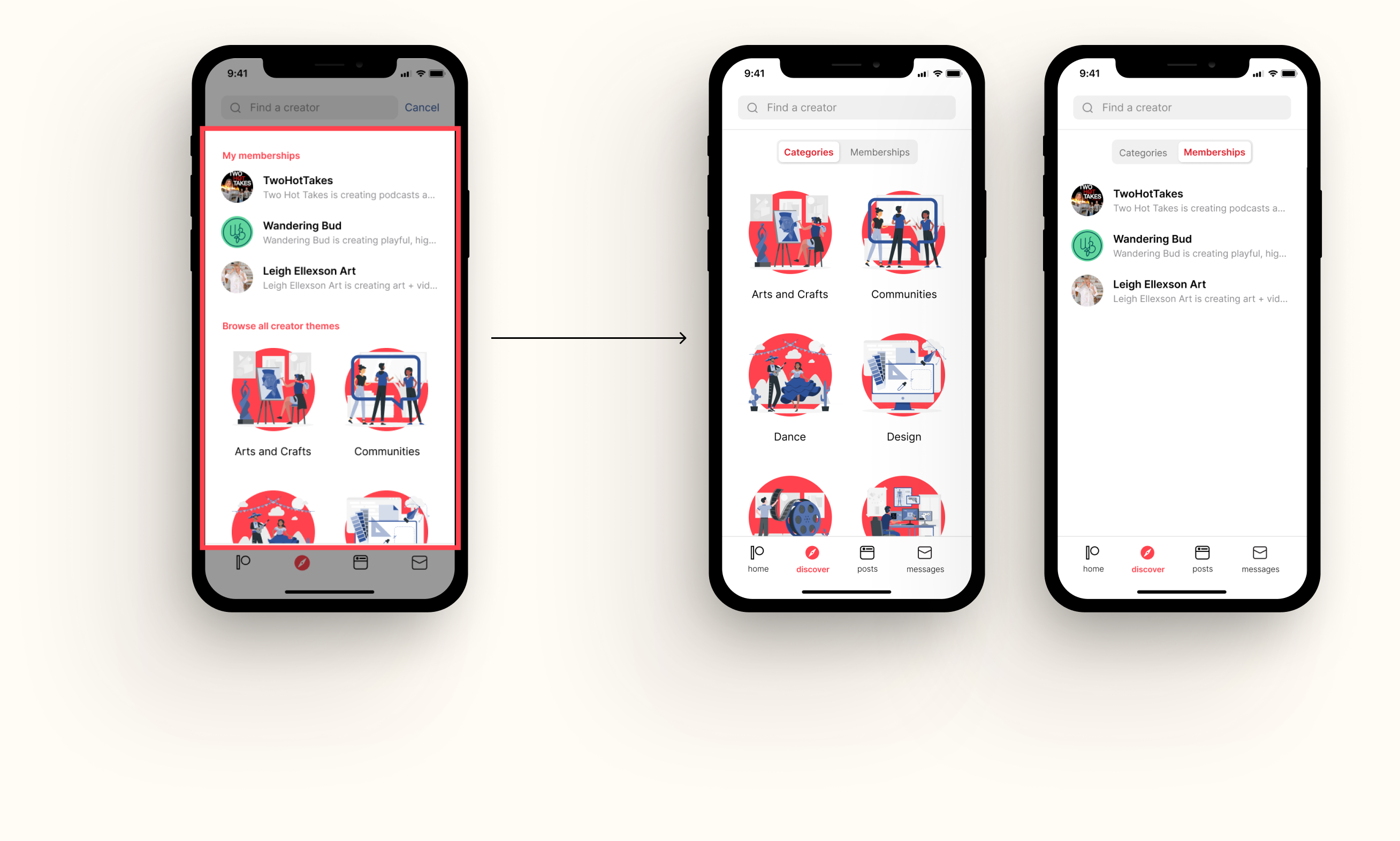
Discover creators screen: categorize creators to users to easily find creators based on their interests
Category results screen: UI cards with creator information and filter options for subcategories.
Category filter screen: Option to choose from subcategories to further narrow creators.
Implementing
the Discover Feature
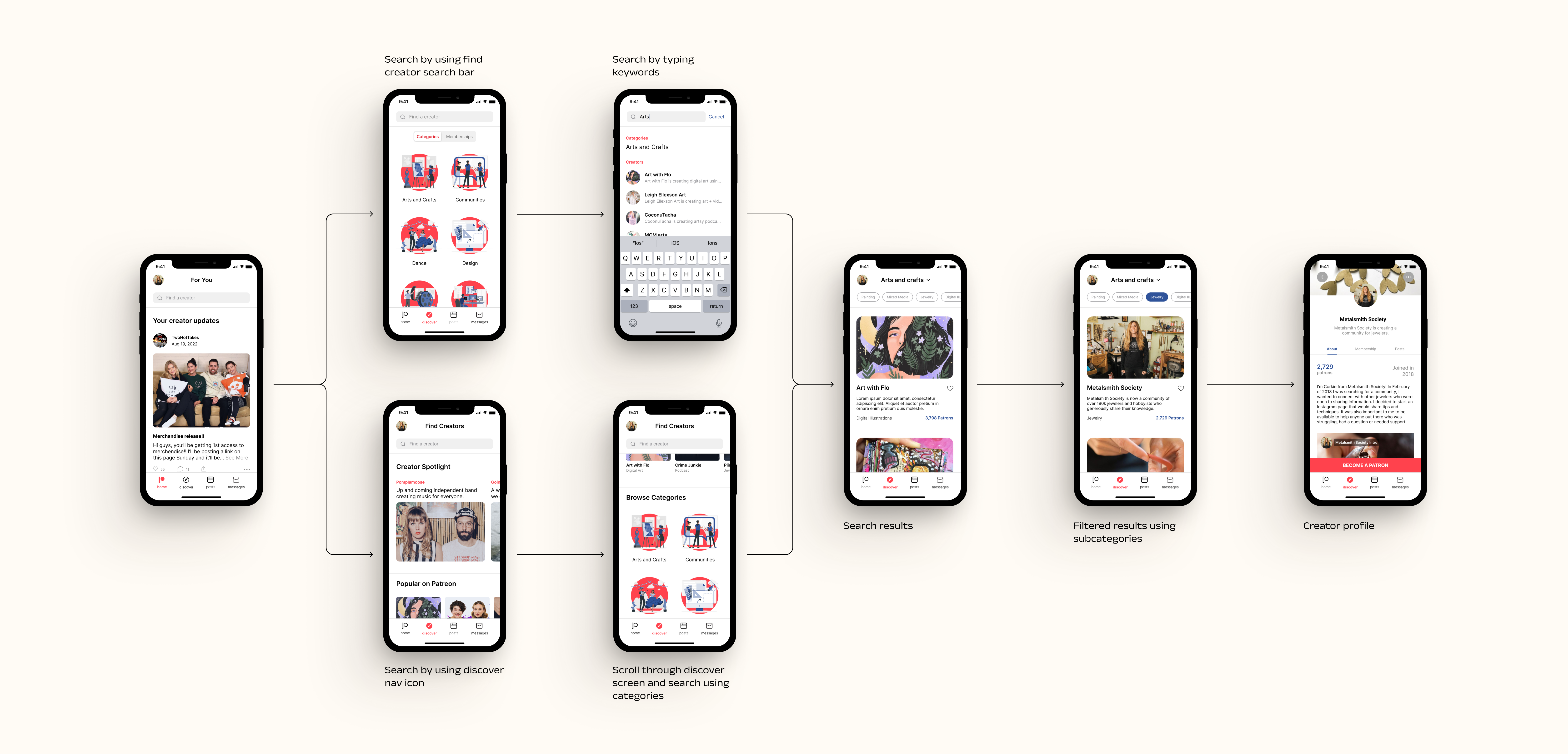
The feature is meant to provide users with an easier way to search for creators on the mobile app. The intent is to curate a discover feed that provides users with a variety of ways to discover new creators, while also promoting the creator and their work. I considered the different flows in which a user would go about searching for creators, which lead to providing users with a variety of ways to obtain the same results. Additionally, I chose to create categories to help users narrow their search down and spend less time looking through creators and more time enjoying the content–a user frustration expressed by a user during the user interview.
Discovering
New Creators
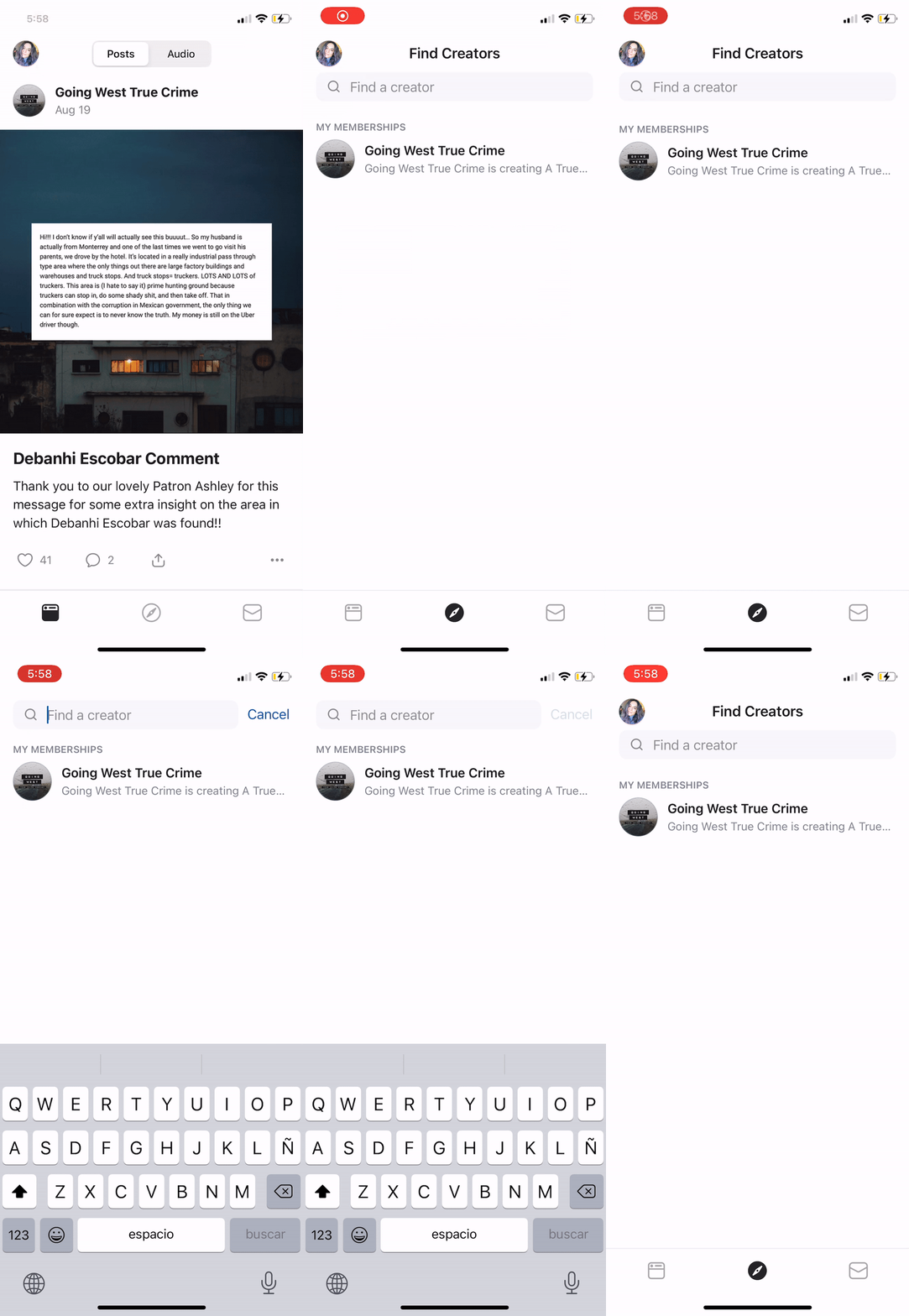
Upon opening the app, the user is greeted with the home screen, giving them the option to search for creators using the search bar or the navigation bar. By using the search bar, the user can type in keywords or use the categories toggle option to search by selecting a category. If the user chooses the discover icon in the navigation bar, the user is promoted to the "find creators" screen, which would feature a variety of creators. If they scroll through, they'll come across a "browse categories" option, where they can search by selecting a category. The user is able to search using the search bar at any point during their experience.
Switching
Creator Categories
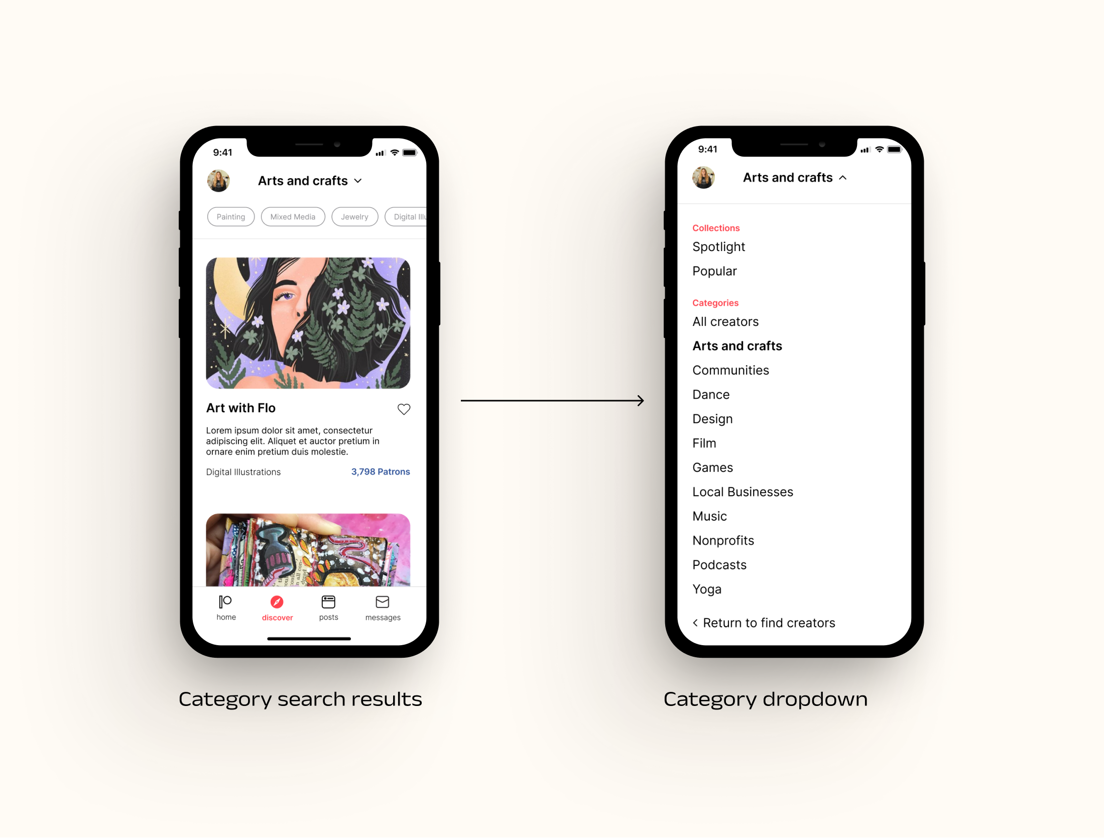
If the user isn't finding anything they're interested in, they can always switch categories without having to navigate back to the main discover screen. To switch creator categories, the user can select the current category at the top of the screen, prompting a dropdown menu where they can choose a new category or browse a specific collection.
Conducting
Usability Testing
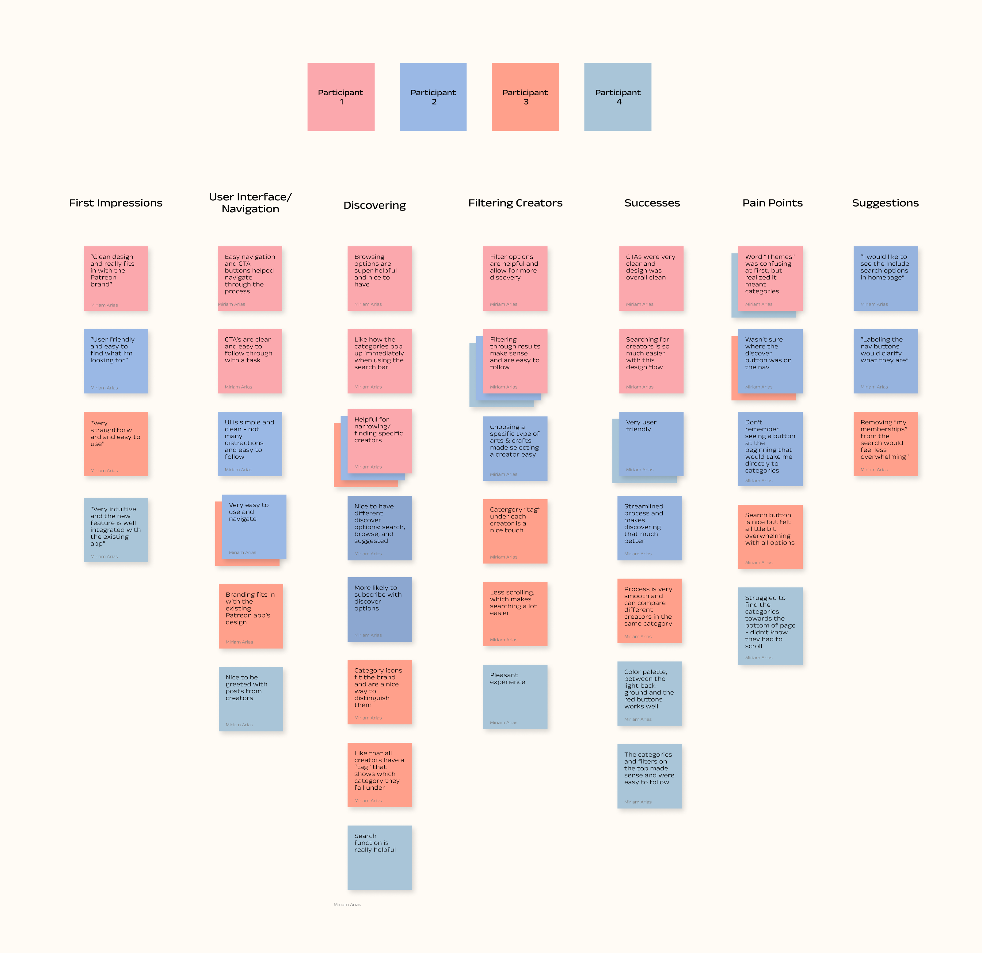
I conducted remote usability testing with 4 participants, all of which are current Patreon users. They were asked to walk me through two tasks. Once the tasks were completed, I asked them for their overall impressions, frustrations, successes, and suggestions to improve their experience.
Reviewing
User Feedback
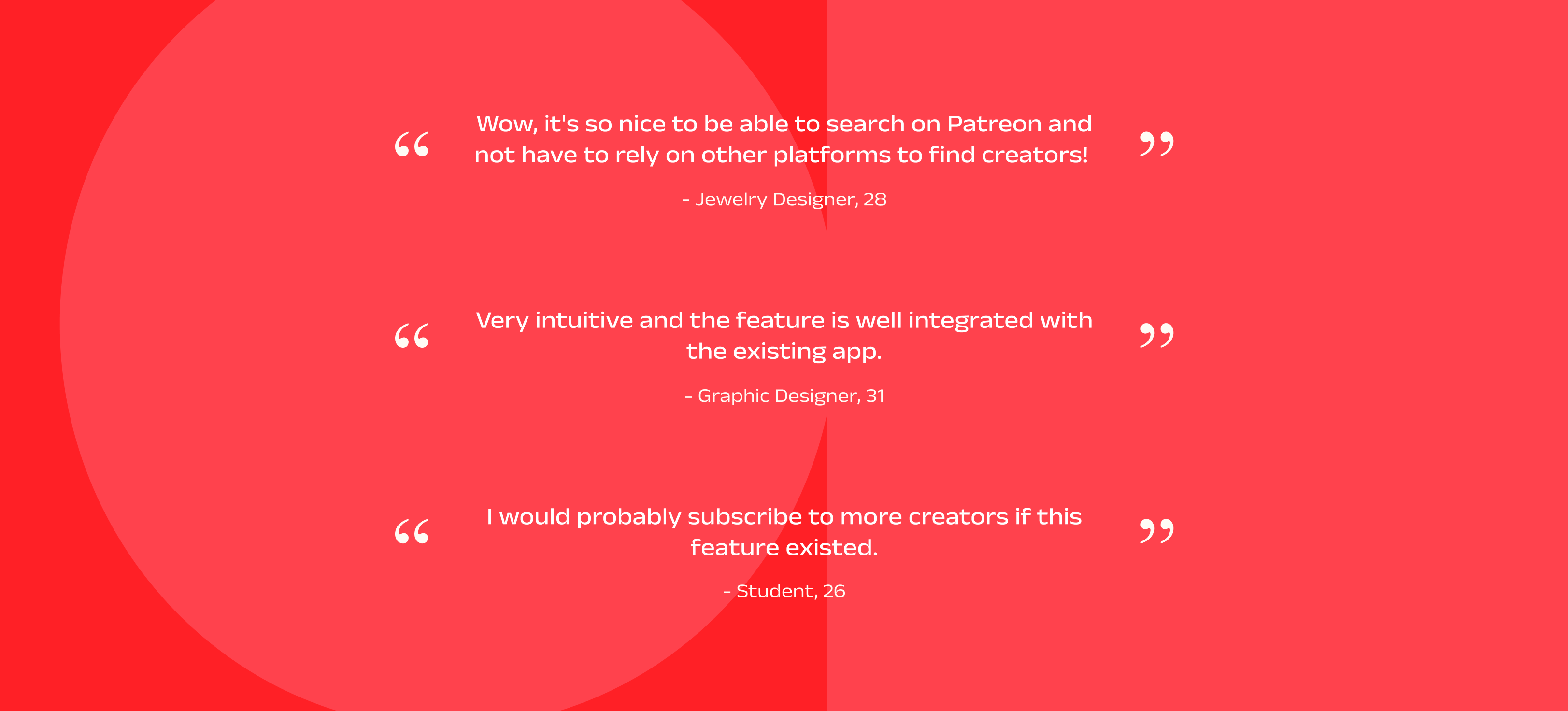
- All participants completed the tasks and followed the desired user flows
- All participants found it straightforward and easy to follow
- 2/4 participants found the copy "browse themes" confusing and weren't sure it meant categories
- 2/4 participants did not immediately know which icon in the navigation bar was discover
- 1/4 participants was confused when the search bar screen displayed my memebership and browse categories
Measuring
Feature Success
To measure success of this feature, I'd compare the old design with the new feature by tracking:
Overall discovery rate: number of patrons discovering new creators via the mobile app
Conversion: percentage of patrons subscribing to new creators
Engagement: how often patrons are interacting with the discovery feature and how long they spend searching for creators
Reflecting
and Next Steps
Takeaways
Next Steps
01 / Work within the existing guidelines and respect the existing design
I spent some time researching Patreon's design guidelines to better understand what I was working with. It was important to me that I maintain as much of the branding concept as possible while designing for the new feature. This also helped me better understand the process of working with existing design standards and how each design decision reflects the design guidelines.
02 / Design for a variety of search/discover options
I wanted to offer user a variety of discovery tools so that they can easily find exactly what they're looking for. I tried to maintain a simple design for clarity while also using CTA's to direct users in the right direction. It was challenging trying to figure out which flows were preferable but during my research and usability testing, I was able to determine how users went about searching for creators.
I began this project wanting to provide a simple solution to finding creators on Patreon. Currently, the only way of finding creators is through a third party social media platform, which leaves a lot of creators hidden if they don't have a huge social media following. The core idea is to bring creators and patrons (subscribers) together on one platform so that creators are easily discovered and patrons have an easier and better way of finding them.
- If I had more time, I would like to perform another round of usability testing, in order to get more feedback on the new design.
- I would like to track the clicks and different search patterns from each user to better understand their behaviors.
- Perform an A/B test to determine if the feature is actually effective in increasing the amount of users who subscribe to creators.
Other works
Agent AI AssistantProfessional Work
Undocked Agent ChatProfessional Work
Spectrum Right RailProfessional Work
Chat Lead Line IntegrationProfessional Work
MuebHausProject type
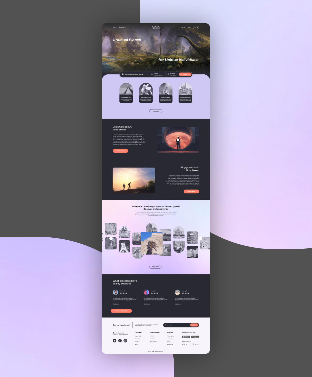
VOID TravelProject type
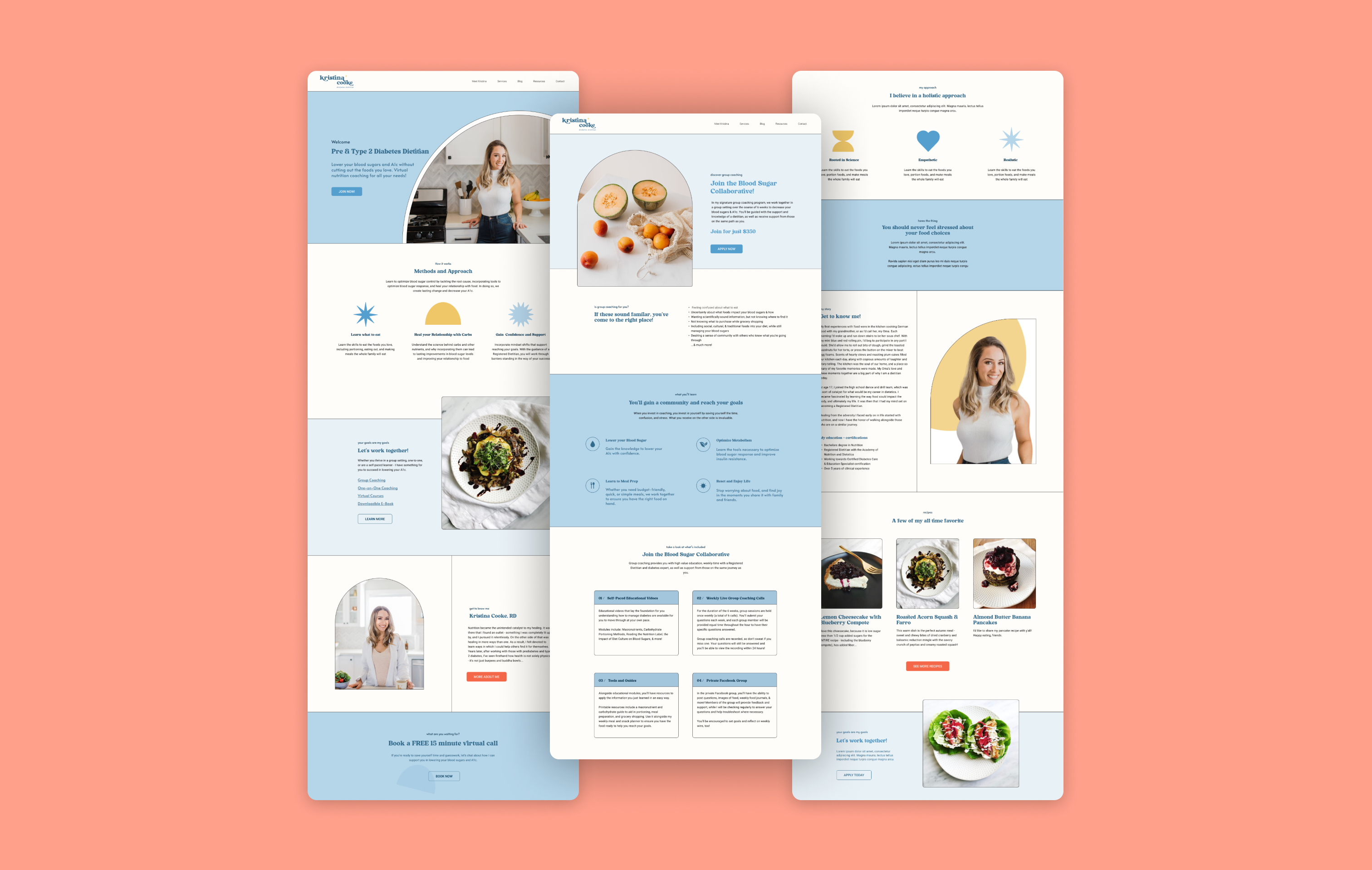
Kristina Cooke, RDProject type
this isn't goodbye, it's see ya later ! ✺
designed by miriam arias © 2022
