Kristina Cooke
Registered Dietitian
ui/ux, branding, website
2022
Kristina Cooke is a Pre & Type 2 Diabetes dietitian offering online nutrition coaching services. Inspired by the modern and retro aesthetic, I created a brand that felt whimisical, professional and a breath of fresh air for a medical/nutritional service. I worked with Kristina to establish a brand identity and online presence for her newly established business.
Project Details
Client
Kristina Cooke, RD (freelance work)
Role
ui/ux design & research, graphic and branding design
Timeline
June - July 2022 xxx (2 weeks/80+ hours)
Tools
figma, adobe creative suite, squarespace
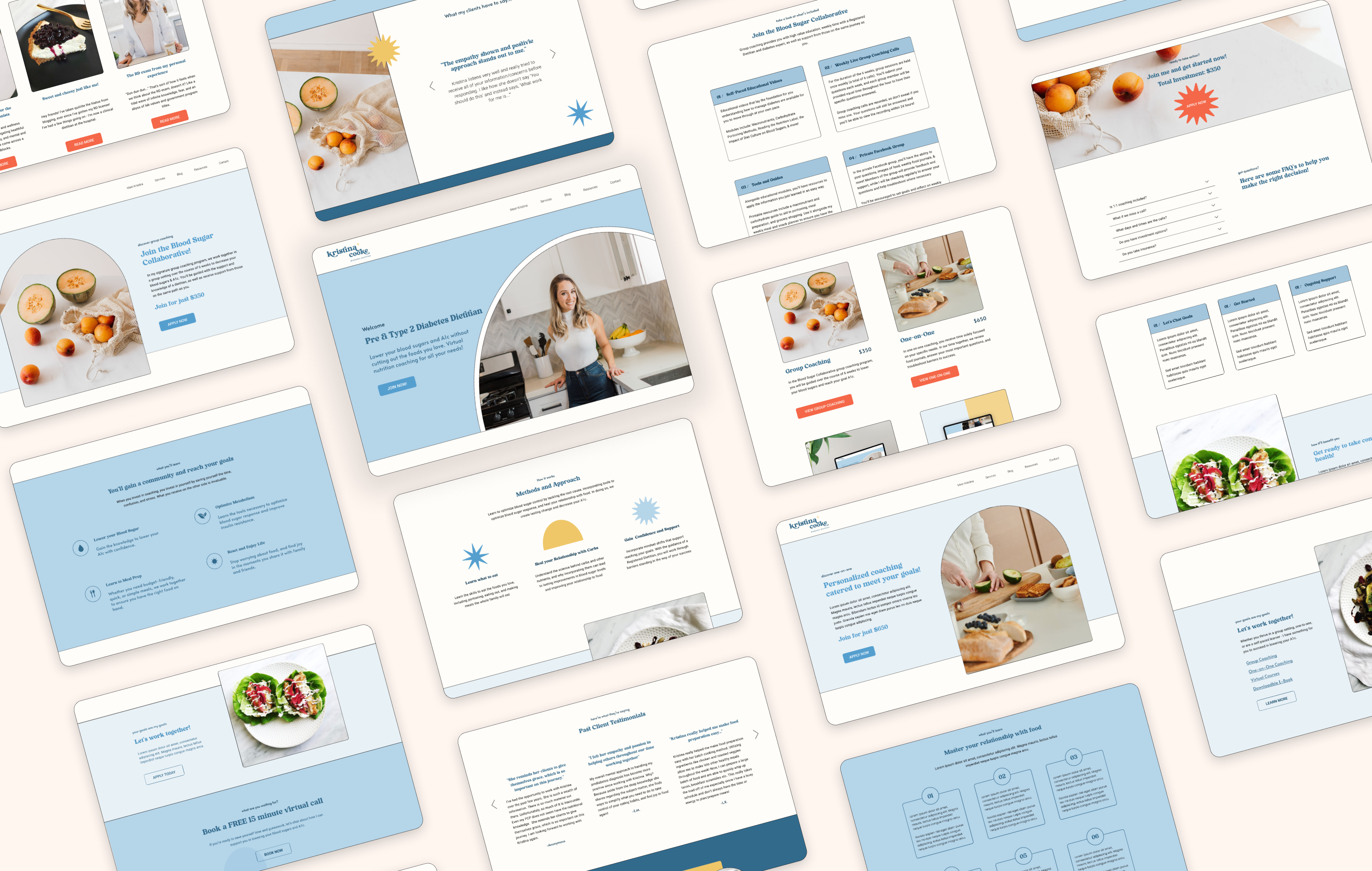
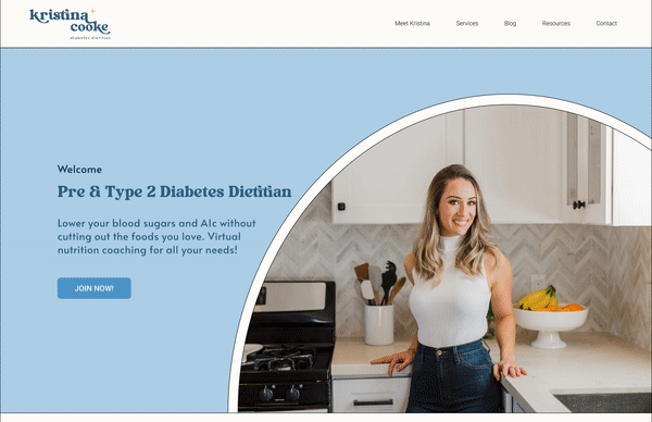
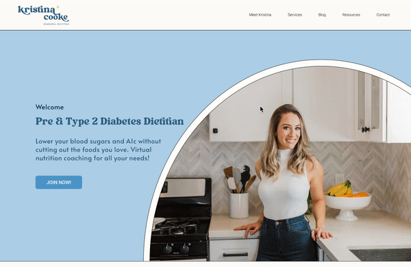
I proposed a complete UX/UI and branding overhaul of the website to better respond to her business goals and services. Having recently launched her business, Kristina’s website lacked brand identity and wanted to re-establish herself as a type 2 diabetes dietitian. My goal as a designer was to design a unique website that will help convert users into clients.
Let's talk about the Problem
"Buying online services are difficult because you really don't know what you're getting in return."
The existing website doesn't properly convey the unique value proposition of her services, lacks identity, and is not converting users into clients. Additionally, the existing website doesn’t provide in-depth information about her mission, goals, and the benefits of working with her.
Design Challenge
How can I design a website that conveys her value proposition, converts current users into clients, and create a unique brand that will help her gain the trust of her users?
Proposed Solution
Redesign her existing website with in-depth information, unique value proposition, and a strong brand identity to ensure she gains the trust of future clients. The design will be responsive, educational, engaging, and facilitates purchasing of services.
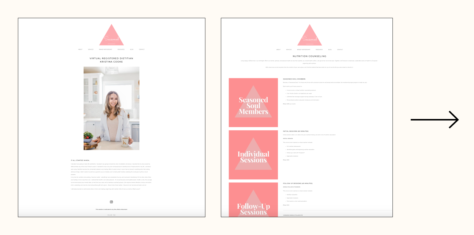
Quick glance Before & After
Research Goals
Understand what motivates people to purchase online services and what factors lead them to their purchase. Secondly, Identify what consumers value about online services to identify key points and successes in order to build a product that fits their needs.
✼ What motivates people to purchase online services?
✼ What are some concerns and fears users have when they buy online services?
✼ What information is important to the user?
✼ What are competitive platforms offering users? And what makes them successful?
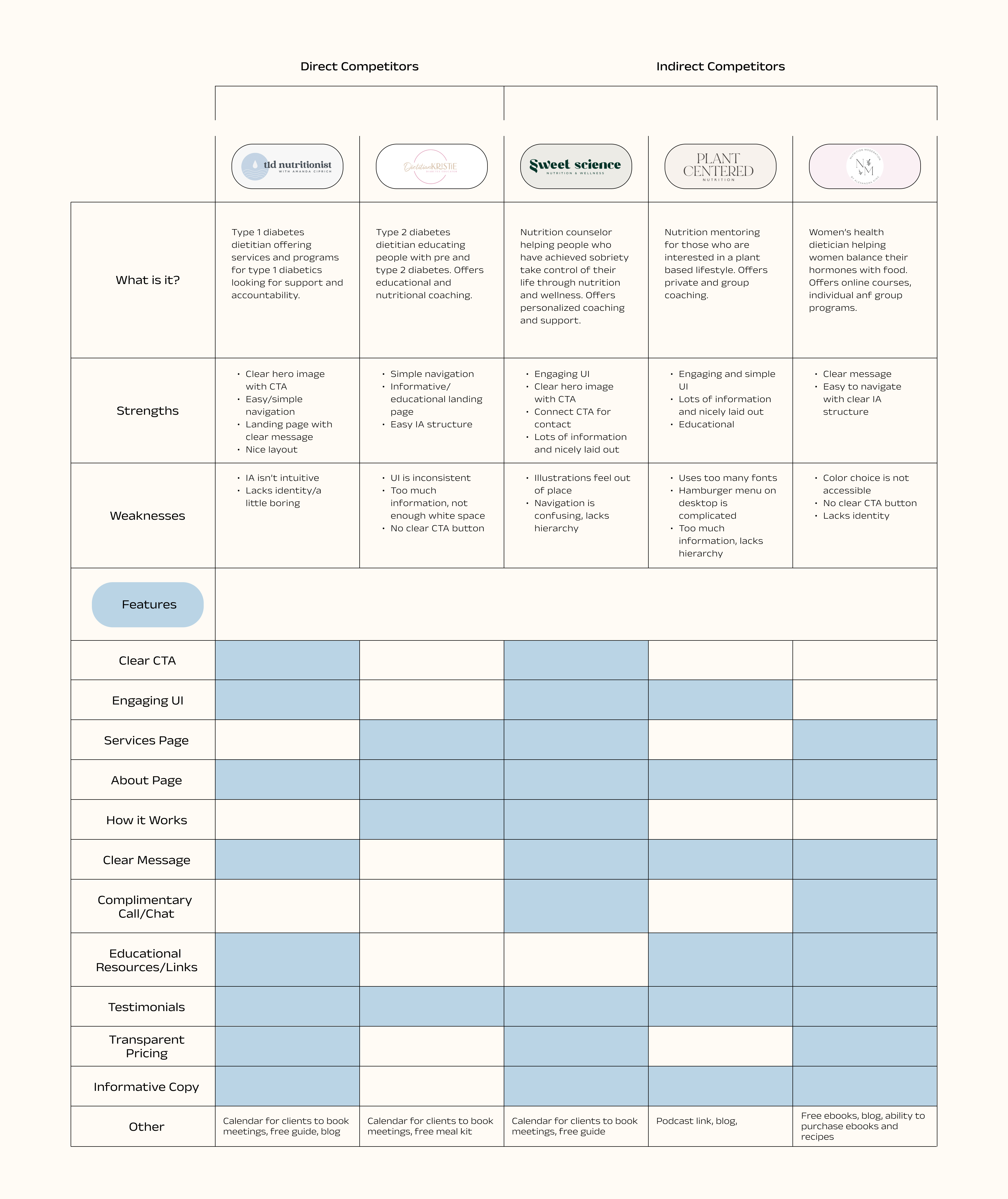
Conducting
Competitive Analysis
First step in my research process was to conduct competive analysis and familiarize myself with other dietitic businesses. I took note of thier successes, branding, navigation, services, and overall experience.
Some key items I looked at:
- Key features
- Resources and information
- User interface, usability & navigation
- Types of services
- Memorability and intuitiveness
Performing
User Interviews
Findings
Trust: Participants are more likely to purchase an online service if there are testimonials and if the person is relatable and passionate
Flexibility: Participants value their time and want to find a service that works best with their schedule
Unique Value Proposition: Participants are more likely to purchase a service if there is a clear statement of how this service will benefit them and solve their frustrations
Overall Experience: Participants prefer a seamless and effortless website with all necessary information to make a decision
What I heard
"Design your website with your targeted consumer in mind. One size fits all doesn’t pull much." - Sales Executive, 38
"Breakdown of the service, what is offered and when, other people's reviews — this information helps me decide if the service is worth it." - Videographer, 40
"Trusting an online business is difficult, but if they have a unique value proposition and testimonials, I am more likely to trust it." - Educator, 33
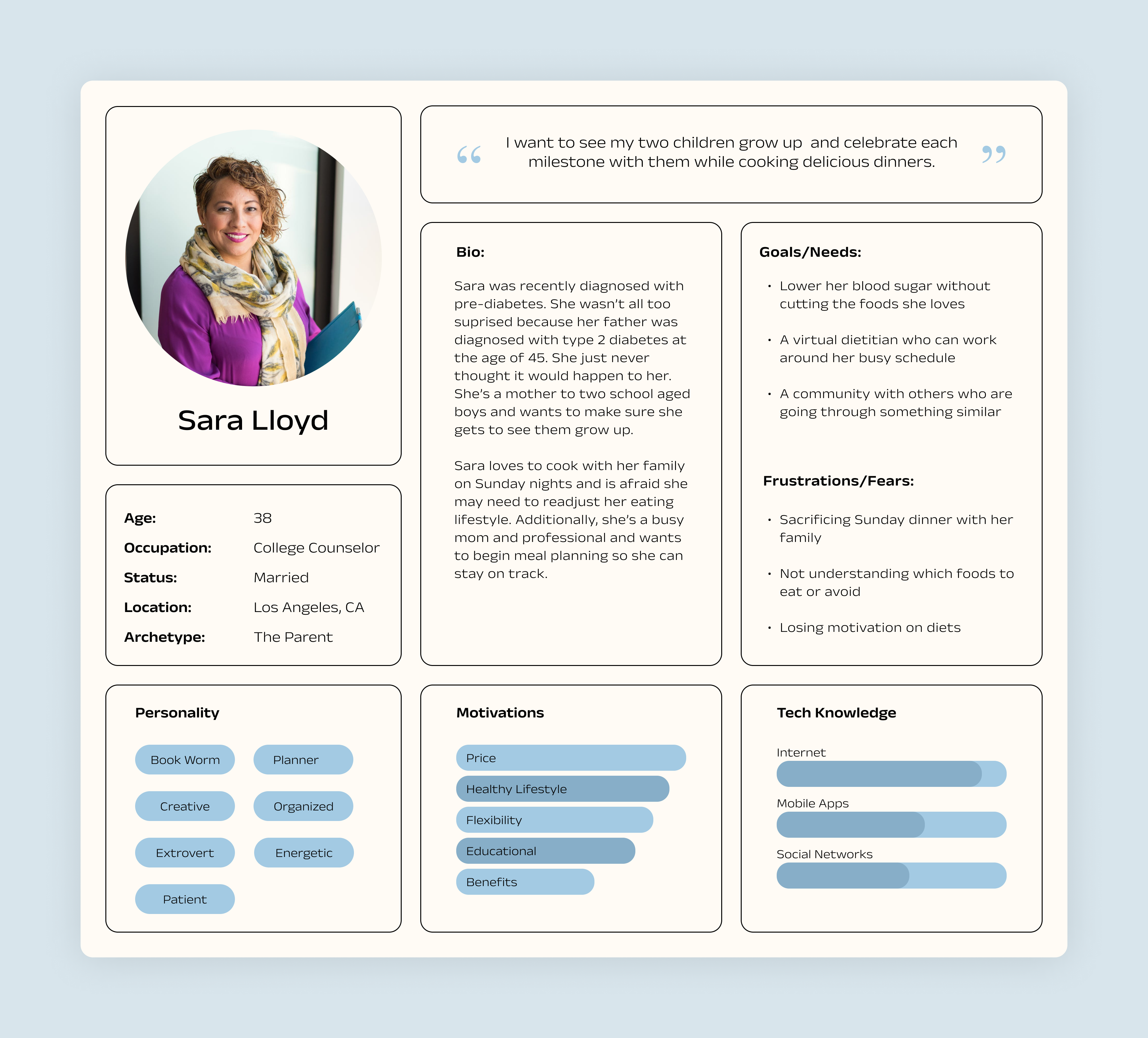
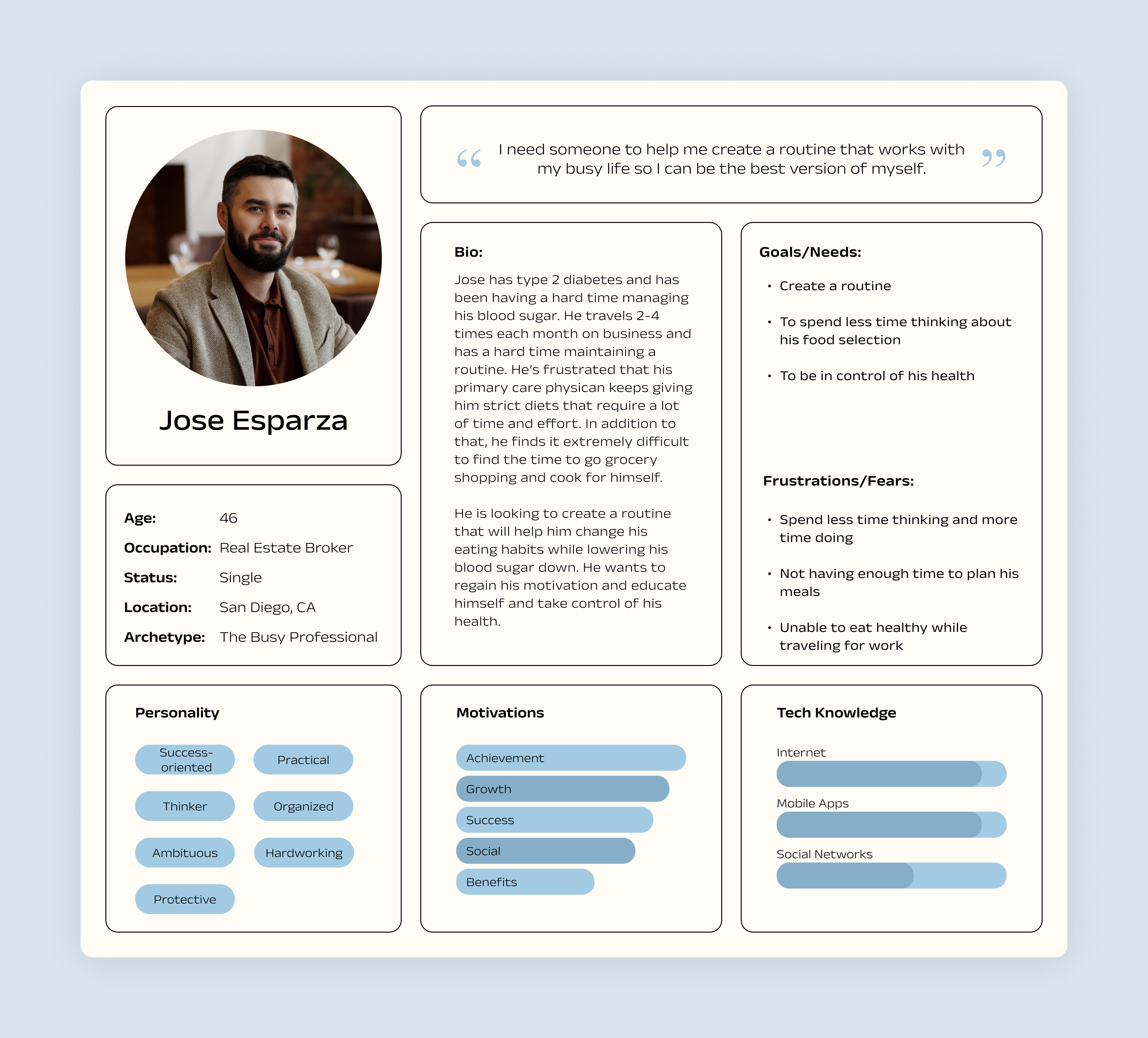
Creating
Personas
Two personas were crafted based on my user interviews and surveys I conducted. One persona is a mother and has a very tight schedule, while the other is a career-oriented person who doesn't have much time to prepare meals.
Pains
- Lack of information
- Sacrificing their favorite foods
- Not having enough time to cook/meal prep
- Feeling alone
Gains
- Learn how to manage their diabetes
- Develop healthy habits/create a routine
- Flexibility
- Lower blood sugar without cutting the foods they love
Improving
Information Architecture
Kristina's existing website provides all necessary navigation options, but lacks the information users are looking for and does not provide users with a full overview of the business and its value proposition. The proposed information architecture builds on what is existing and focuses on providing the users with the right amount of information, in a logical flow, creating a seamless and effective navigation system.
Site Map - Before
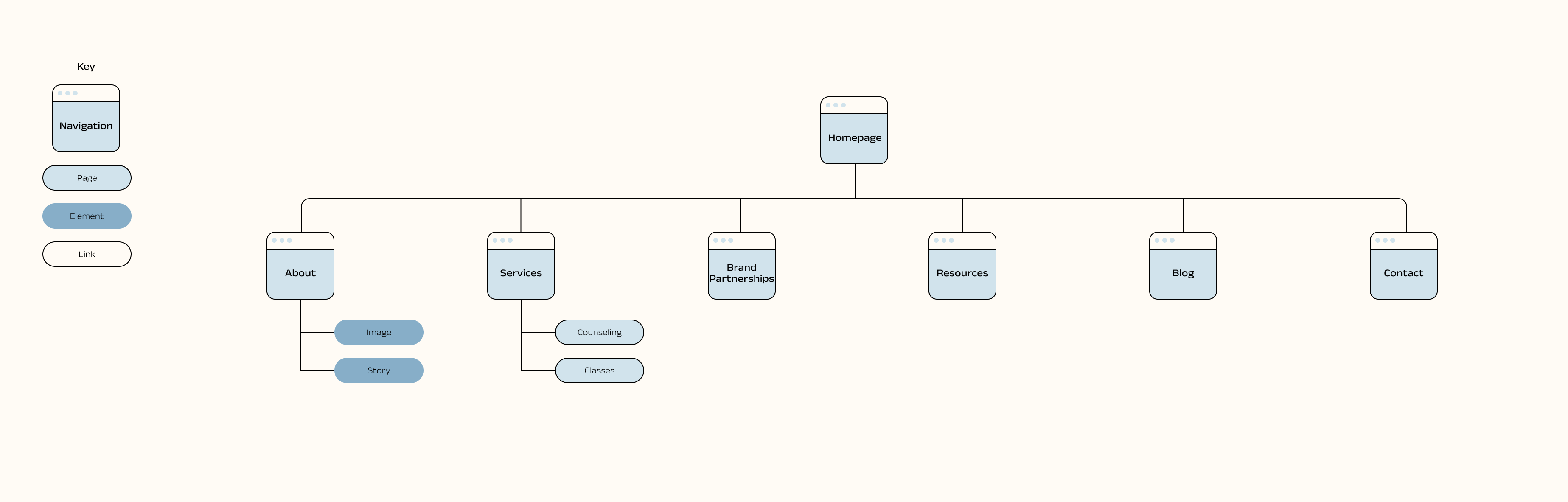
Site Map - After
Walking
with the Users
Using the information from the site map I created earlier, I developed a task flow and user flow based on one of the personas I created, Sara.
The task flow represents a path Sara might take when navigating through the website and applying for group coaching.
The user flow outlines all the possible paths Sara might take when landing on Kristina's website, viewing her services, and applying for group coaching.
Task Flow
User Flow
Generating
Design Ideas
At this point, I gathered enough information to begin sketching low-fidelity ideas. I began by sketching the hompage and meet Kristina pages because these are the most important in telling the story and providing users with the right amount of information to gain their trust and convert them into clients. These are some key components of the design:
1. Bring attention to the services Kristina offers and how her services will benefit the user.
2. Users are more likely to trust the service provider if they can relate to them and have more insight on who the person is and how they can help.
3. Include testimonials so that users know about people's experiences and successes working with Kristina.
Refining
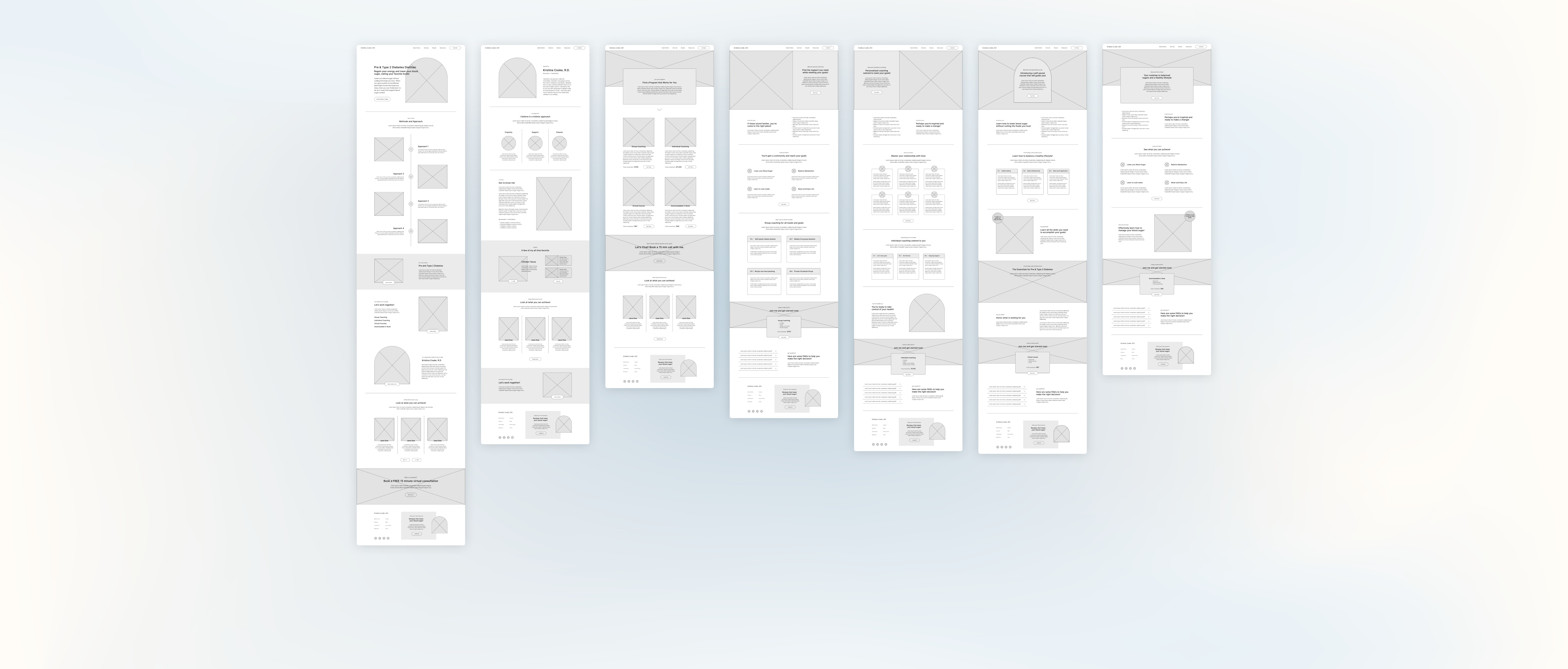
Low-Fidelity Wireframes
Low-fidelity wireframes were designed to solve pain-points and highlight necessary features that were discovered during the research process. These features include:
- Important information regarding her services
- Methods & approach
- How the user will benefit from her services
- Services offered
- Testimonials/Client Wins
In addition, the screens that were developed to capture the necessary paths users might take when applying for coaching or purchasing a service.
Creating
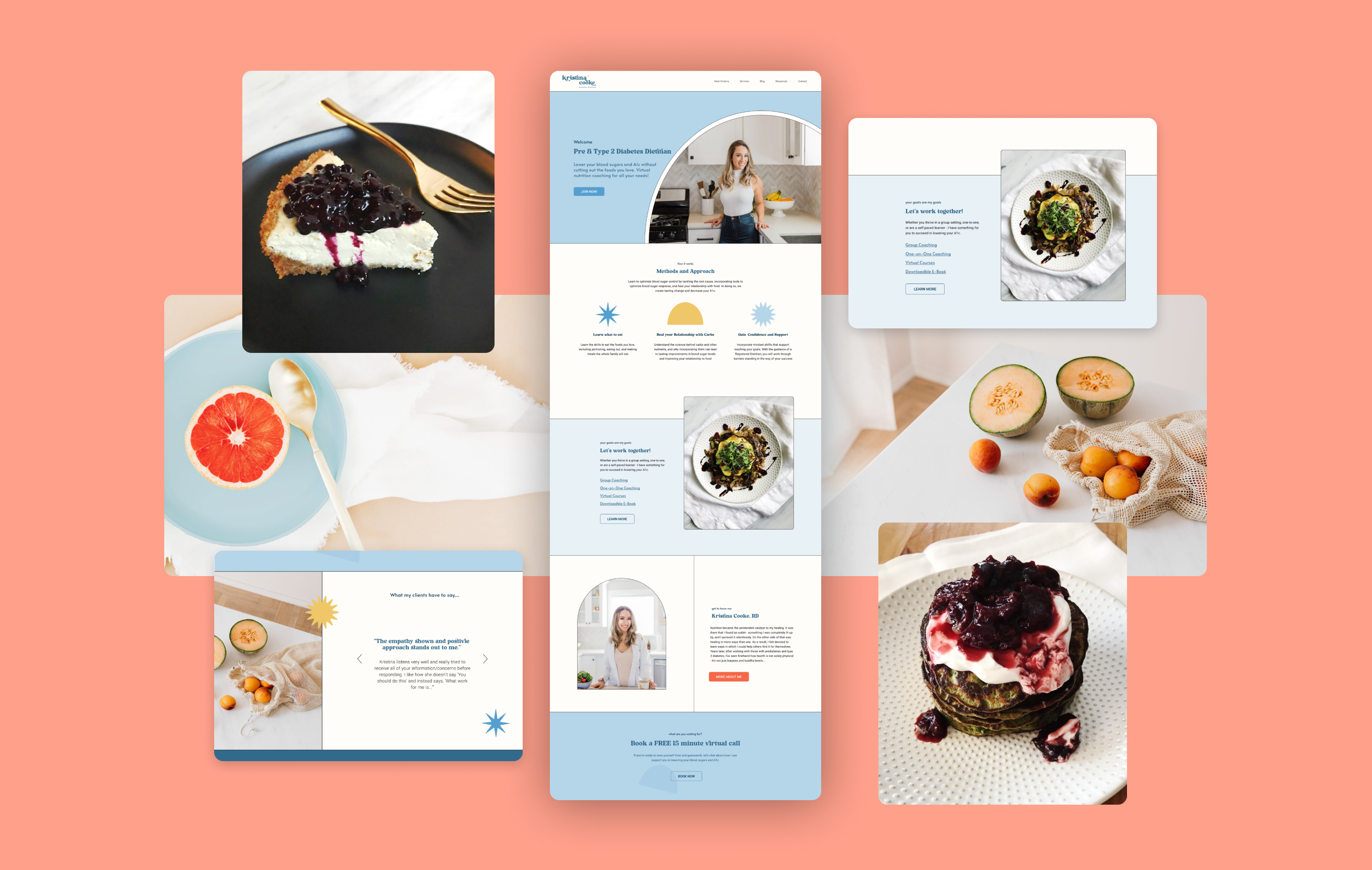
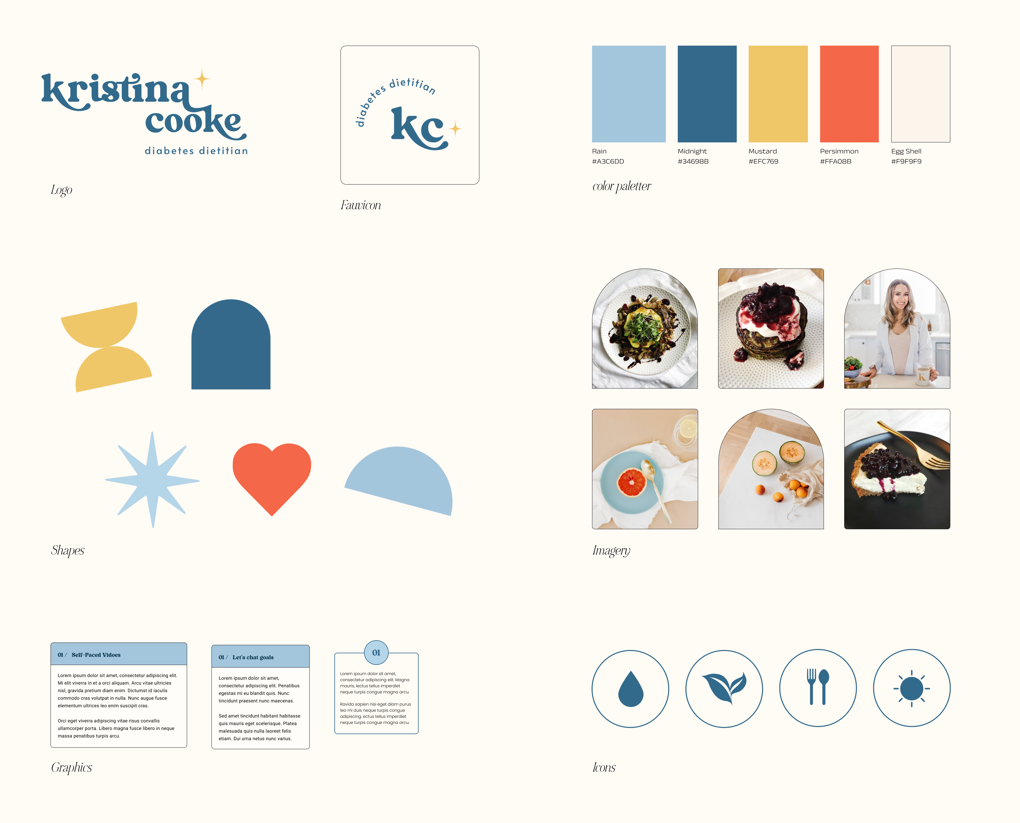
Visual Identity
I worked with Kristina to develop a brand identity that reflected her business and her as a professional and person.
Words that describe her brand:
Retro, Professional, Warm, Whimsical and Empathetic
Mood Board
Identity
Capturing
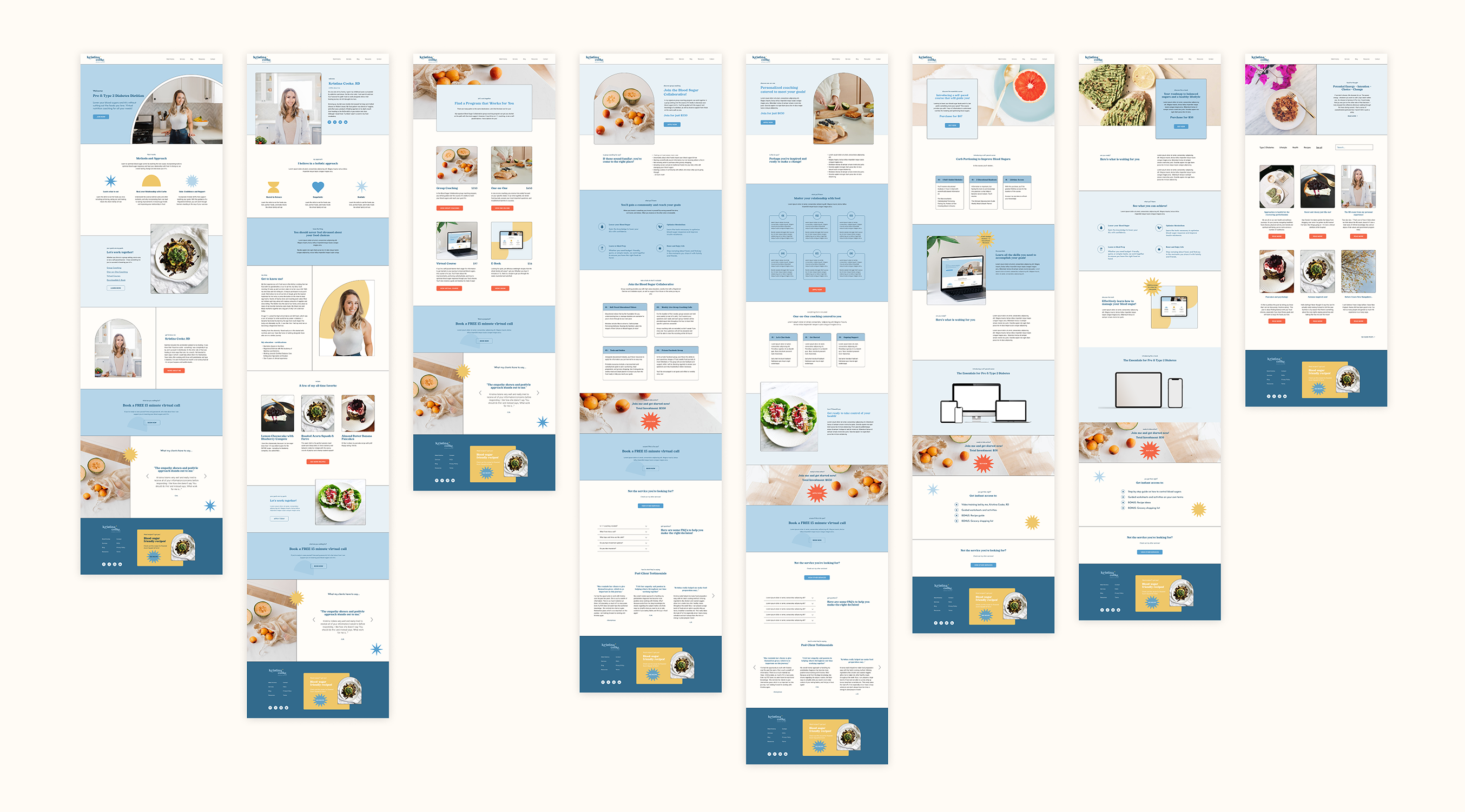
High-Fidelity Wireframes
To capture the accuracy of the website, high-fidelity wireframes were created. They aesthetically represent Kristina's brand and the UI design accomplishes Kristina's visual identity goal.
Performing
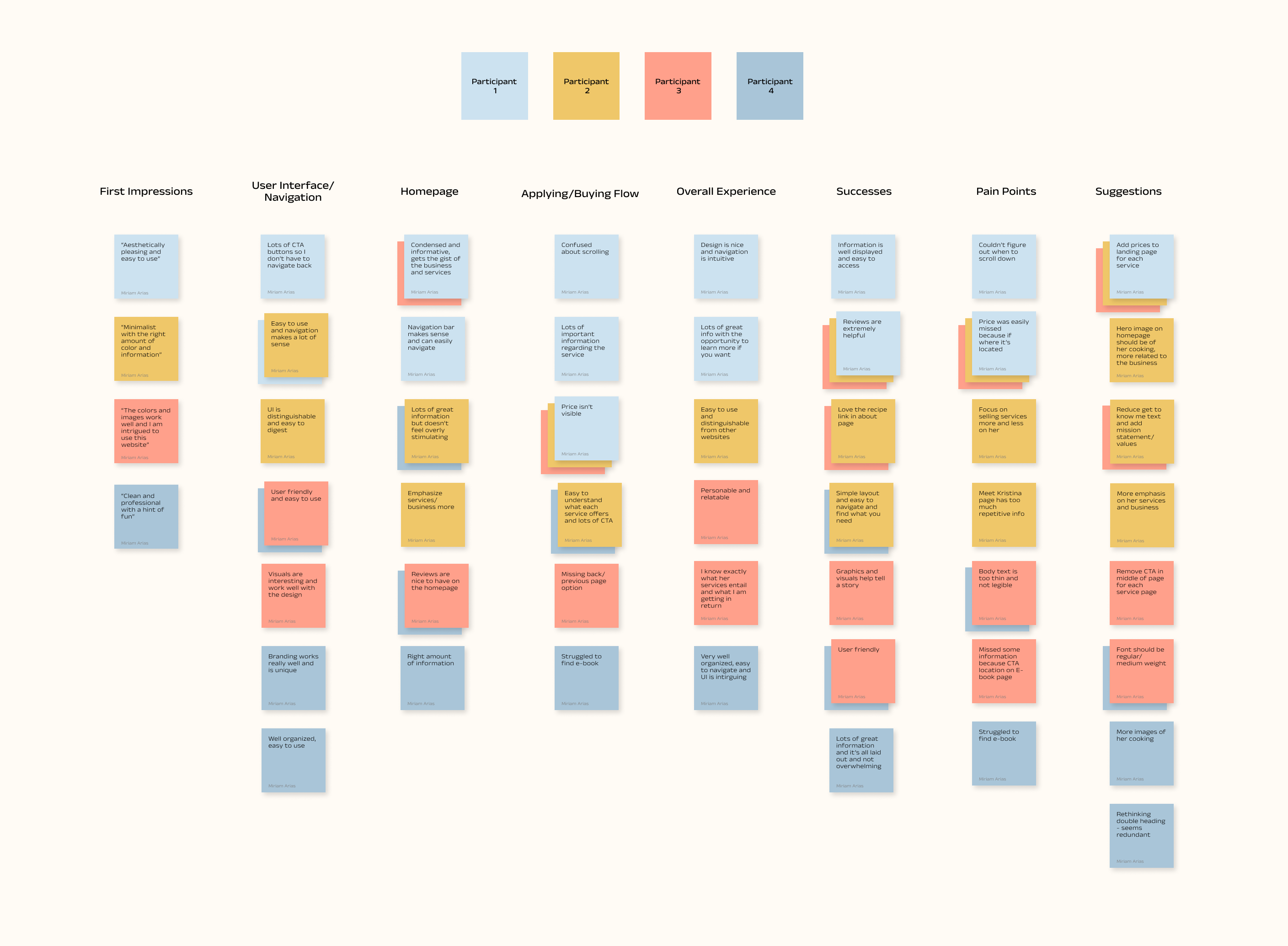
Usability Testing
A high-fidelity prototype was tested with 4 participants. Participants were given background information about the product then asked to assess the following:
- Website navigation and user interface
- Task completion and efficiency
- Frustrations and pain points
- Successes and overall experience
Iterating
the Prototype
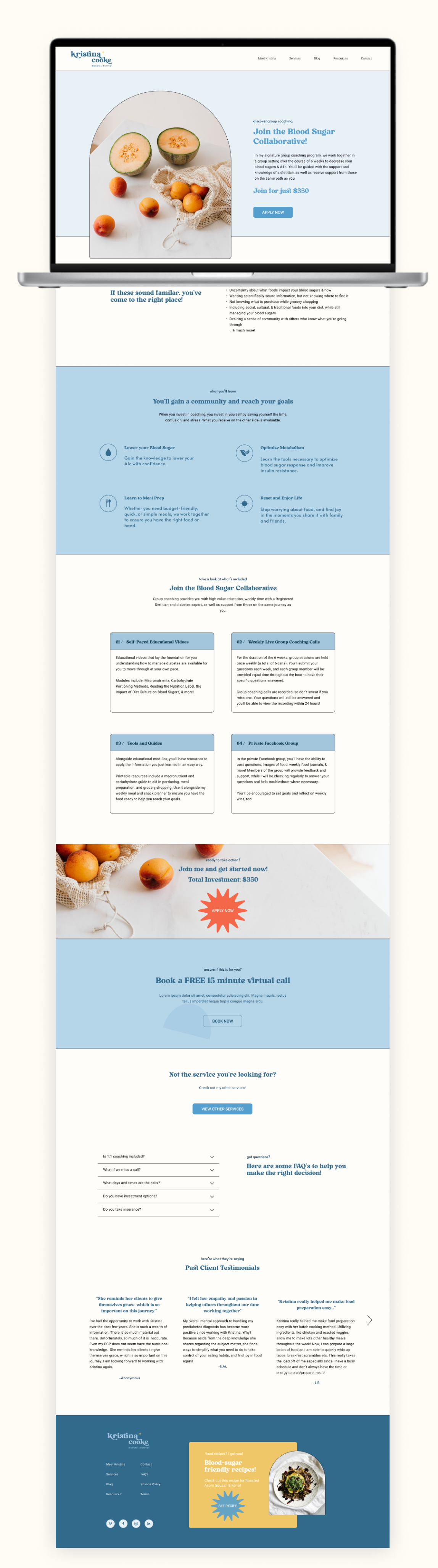
After collecting all of my user feedback, I addressed the problem areas and revised the prototype. Below are the revisions.
- Placed price on landing page for transparency
- Removed CTA button in middle of service page so user doesn't skip important information
- Changed body text from light to regular weight for legibility
- Added a return to services CTA for each service page
Reflecting
and Next Steps
High priority items from the priority matrix were addressed in the prototype. I will continue to iterate on the design as I incorporate all user feedback. The prototype was helpful for getting a sense of how her website will look and function. Additionally, we were able to improve user experience, implement new features and provide her future clients with a platform that is efficient and exciting.
I was able to present the final design to Kristina and she was very excited to see the prototype come together! As we move forward, I will continue to work with her to build out the website when she is ready to launch her business. I am grateful to have the opportunity create something that is special to Kristina and her future clients. Website coming soon!
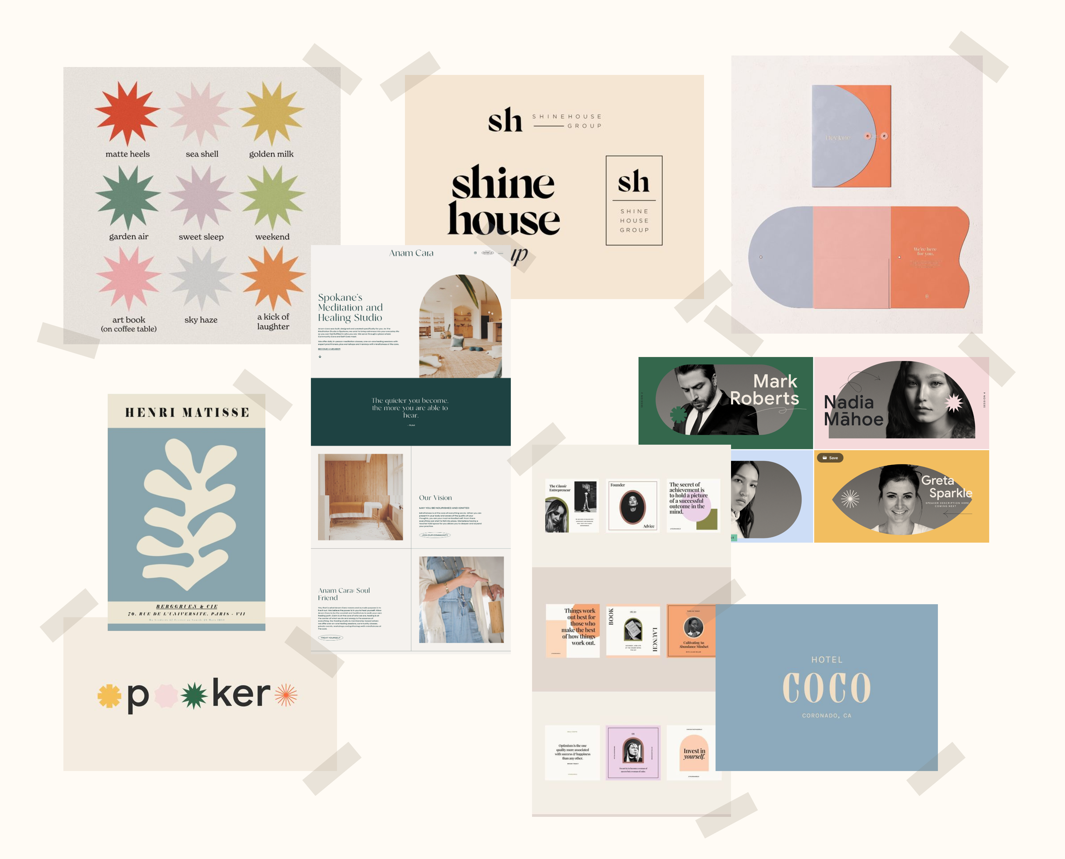
Other works
Agent AI AssistantProfessional Work
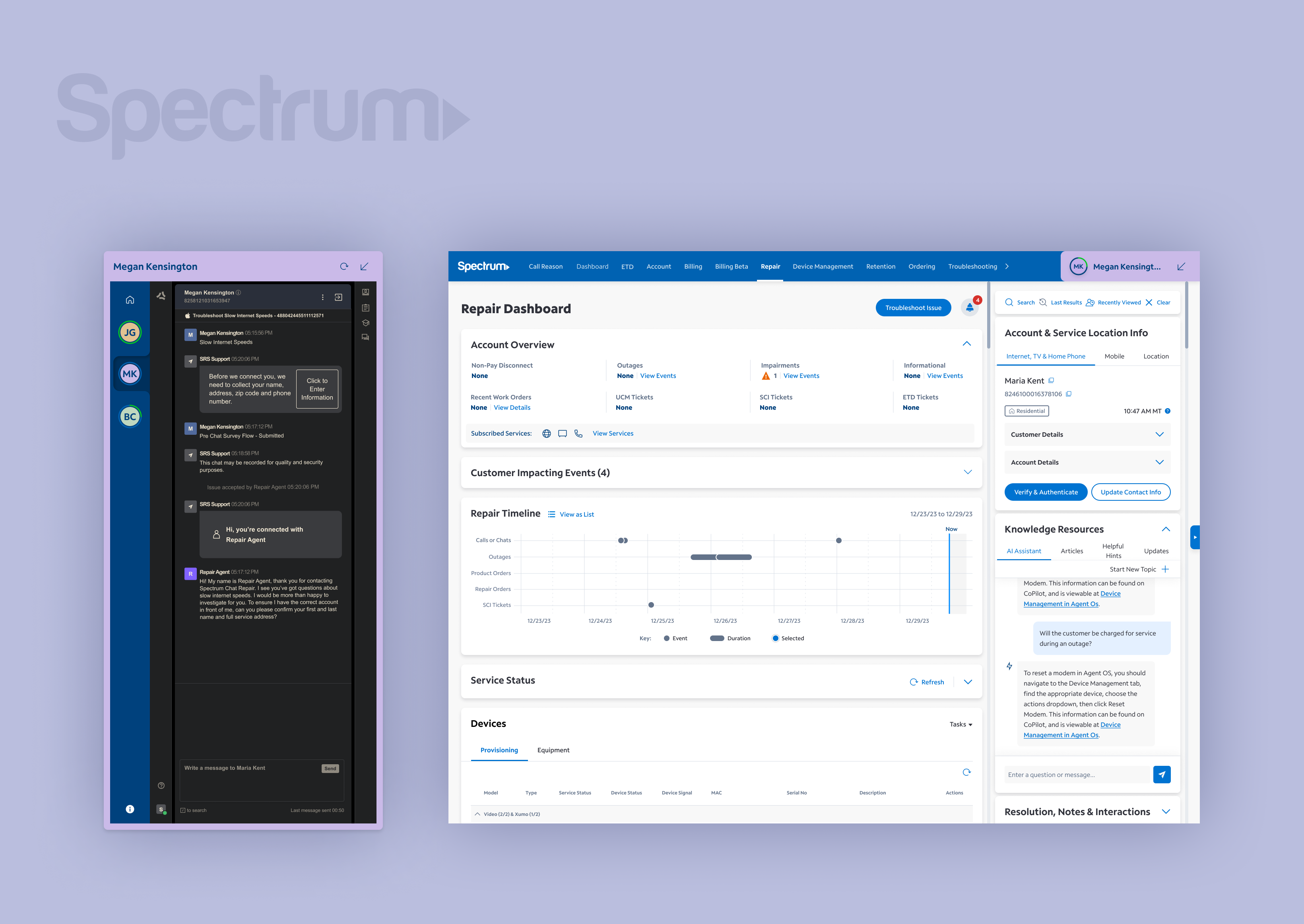
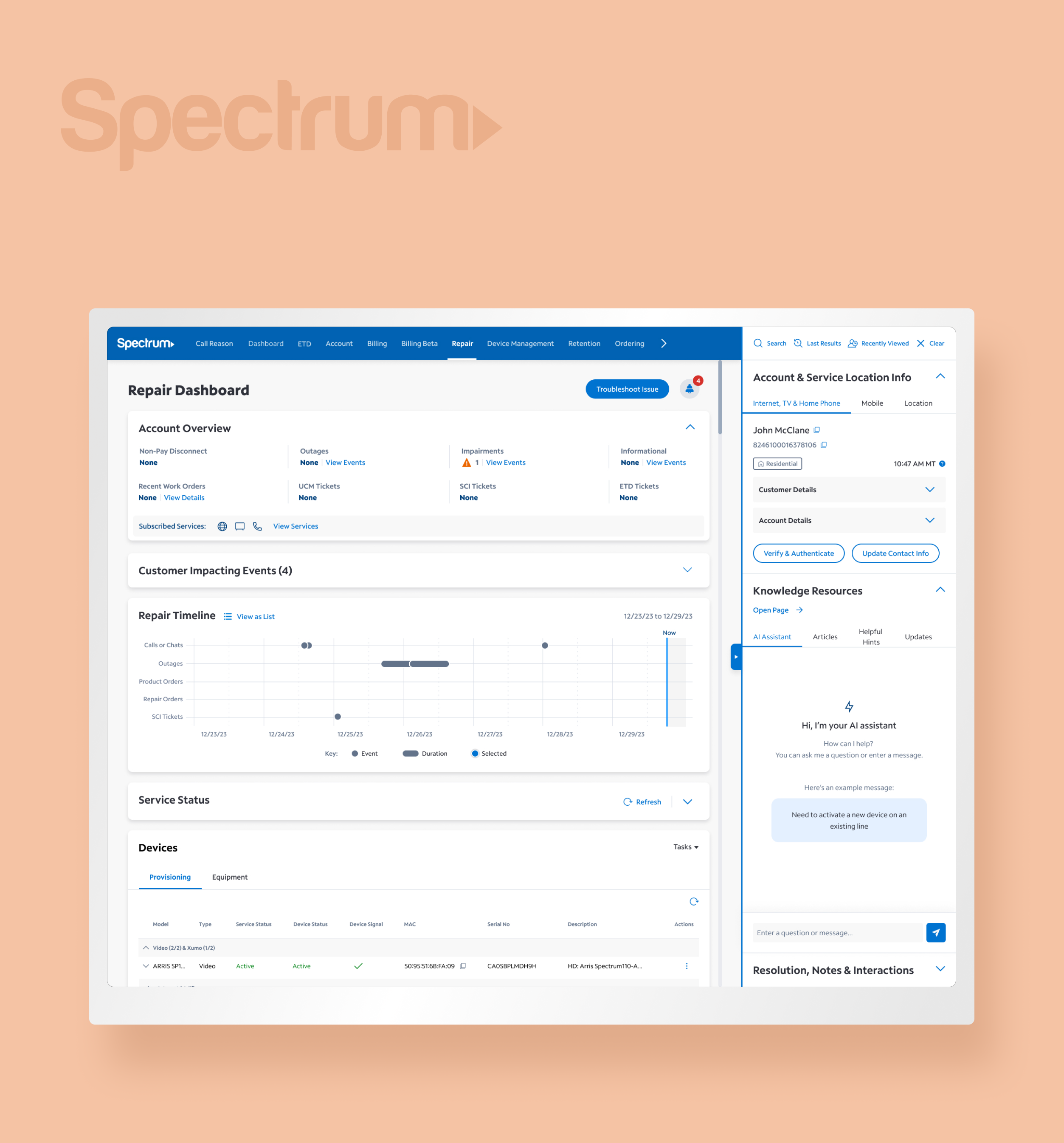
Undocked Agent ChatProfessional Work
Spectrum Right RailProfessional Work
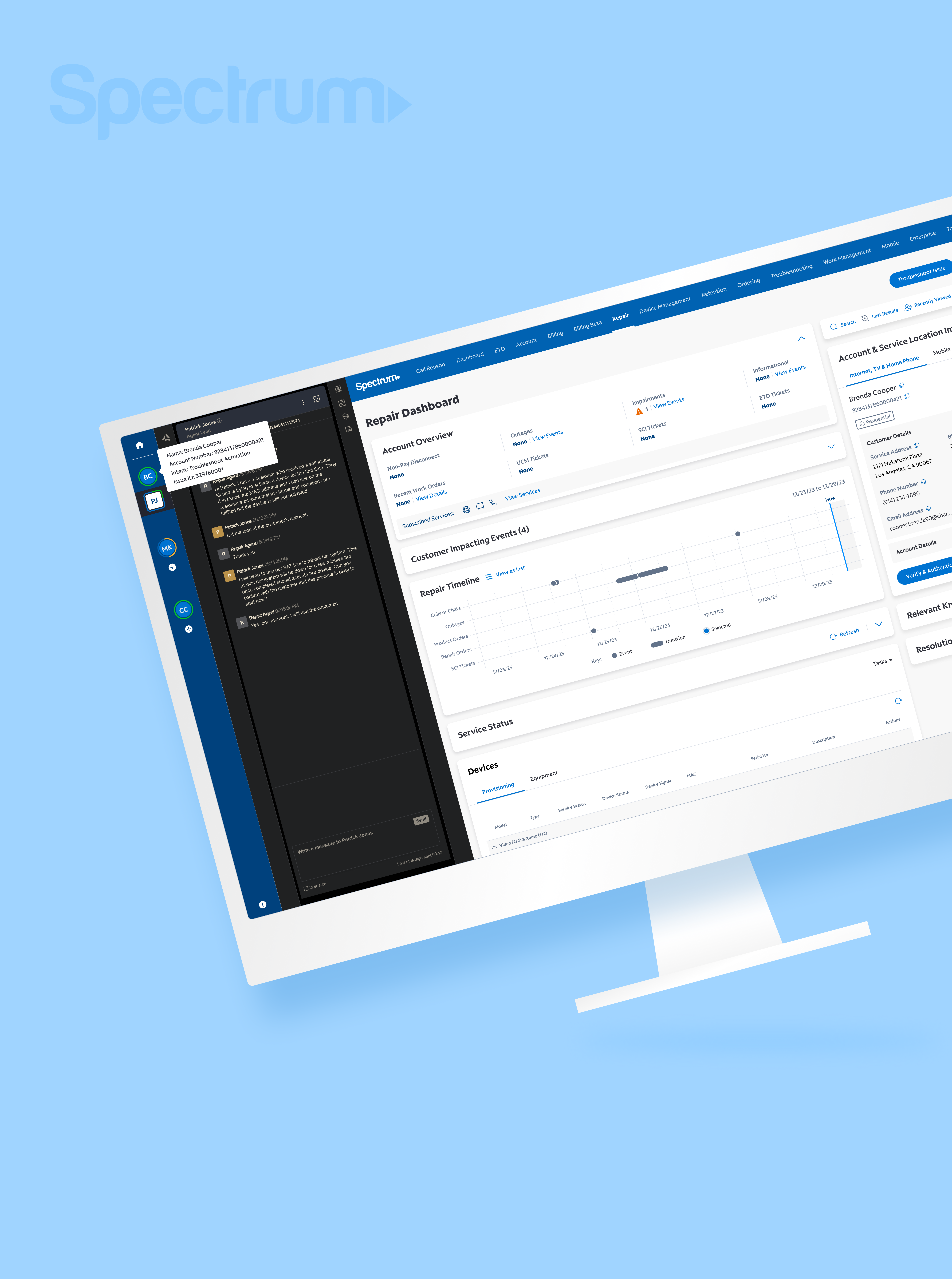
Chat Lead Line IntegrationProfessional Work
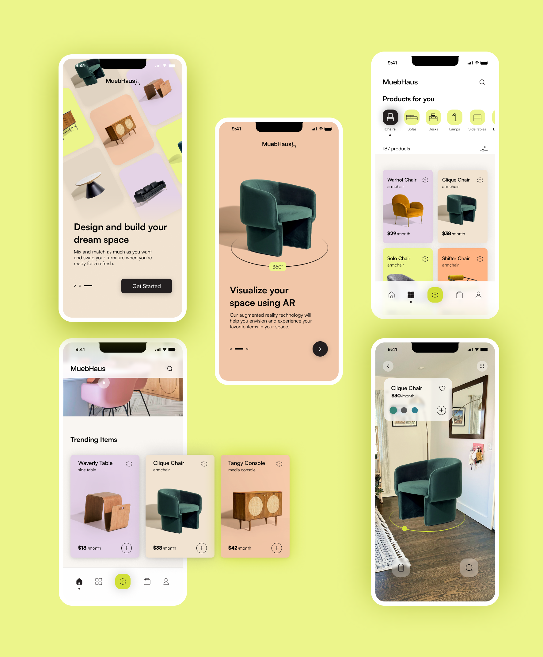
MuebHausProject type
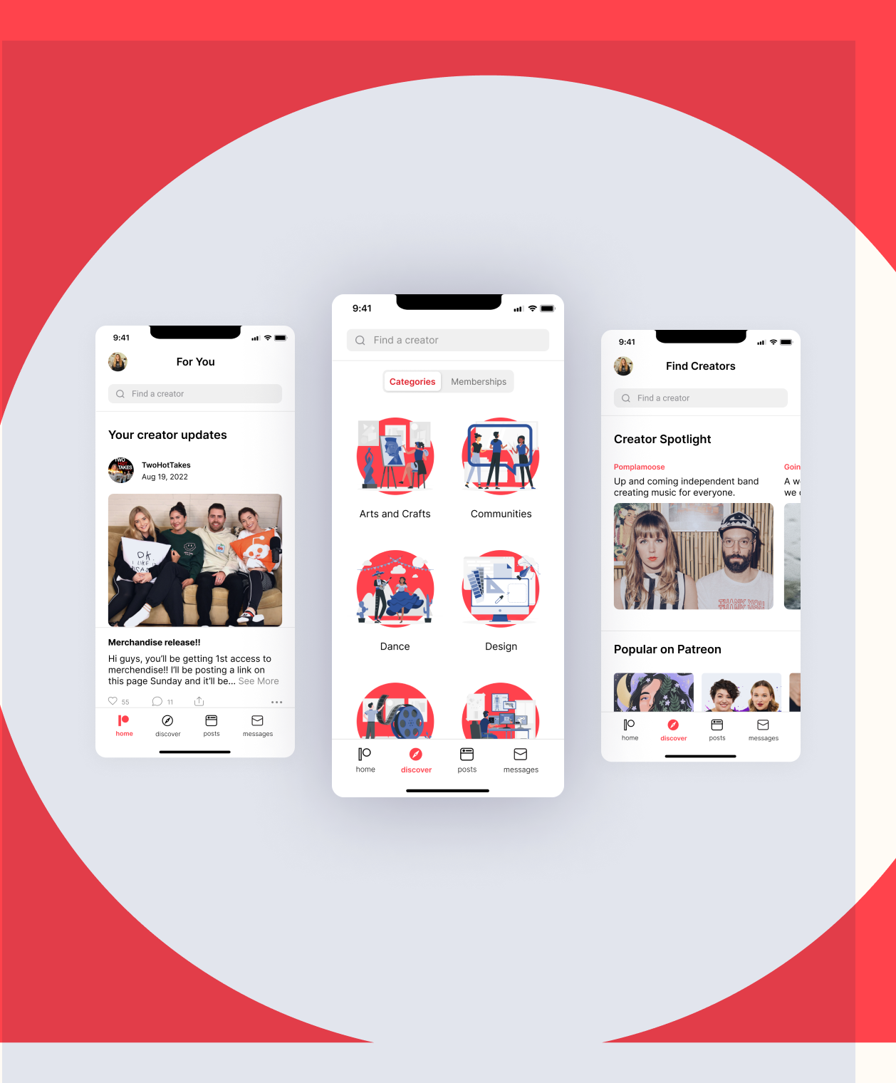
PatreonProject type
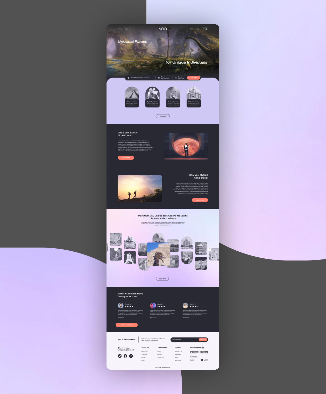
VOID TravelProject type
this isn't goodbye, it's see ya later ! ✺
designed by miriam arias © 2022